Lesson 4 – Use Empty Space in Your Photos
Lesson 4
Remember when we talked about abbreviating your subject? We’ll continue along the same vain with today’s lesson.
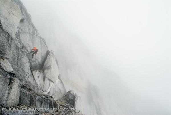
Just as you don’t always have to show the entire subject, you should never try to include too many elements in your frame. This only complicates your scene and confuses the viewer, whereas a cleaner, less cluttered composition will almost always result in a more powerful image.

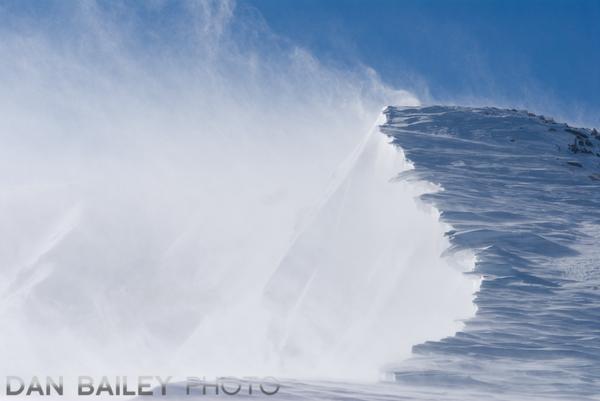
Including large areas of empty, or negative space can be a powerful compositional tool in photography. By placing your main subjects against large open backgrounds, you not only make the subjects stand out more, you create a stronger sense of balance in your photos.
It also gives your subject room to breathe. Remember, photography is as much about the brain as it is the eyes, and if you allow your viewer room to think, they’ll be able to approach your composition with a clear head.

In addition, you’ll find that what we call “empty space,” can end up being a prominent subject element in itself that helps enhance the storytelling aspect of your photo by creating suggestion, mood.
Don’t think you need to fill up your entire frame with subject matter. It’s better if you don’t. The best photos tell the story with a clear message. They almost hit you on the head with how simple they are.

Creative Challenge #4
Want More?
Read my post There is No Failure in Creativity.
In the next lesson, we'll talk about a different approach to shooting in color.
