In the beginning, there was only monochrome. All the first photos were shot in black and white, although sometimes it ended up being more brown and cream.
In 1936, Kodak invented the very first color film, which was Kodachrome. This, of course, opened up a whole new way for photographers to express themselves. No longer was photography just about shape, shadow and tone; the dimensions of hue, tint and saturation were added to our collective creative palette, which allowed us to push the boundaries of our vision in any way we chose.
The possibilities were pushed even further with the invention of Adobe Photoshop and the advent of digital imaging. Although few photographers use actual film anymore, our cameras and computers allow us to create any kind of look we want in our imagery.
The options are endless. We can slam the sliders, or use “vivid” camera settings and film simulations to add brilliant, Pantone® exploding levels of saturation in our images. Or we can pull then back and shoot quiet, subdued images that barely have any color at all.
But what’s the “right way?” What’s the perfect amount of color? How much is too much? Is there a guideline or some kind of rulebook that tells us how much color we should use in our photography?
Fortunately, no. There’s no rulebook, although some people actually like rules, because they make things easy. And regardless of how we might judge certain images, this is all just art and there are no “right” or “wrong” answers.
As with any other creative technique in photography, it revolves around the story you’re trying to tell, the specific message or emotion you’re trying to convey, or the visual impact you want to impart on your viewers.
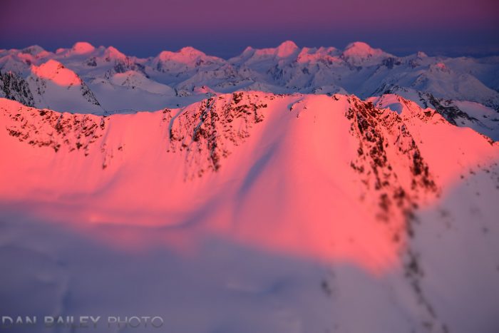

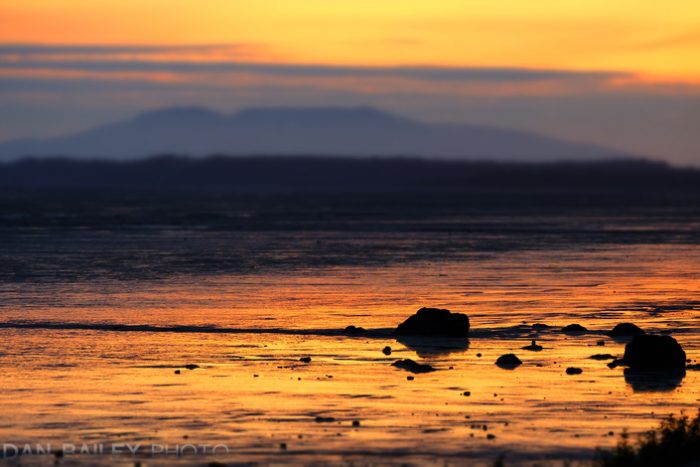
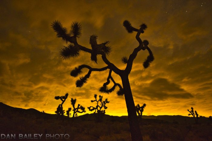
Using Highly Saturated Colors
The general trend in photography, at least on Instagram anyway, seems to be that more saturated is better. You know the look: HDR cotton candy with maple syrup poured all over it. (That’s what my wife calls it.) So vivid that it would make the Wizard of Oz look like black and white.
Technically, there’s nothing wrong with using incredibly vivid color. In fact, rich colors help enhance our photography because it compliments the way our memory actually works.
We tend to store important events and striking scenes in such way that our brain remembers them with heightened, enhanced significance. Much of this revolves around the inherent emotional connection we have with those particular situations.
Think about it. If you were to take a simple snapshot of an exciting scene, using a normal lens and no special creative or visual photographic techniques, chances are good that your picture will look pretty boring.
However, if you use your expensive glass and employ some solid camera and creative techniques, and then apply some selective processing, your picture will look much more exciting. That’s because it more closely matches your own “larger than life” memory of the scene.

Using highly saturated colors in your photo helps create that “larger than life” look in your work.
The colors in our minds are often far more vivid than what “reality”might show, so increased saturation plays to this phenomenon of “memorized color.”
In fact, this psychological concept is what inspired the Fujifilm engineers when they created the original Velvia film. They recognized that photography isn’t necessarily about accurate reproduction, but rather a medium for emotional communication.
Their idea was to produce a film that more closely matched the rich palette of colors we remember. This experiment proved to be a huge success. Velvia went on to become one of the most widely used films for outdoor and travel photographers, and it has been included as one of the film simulations inside the Fujifilm cameras.
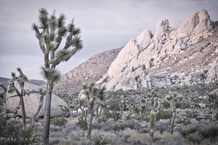
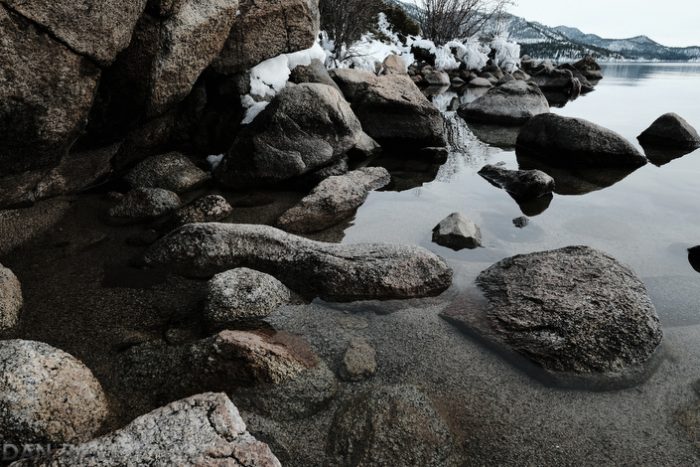
Using More Subdued Colors
Of course, slamming the vibrance isn’t the only way to add impact to your photography. Let’s explore what happens when you go in the opposite direction, when, instead of over saturating your colors, you pull them back.
You suddenly tell a very different story with your picture, don’t you?

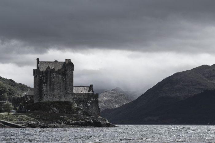
In a sense, pulling back the saturation and vibrance starts to bring your image towards monochrome territory. This plays into the notion that photography is also the “Art of Omission,” where showing less is actually more.
If you give your viewer too much information by spoon feeding them every possible aspect of your scene, you leave them very little room for their own emotional engagement in the process. There’s nothing left of them to do.
However, if you use the power of abbreviation and only show part of your scene, you force your viewer to activate their own brains and imagine the rest of the scene. You force them to think actively about what lies on the other side of the frame, or imagine what the colors really looked like.
In addition, when you take away the element of color, your viewer can focus on the story and subject of the scene instead of the details. This is why black and white images have so much power; there’s no extraneous information to distract from the specific message or emotion you’re trying to convey.

This is why Kodachrome was the revered choice for photojournalism and National Geographic photographers for so many years, even after Velvia hit the market. It had a very accurate, yet muted color palette that told the story without giving away too much.
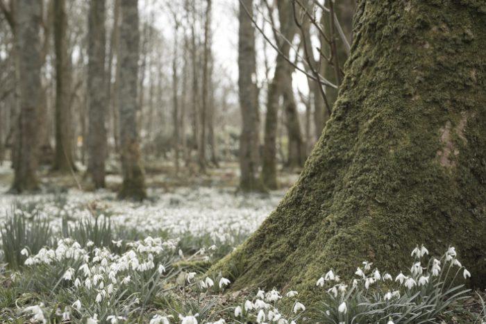
This is the approach when you use the more muted X Series film simulations, like ProNeg Std and CLASSIC CHROME, which is actually patterned after Kodachrome. As much as I love using the Velvia film sim in my photography, I also love using these more muted film sims to bring things back and focus on the shapes and story of my scene. Sometimes I’ll even customize the Film Sims on my Fujifilm cameras to add even more creative complexity.
When processing my photos, these days, I’m just as likely to drag the Saturation/Vibrance sliders to the left as to the right. It all depends on what I’m trying to focus on in my picture. In many cases, it’s simply a matter of getting a creative idea in the moment and running with it.
No matter what system or software you use, or whether you choose your colors in-camera or during the processing stage, I encourage you to experiment with these two approaches and see where your creativity can take you.
I was heavily into underwater photography for 20 years in the era of film. I tried all slide film and I mean all. I stuck with Kodachrome for macro shots and Velvia for everything else. I loved the look of Velvia so much, that I eventually used that exclusively…even for the macro shots.
Recently, I completely switched to the Fuji X system from a full frame DSLR. I absolutely love the film simulations with Fujifilm, which bring me right back to my days of film. Or so it seems.
[…] 6. Using Bold vs. Subdued Colors in Your Photography […]