One year ago this week, I posted my first video tutorial here YouTube. It was a detailed explanation of the Fuji film simulations and how you can use them to maximize your own creativity with your Fuji camera. That video has become my most watched tutorial, so if you haven’t seen it, you can find it here at this link.
A few months after I made that video, Fuji added another film sim to the mix called CLASSIC Neg. It was introduced with the release of the X-Pro 3, and it’s now found inside the X-T4 and X100V as well.
CLASSIC Neg quickly became one of my favorite film sims, and I’ve used it extensively on a wide variety of subject matter during the course of this year, so in this post, I’m going to give you a close look at CLASSIC Neg. and show you what you can do with it.
Like most of their other film sims, CLASSIC Neg. was directly patterned after one of Fuji’s legacy films.
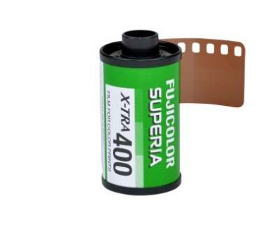
Built to replicate the look of the FUJICOLOR SUPERIA color print film introduced in the late 1990s, it’s designed to give you the look of consumer color negative film that was so prevalent in the decades before digital photography took over. That said, you can actually still buy SUPERA print film.
In a sense, CLASSIC Neg. is designed to look like snapshots of old, you know, back when we shot print film and got our pictures back from the lab in that little envelope. Or, depending on your age, maybe you don’t know. For millions of amateur shooters, that’s what photography was all about through much of our lives.


With CLASSIC Neg., Fujifilm digs into its 85+ year history with film and color, and gives us a unique, but familiar look. This new film sim taps into our color memories with a bold and unique expression that plays nicely with the already rich set of color choices we have on the X Series.
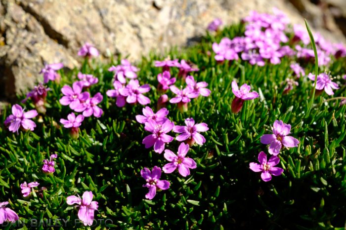
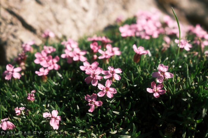
The color palette of CLASSIC Neg is interesting. It has a similar, strong tonality to CLASSIC CHROME, but with slightly richer “Fuji-style” colors that you see in PROVIA the PRO Neg. film sims. It also has whiter whites than most of the other film sims, even Velvia. To my eyes, the best way to describe it would be Pro Neg Hi with brighter highlights, slightly darker shadows and a little bit less saturation.
The overall effect is a slightly muted, but high contrast profile that, again, is reminiscent of glossy lab prints that so many of us grew up on.


It might not seem so great at first. After all, it’s not as vivid as velvia and it’s got got that high contrast without those bold colors, but this gives CLASSIC NEG it a very representational look, and if you’ve watched a few of my video lesson on YouTube, then you’ve probably heard me talk about the notion of how the ideas of representation and abbreviation play in photography.
In my mind, making powerful images isn’t about perfectly reproducing your subjects, it’s about creating a visual representation of your scene and abbreviating the strongest visual elements and ideas present. Instead of spoon feeding everything to your viewers, you make them work for it and try to imagine what you didn’t show in your picture. It’s that whole less is more concept.
I find CLASSIC NEG to be a highly versatile film sim. It seems to work with just about every kind of subject and it produces a very cool and timeless look that holds a great deal of style. It works well in the sunshine and unlike a film sim like Velvia, it actually works quite well in the shade and under white, overcast skies.
Its qualities are accented in a wonderful way when you add the COLOR CHROME FX Blue effect, especially when you have any kind of blue tones in your image, either blue sky or open shade.


In addition, it’s very customizable. I love dialing the shadow detail up and down to play around with the contrast, and also boosting or cutting the COLOR control, in order to make it even more bold or subdued, depending on the look you’re going for.
A few weeks ago, I was out photographing at the Knik Glacier, and I took out my X100 to grab a few shots. As soon as I looked through the viewfinder, I was blown away by what I saw. When I looked at the image, I noticed that the camera had been set to Classic Neg, with -2 HL, -2 and +4 color with CCFX Blue Strong and the Grain setting to WEAK.

I don’t even remember what I had been shooting, I was probably just messing around with the controls, but that’t what is was on, and it looked amazing. That’s that representational look I was talking about. This color isn’t 100% accurate, that doesn’t really matter to our eyes. Our brain sees beyond that, and in our minds, it just looks really cool.
That’s how well these color sims have been engineered. They’ve been crafted with such careful precision. Not every color recipe looks great, and you can imagine that certain color combinations might look pretty bad. The Fuji colors play so nicely with our brains and with the notion of memorized color, which is a concept I talked about in my last video about using bold and subdued colors in your photography.
CLASSIC NEG also look awesome in combination with the new CLARITY setting you have inside the Q menu. You can crank the clarity up to add nice, bold definition and harder edges to the photo, or you can can it deal it back to soften things up and reduce the overall contrast. Since the CLARITY control goes form +5 to -5, this gives you a lot of leeway for making fine tune adjustments to your image and coming up with unique looks.


In fact, I’d say that CLASSIC NEG is one of the reason I’ve used my X100V so much this year. As much as I love my X-T3, it doesn’t have CLASSIC NEG, at least not yet. I’ll often take both cameras with me and use them side by side, keeping my X100V set to CLASSIC NEG.
Given that the X100V, X-Pro 3 and X-T3 all have the same internal processor, though, I don’t see any reason why CLASSIC Neg can’t be added the X-T3 and X-T30 in with a future firmware update. I haven’t heard anything from Fuji on this, but I’m going to remain hopeful.
If you do have an older Fuji and are thinking about upgrading, this might be one of the strongest reasons to upgrade to one of the three new models.
As you can see, I really love this new sim, it has a wonderfully rich and characteristic look, and it’s yet one more tool that we have to evoke and inspire different moods with our imagery.
So much of Fujifilm’s legacy is wrapped around film and color, and the film simulations are the extension of that rich heritage in the digital world. I just think that the film simulations are the lifeblood of the X Series cameras, and they foster such a unique style of creativity. They allow you to quickly choose a look that matches your mood and your own creative ideas for the scene, and quickly create an image that matches your own ideas and feelings in the moment.
So, if you have an X100V, X-Pro 3 or X-T4, I encourage you to give the new Classic Neg a try. I think that once you become familiar with it’s visual characteristics, you’ll find it to be a pretty useful color profile for creating image that have a familiar sense of drama.
You can watch my video tutorial about CLASSIC Neg. here.