When searching for our subject matter, photographers often look for scenes with diverse color palettes and wide tonal variation.
By using a mix of contrasting hues and strategically placing small instances of hot colors against cooler backgrounds, you can create differing levels of tension and balance within your composition. This helps direct your viewer’s eye around the frame.
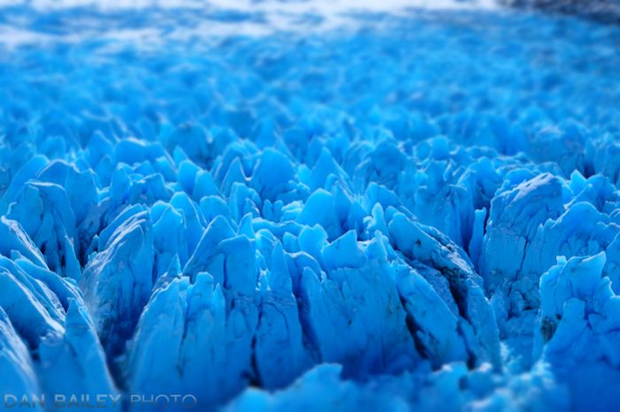
But what if you go the other way and pare your colors down to a single dominant tone? What if you eliminate the element of color contrast in your composition and only feature a single hue or a very narrow range of hues in your photo?
I refer to this approach as shooting monochrome in color.
As much as I like playing different colors off of each other and creating high contrast levels in my images, I really enjoy experimenting with this technique.
The reason that black and white images often have such powerful visual impact is that they present the subject without the distraction of color. Since we naturally see in color, removing it entirely from a photograph creates a medium that suddenly becomes separate from our real life experience.
By narrowing down the content of your images to a single hue, you remove most of the color, and this creates a similar effect for your viewer. It denies you the most prominent visual element in your own creative palette, which forces you to get back to the basics of light and framing.

That said, since you’re not limited to using only black, white and varying levels of gray, your creative options are wide open. You can use any color as the basis for your scene, but the trick is to try and use only that color, or hues that are in the same family, or that live near each other on the color wheel.
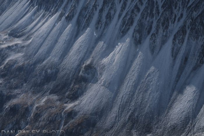
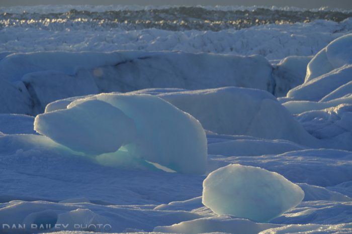
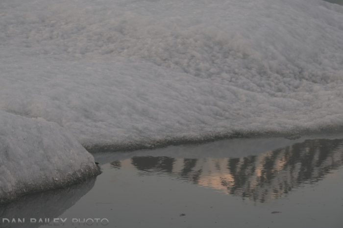
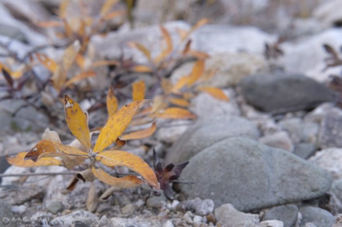
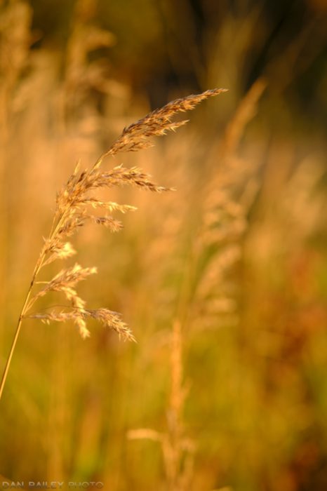
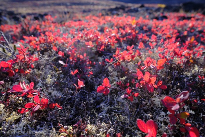
You’ll find that your technique for creating these types of images will vary greatly. With some subjects, it will be relatively straightforward. Think closeups on foliage, flowers, or other monochromatic landscapes. These kinds of scenes easily lend themselves to a single color approach.
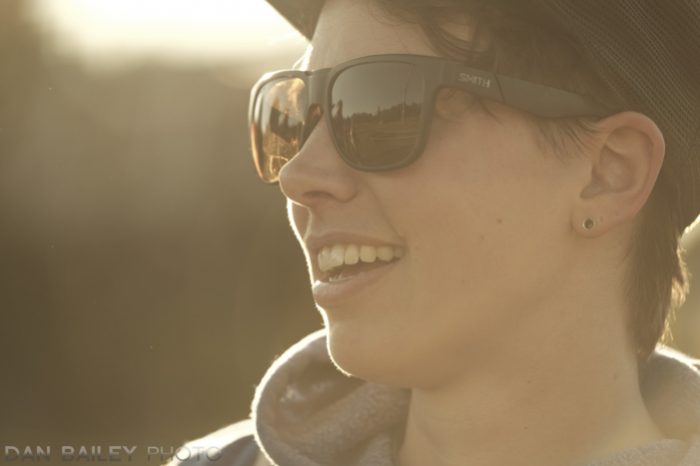
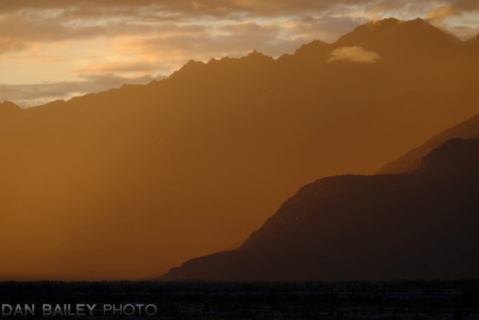
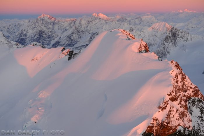
Other times, your effect will be created largely by the prevailing light, as with the portrait above, and sometimes you’ll need to stretch your visual skills and use creative framing in order to make this work. You can also create these kinds of effects with post processing.
How much color you use in your imagery is totally up to you. There are no rules; you can use a single hue or add small bits of other color in the image for added interest. Personally, I like the challenge of minimizing or entirely eliminating secondary colors other than the primary hue.
I’ve enjoyed using with this approach in my photography, and I encourage you to try playing around with it as well. By adding this technique to your own bag of tricks, you can expand your image making options in new and exciting ways. Your own visual senses will suddenly be tuned to fresh, fun, unique creative possibilities, and you’ll begin to see the world in a whole new way.


Each photo is really showing the unique atmosphere. Wow!