When designing the X Series, the Fujifilm engineers had the idea to incorporate the looks of some of their older films right into the cameras. This was a brilliant move; after all, with an 80+ year history surrounding film and color imaging, this played to their strengths.
Ask any photographer who has used actual Fuji Photo Film why they shot it, or ask an X Series shooter why they use Fuji, and their likely answer is because of the colors. In short, no one does color like Fuji, which I why I feel this is such an integral feature on the cameras.
I’d even go so far and say that the Fuji Film Simulations are the lifeblood of the X Series cameras. This wonderful collection of fifteen ultra-classic color and monochrome palettes give you some of the most iconic looks in the history of photography.
Developed over decades and culled to perfection for the X Series, these built-in color presets offer you a diverse and dynamic set of tones with which to craft your artistry.
(Click here to watch the video companion to this blog post.)
The idea is that as you gauge your scene, you make creativity decisions right there in the moment, based on how you want to show your subject, and then pick a film simulations that best matches those ideas.
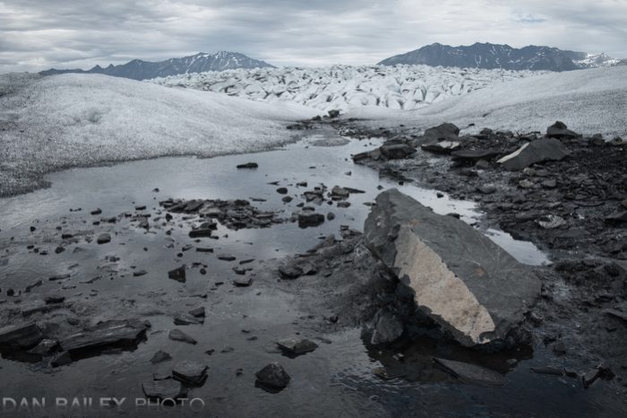
For example, are you going fo bold and beautiful, subtle and subdued? Rich and powerful, careful and contemplative? Clean and crisp, garish and gritty? You’ve got it all right there at your fingertips, from the rich drama of VELVIA and the wonderful skin tones of ASTIA, to the soft, muted colors of ProNeg Low, and the classic journalistic tones of Classic Chrome, as well as a fantastic selection of black and whites modes!
Here’s a detailed rundown of my favorite film simulations on the X Series cameras, and what kinds of subjects I typically use them for. I strongly encourage you to play around with them. Get to know the film sims intimately. Commit them to memory and make them an integral part of your own shooting experience.
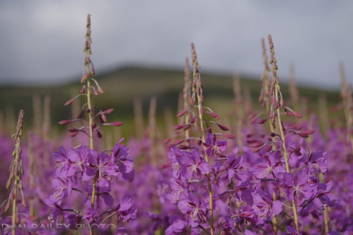
VELVIA
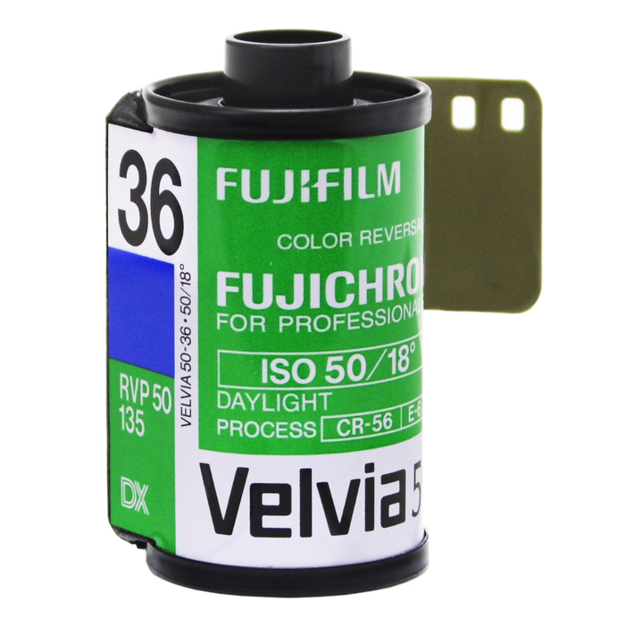
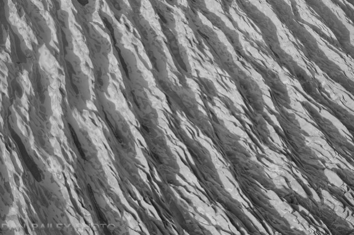
In 1991, Fuji Photo Film as they used to be called, unveiled an ISO 50 color reversal (slide) film that shook the world of photo imaging with its wonderfully rich color, highly saturated color palette and inky black shadows. Outdoor photographers loved it and seemingly overnight, VELVIA quickly became the favorite film of landscape, nature, travel and adventure shooters everywhere.
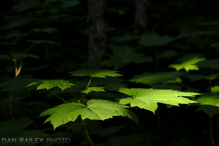
VELVIA has a very vivid look. It was my favorite slide film and it’s my favorite film simulation because it delivers colors that are larger than life. It’s not always accurate or nor is it always true to life, but for general outdoor photography, it delivers the intended emotion and confidence of your scenes with a bang.

In fact, when designing the original VELVIA color profile, the Fuji color engineers tweaked the color recipe in such a way that it makes images more “memorable”.
Funny thing about the human brain: We often remember things as being more “enhanced” than they really were in real life. That’s just how we work. In fact, if we were to look at a faithfully accurate photo of a memorable scene, we would think it’s “missing something.” VELVIA plays on this psychological aspect of human memory and helps us create imagery that has a strong impact in the memory of our viewers.
I LOVE VELVIA and I always have, even when I shot it back in my film days. Having bought my first roll of VELVIA back in 1993, I’ve been shooting those colors for half of my entire life. In that way, those VELVIA colors have been an integral part of my development as a photographer.
VELVIA works for just about anything on bright sunny days: Action, adventure, landscapes, travel, people… It’s not so great on cloudy days or for close portraits, especially with darker skin tones.

ASTIA
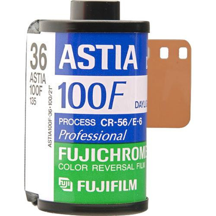
Based on Fuji’s professional ISO100 color reversal portrait and fashion film, ASTIA does great with skin tones and clothing, which makes it ideal for photographing people outside under natural light. That said, it looks great on any kind of subject, inside and out, because it has great color that doesn’t block up when the contrast of your scene increases.
For this reason, ASTIA is my preferred film sim on cloudy days when VELVIA is too contrasty. It’s one of my favorite film sims, and I find it incredibly useful for a variety of subject matter and lighting conditions.


CLASSIC CHROME
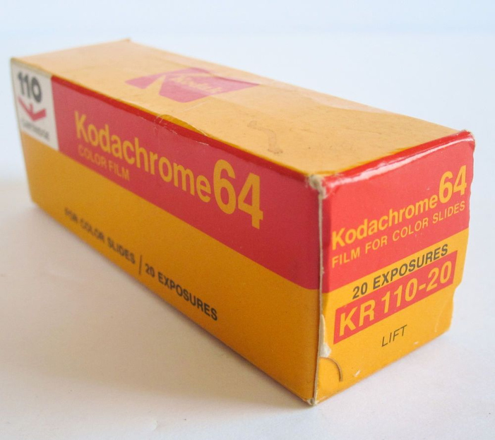
Although the Fuji people can’t officially call it as such, Classic Chrome was designed to emulate Kodachrome, the most classic of all film stocks. With the lowest saturation of any of the other film sims, Classic Chrome produces softer colors and gives a wonderful muted look to your images.
At first, Classic Chrome might seem a bit boring, especially when compared to VELVIA, but when you realize what it’s doing, you’ll find that it almost produces a very pleasing, almost monochromatic look, but in color.
The tonality of Classic Chrome is interesting, it’s relatively soft in the highlights and harder in the shadows. This makes it quite usable for shooting under overcast skies. Shadows become a bit more rich, but your brights don’t blow out so easily. You can use this to your advantage in a wide variety of situations.
When you want your story to be about the subject and not the colors, Classic Chrome is a great choice. Think photojournalism, environmental portraiture or street photography. It’s even great for certain landscapes, because when you take away bright color, you force your viewer to concentrate on shape and tone and imagine the colors that were present. In that sense, it’s like VELIVA in reverse.


PRO Neg. STD
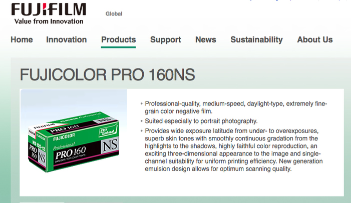
The two PRO Neg sims are patterned after Fuji’s popular NS 160 print film, which was the go-to choice for wedding and portrait photographers
PRO Neg. HI has slightly more tonality than STD, which gives it a little more contrast. It’s ideal for outside portraits or street photography.
On the other hand, PRO Neg. STD has the lowest tonality of any of the film sims, and it produces images with minimal contrast and soft, muted colors, but with slightly enhanced skin tones. It’s designed to give the best results when photographing portraits inside under studio lighting and flash.
Where CLASSIC CHROME has muted colors, but retains hard tonality in the shadows, PRO Neg. STD pulls everything back evenly. You get those nice Fuji colors, but at a very low saturation level with much softer shadows.
I actually love shooting with this film sim and I use it quite often to give a much more lower contrast look to my imagery, especially when fighting shadows on bright days.


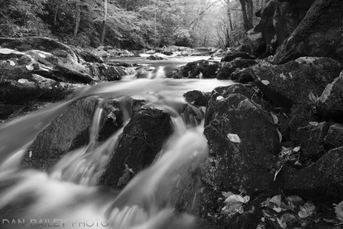
ACROS
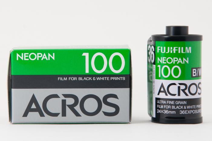
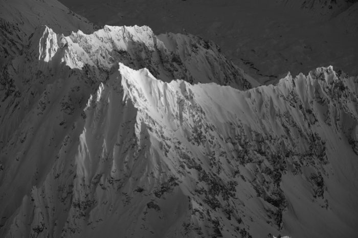
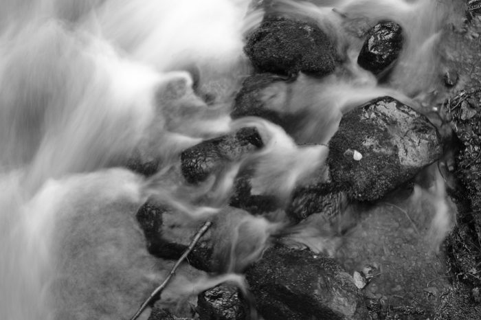
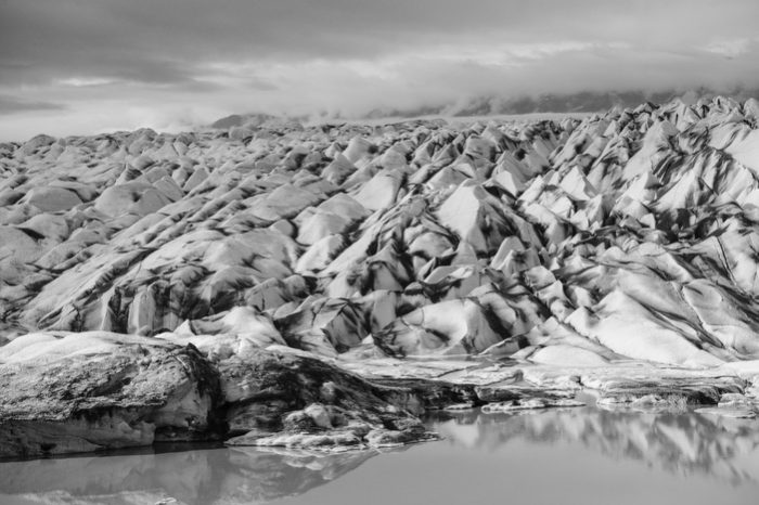
ACROS is a black and white film simulation with an exceptional level of tonality and a very complex grain structure. It requires a higher degree of processing than regular Monochrome sims, so it’s only found on the newer X Series cameras (X-Pro2, X-T2/3, X-H1, X100F and X-T20/30.)
With a tonality curve that’s capable of holding detail in both bright whites and dark shadows, ACROS produces an exceptional level of depth and tonal gradation across the entire image.
It also produces a wonderful, characteristic level of grain that very closely mimics actual film grain. Just like you would see in a black and white print, ACROS has more grain in the darker areas and almost none in the highlights, and it increases in strength as you move up the ISO dial.
At ISO 3200, ACROS looks incredible, with superb tonality and gorgeous, film like grain. At ISO 12800, images still hold up with a surprising amount of detail, and the grain looks just like what you’d see on a print made from Kodak T-MAX 3200.
I absolutely love ACROS. You will too. If you have a newer Fuji, definitely shoot in ACROS mode and don’t be afraid to shoot it any ISO setting. I’ll often shoot ISO 3200 in broad daylight, just so I can get that awesome looking grain. Remember, photography is all about representation and a little bit, or a lot of grain never hurt anyone.
You Should Try Them All
Although these are my favorites, I use all of the film simulations in my photography, and you should too. Or at least experiment with them and see which ones you like. Each of them renders the colors and tones of your scene differently, and can impart a slightly (or drastically) different feel to you photographs.
Here’s a video companion to this lesson where I explain each of these film sims in a little more depth and show you a few more images examples. I cover all of the film sims in my bestselling Fuji eBook, X SERIES UNLIMITED.
To read about how to customize the film simulations for adding an even more stylized look in your photography, check out this post.
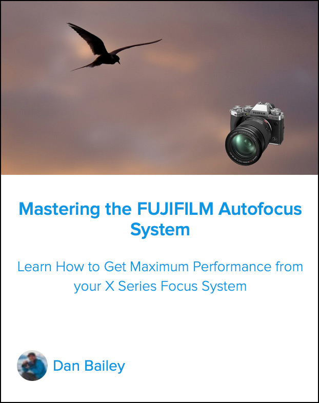
Also, be sure to check out my essential online course, MASTERING THE FUJIFILM AUTOFOCUS SYSTEM. This in-depth tutorial will teach you how to get the best performance from your X Series focus system and give you my pro tips on how to best capture fast moving subjects.
No matter what kinds of scenes you like to shoot, this course is guaranteed to help you become more proficient with the focus on your Fuji camera.