
I’ve long been fascinated with the concepts of how our evolution as human beings plays a part in our artistic tendencies and creative habits.
Throughout the span of human history, we humans have expressed ourselves with artistic representations and depictions of our lives and our world, and a significant element of our creative endeavors is geared around the use of color.
As with many of the behaviors and tendencies we exhibit our lives, our use of color is closely tied to both our biological evolution and our cultural history, which reflects thousands of years of evolution.
As early humans began migrating and exploring much more diverse and complex environments, we were suddenly faced with a vast increase in the amount of visual information we were taking in. This required a dramatic increase in visual processing power. Here’s a geeky, yet fascinating paper that talks about the correlation between our visual specialization and brain evolution.
Consequently, our brains grew much more powerful to the point where 30% of the of neurons in our cerebral cortex are devoted to visual processing, and 80% of all visual processing done in our brains is devoted to color recognition.
Color recognition played a big part in our big brain evolution, and in fact, it’s one of the most fundamental aspects that separates us from most other mammals.
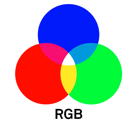
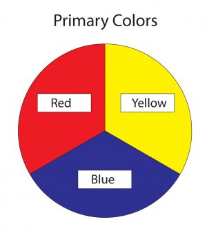
Where the majority of mammals on the planet can only recognize two of the primary colors in what we know as the visual spectrum, we humans evolved with what’s called Trichromatic Vision. Possessing three types of cone cell receptors in our eyes that are geared towards recognizing the colors red, green and blue.
RGB. Do these letters sound familiar?
The man difference is that evolved with the ability to easily recognize the color red. Given that many of the things in nature that are red are either things we can eat or dangerous things that we tend to avoid, our ability to quickly spot red played a huge role in helping us stay safe and well fed.
Combining Biology with Culture
In addition to our genetic evolution, we humans are also heavily influenced by our rich cultural history that spans thousands of years of civilization. Color has always played a large part in our cultural traditions and moods, and when you combine our biological and societal history, it’s easy to see the important role that color plays in nearly every aspect of outlives.
USING COLOR to EVOKE MOOD
There is multitude of ways we can use color in our photographs to evoke certain moods and visual response from our viewers. Here are a few essential tips to get you started.
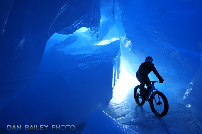
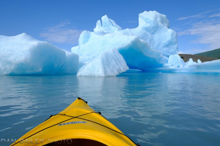
Blue
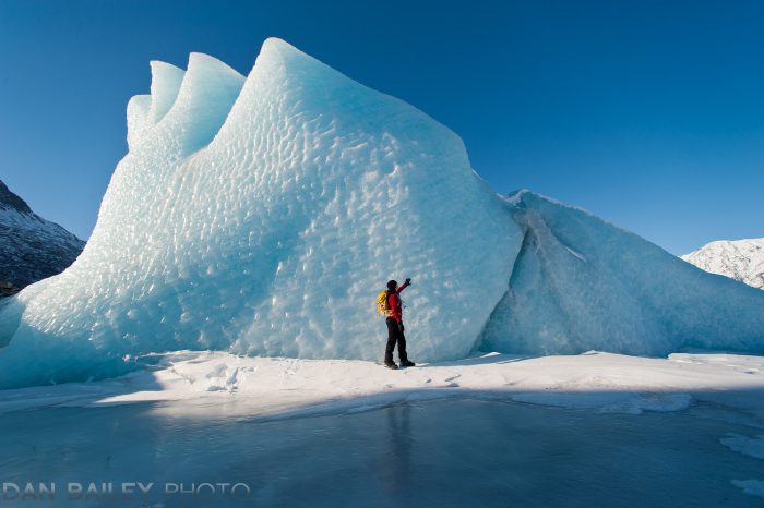
Technically, there is almost nothing in nature that is the color blue. However, due to the ways that we perceive the scattering and diffusion of short blue light wavelengths, we associate blue as being the color of the sky and the ocean. And glaciers.
For this reason, blue is perceived as being a noble, highly dignified color that projects feelings of calm and tranquility.


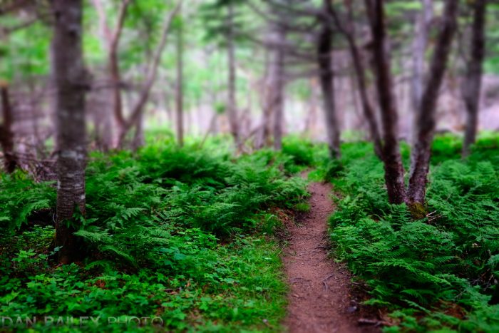
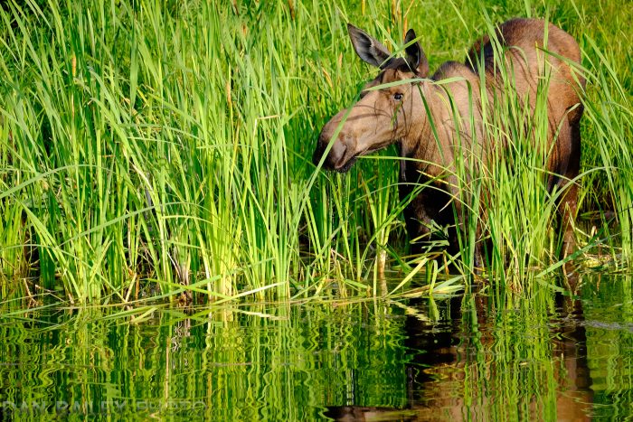
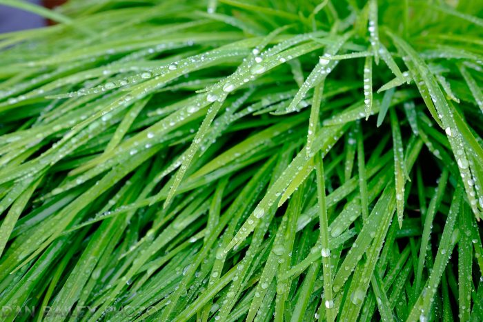
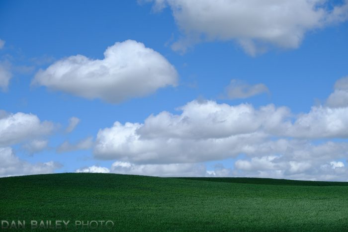
Green
The predominant color of nature, grass, and vegetation, green evokes a timeless feeling in your images.
If you combine green with blue, you’ll create a serene, subdued image that projects endless tranquility.
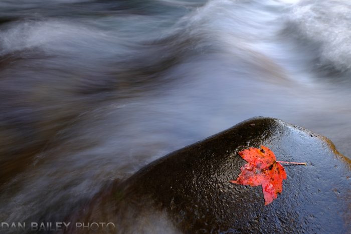
Red
Red is the color of blood, the distinctive marking on a black widow spider and things like berries, apples and ripe tomatoes. Red incites energy and an immediate sense of heightened emotion.
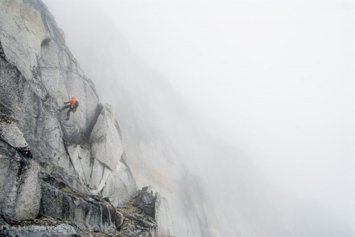
As I mentioned above, our ability to see red so clearly marks one of the fundamental characteristics of our advanced human visual systems. Using a small splash of red in your photos will catch the attention of your viewers and draw them right into the image.
For this reason, red is very eye catching in photos. You can’t avoid looking at the red thing, even it’s just a small part of the image. However, due to a specific chemical depletion in our cone cells that occurs when we view large amounts of red for a long period of time, too much red will incite eye fatigue, and create weird optical illusions.
This isn’t to say that you should never make photos with an all red color palette, you just need to do it sparingly and use an effective composition. If it’s done right, it can generate a powerful viewer response.
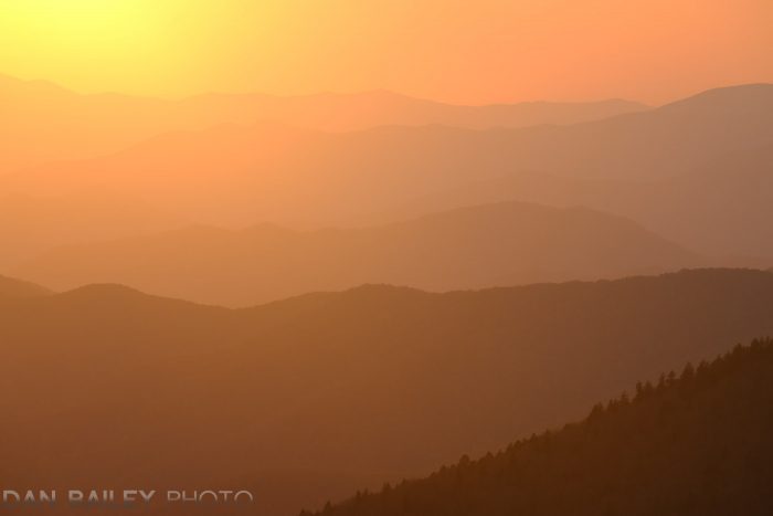
Note, like red, orange can also be used as an effective spot color.


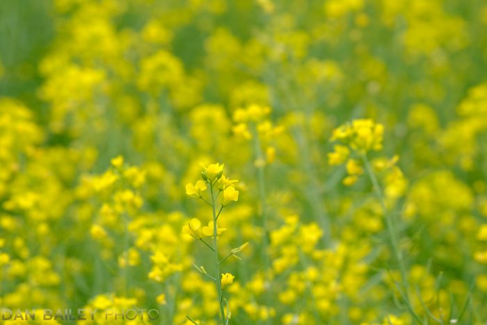
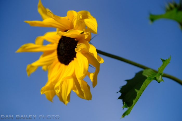
Yellow
Yellow is the brightest color in the spectrum, and it’s the most stimulating and fatiguing color to look at. Even more so than red.
Things in our world that are yellow are meant to be looked at, like school busses and warning signs. For this reason, you can use yellow as a spot color and visual target to draw your viewer’s eye right into image.

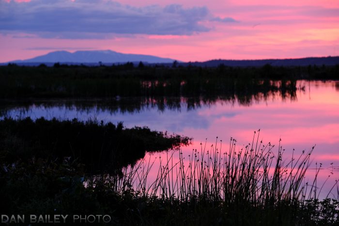
Pink
Lying between hot red and cool violet on the color wheel, pink is perceived as a warm color. You’ll find that you can be very bold with pink. It commands a lot of attention but it doesn’t incite the same level of eye fatigue as red does.
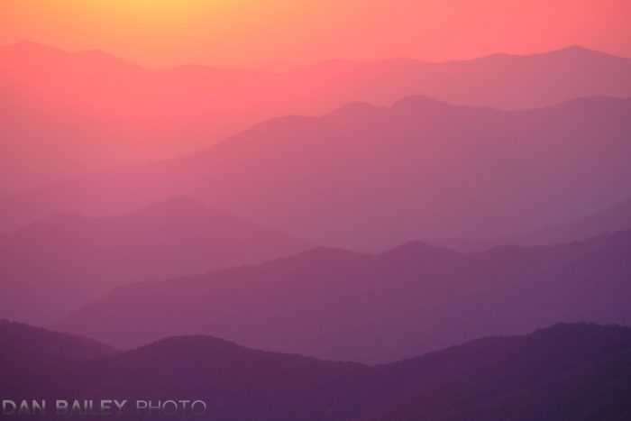
In landscapes, pink is often the color of sunset light and it can add a lot of richness to your photos, even when used in large amounts. I love using pink in my photographs, especially my mountain aerials.
You’ll find that orange behaves much like pink in the sense that you can use it in large amounts without inciting eye fatigue.

COLOR COMBINATIONS
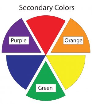
You can combine colors in your image to achieve powerful visual effects. Anytime you use primary or secondary colors together, or if you use complimentary colors together, (opposites on the color wheel), you’ll create please images that retain the viewers attention.
These kinds of colors are highly attractive to us, and so we want to see them. When used correctly, then can command an equal amount of attention, and this creates strong visual relationships that draw our eyes back and forth across the image.
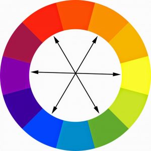


With all of the colors in our world, there is an endless variation to how you can arrange them in your photography. As with any compositional technique, it takes practice to get a feel for what colors work well together and how to position them in your frame for maximum visual impact.
Keep in mind, there are no hard and fast rules here, so feel free to experiment with your use of color and see what works for you in your quest to communicate your creative ideas.

Watch the companion video to this blog post and see more image examples of how I use color in my own photography. For more compositional ideas, be sure to check out my eBook Making The Image: A Conceptual Guide To Creating Stronger Photographs.