When I look through the camera and arrange my subject matter in the viewfinder, I usually try to keep things away from the edges. In fact, one of the most ingrained compositional guidelines I live by in my photography is to keep the edges sacred.
I just think it gives the photo a cleaner, less cluttered look. It also reflects the notion that you, as a photographer, are making deliberate decisions about the arrangement of subject matter in your frame.
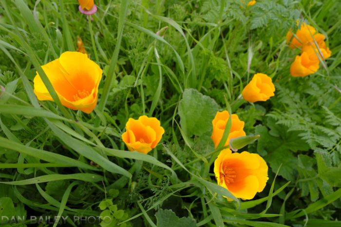
Look at the photo above. See that partial flower along the left side of the top edge? Looks a little sloppy, doesn’t it? It’s almost like I didn’t notice it was there there until later. That’s exactly what I’m talking about. I should have noticed. It’s good photography technique to notice stuff like that.
Here’s another version. See the difference?
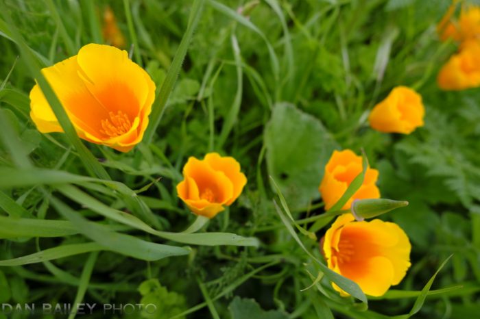
Of course, this second shot has a different issue. See those flowers near the top right corner? They’re also sitting right at the edge. Are they any less offensive than in the first example?
I think they work, and here’s the difference. We can consider them disappearing subject matter. They’re part of a repeating pattern of orange flowers that draw the eye in and out of the frame. They’re similar enough that we recognize them for what they are, instead of being a unique subject element that’s chopped off.
Also, since they’re so out of focus, they just fade nicely into the background. They add a bit of additional flavor before subtly leading our eye out of the frame.
However, I realize that to some viewers, even this example is visually bothersome. If this were your photo, you might have a strong compassion to remove them entirely from the frame. And that would be ok, because it’s your photo.
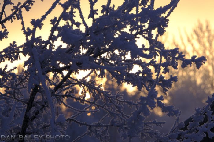
Let’s look at at another example.
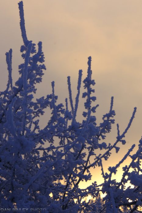
This one is a little more obvious. In the first example, that frosted twig is sitting a little too close to the top of the frame. Pretty easy to spot right? It feels a bit crowded up there, and there’s no room for the subject to breathe.
That’s a prominent description I like to use when talking about this technique. You want your subject elements to have enough breathing room so that they don’t feel cramped at the edges.
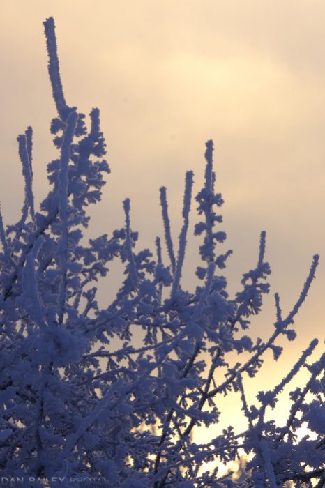
Of course, if you’re dealing with a repeating pattern or if you’re focusing on the details of a scene, you can totally get away with busy edges, as long as you’re being deliberate about your composition, and as long as you’re not cutting anything unique or important off right at the edge.
In this case, it’s all considered environment. Nothing is being cut off, it just ends, or rather it just travels out of the frame in a natural way.
When we create our compositions, we strive to include a little bit of tension and visual discomfort in our frame, but there’s a difference between offering slight discomfort and making it so your views are bothered.
In the last example, I’ll give you three versions, only this time, I want you to tell me which one works best and which one doesn’t. Take a look and let me know which of these three scenes appeals to you the most, and which one bothers you the most.
As you’re playing around with the camera, and looking at subject matter, think about this guideline and see if it helps create more effective compositions. Be deliberate with your framing and remember to pay attention to every single element in your frame. Nothing should get by you.
If it does…and it occasionally will, it just means you need more practice seeing. We all do.
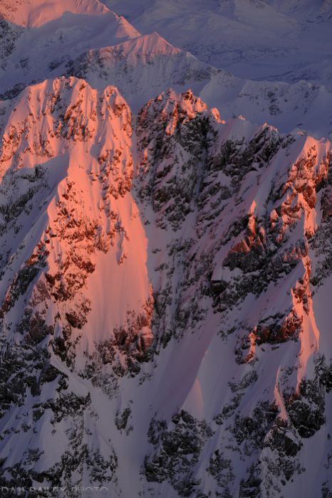
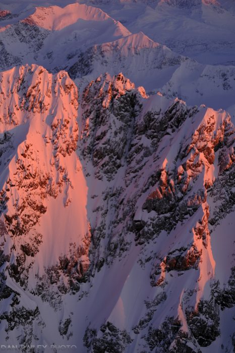
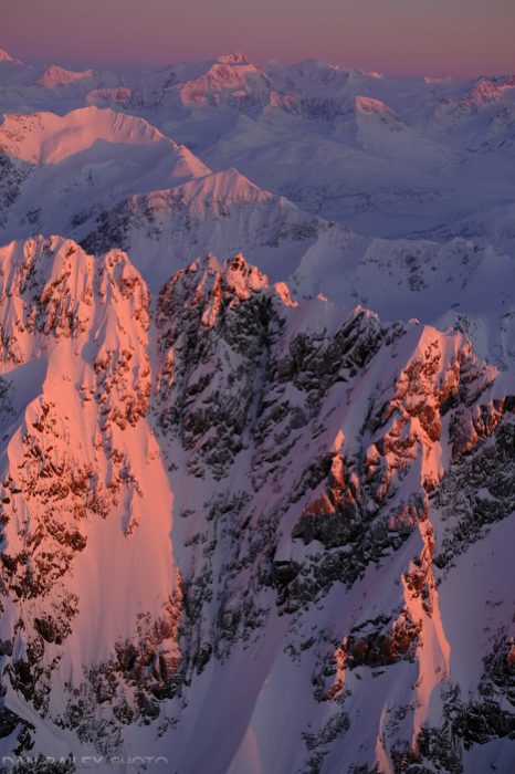

I like the third one
I agree, after reviewing the photos, #3 with the sky above the mountains.
Yes, I prefer the 3rd picture as well. With the sunset (or sunrise) it is much more complete with the nice colors starting in front and fading out at the horizon.
I like # 2
Greetings, Great topic. I enjoyed that we are not presented with situation and answer but forced to choose and employ photographic principles. This type of exercise is beneficial for me to develop a better composition. In my opinion, #1 is cutting off the top of the mountain in the upper left, providing a feeling of “looks sunny and bright but how much higher is the mountain”. # 2 shows the top of the mountain but now there are 2 leading lines. If there are 3 sets of mountains then that would create an image that is following the rule of thirds. #3 creates the triad that is pleasing to view. The addition of the sky provides and endpoint and maintains the sacred edge.
I like the third one because it feels more balanced though expansive. I generally like wide-angle shots too, so there’s some bias there. (I do feel like the horizon should be more level but that may not be “true.”) Otherwise, I’d choose the second one for something rich and powerful. Thanks for sharing. I enjoyed your post and photographs.
I like the first one. Brings the focus to the central point of the composition without drawing attention away and creating a struggle.
I can’t say which one I like the most. It is a toss up for a couple of reasons, but the top one is the one I like the least!
The second (middle) image puts my eye on the most interesting elements of the frame, but that top edge is a bit tight.
The bottom image shows more depth, but my eye is focusing more on the snow-covered mountain in back of the crags which have that great light.
Thanks for sharing your perspectives!
I like the third picture. To me it tells “the rest of the story” that the first two leave out.
I like the third one. It has the best depth of field for me, without sacrificing the main focus on the steep mountain side. The view tapers nicely off into the distance. Almost like Chinese paintaings and like flying over the scenery.
I like the third one
It is the top one I like the most.
With the sunshine on the rock as the best outcoming theme in the photo. I like it that there is less around that takes my attention away.
And it looks ‘strong’.
Well: to me it does- but who am I ?
I prefer the third as it covers a good depth of field view