I just got back from the Great Smoky Mountains, where we just finished our third Fujifilm X-Photoraphers Nature and Travel Summit.
These 4-day intensive workshops are specifically designed for Fuji shooters. We teach photographers how to get the most from their X Series gear and also give them a chance to try out different X/GFX cameras and lenses in the field.
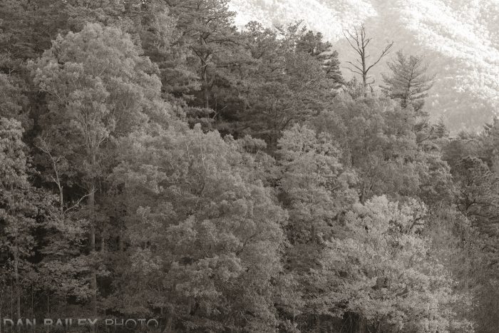
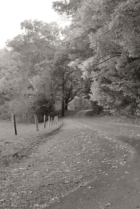
This was my third time photographing in the Great Smokies, which is by every measure, a fantastic location for landscape photography. It’s also the most popular National Park in the entire U.S., with 10 million annual visitors, most of who come to peep autumn leaves during the fall.
After all, this region is known for its amazingly beautiful fall colors, with brilliant hues of red, orange and yellow that paint all of the hillsides and thick forests.
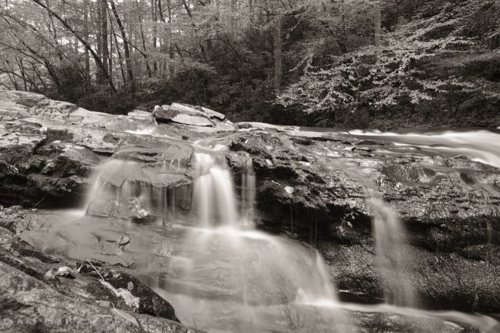
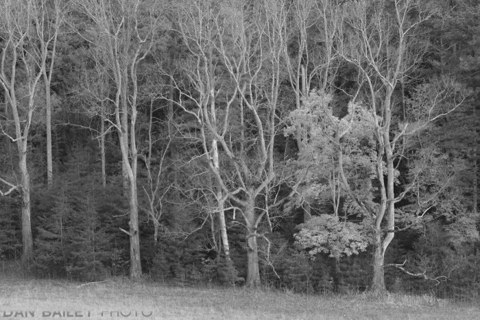
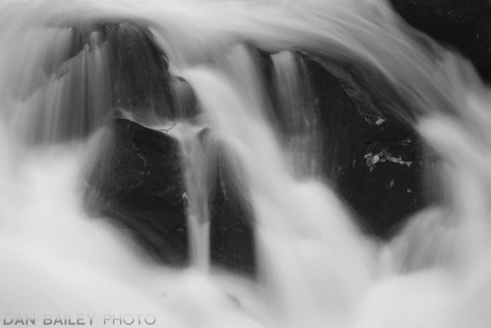
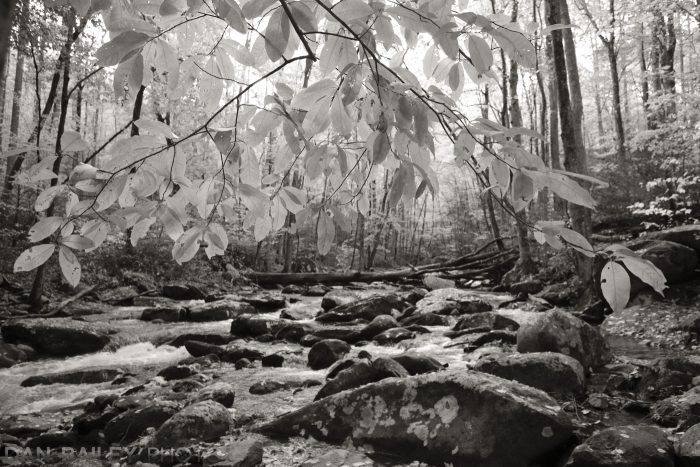
So, what did I do with all of this vibrant, saturated scenery? I ran around shooting in black and white.
Wait… huh?
That’s right, I captured about a third to a half of my scenes in monochrome.
I’m always trying to stretch my own creative boundaries, and I enjoy playing around with different techniques as I try to create unique images that excite and inspire me.
As much as I love color photography, I love shooting in black and white on my Fujifilm cameras, mostly with the ACROS film simulation. I’m also endlessly fascinated by the notion that photography is a representational medium where you’re trying to tell a story or evoke ideas and emotions with a single still image.
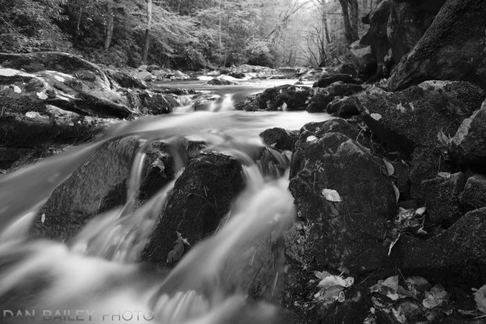
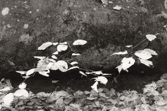
One of the most most powerful creative techniques in photography is to abbreviate your scenes. This engages your viewer’s imagination to fill in the rest of the story inside their own mind. When your narrow down to very simple compositions with just a few key elements, you incite an immediate connection between your photo and your viewer that triggers a much different emotional response.
By rendering the scene in black and white, you’re accentuating that notion of photographic abbreviation. Since most people don’t see in black and white, they can’t help but perceive the scene in a different light. Without the distraction of all that pesky color, they’re allowed to focus more on the elements of shape, shadow, tone and the placement of your subject matter, and hopefully extract the message you’re trying to present.
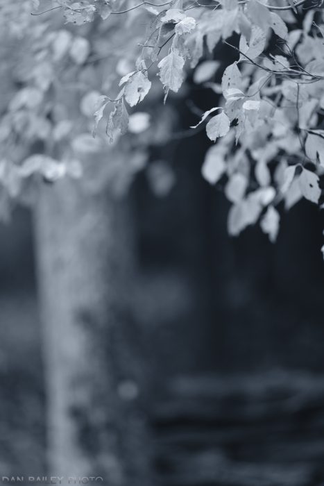
I’ve also been having fun lately with the new B/W ADJ. setting on the Fujifilm X-T3. Found inside the IMAGE QUALITY menu, this new feature lets you apply a warm or cool tone to your black and white images right inside the camera.
I love this feature, and aside from the faster autofocus, it’s pretty much my favorite thing about the X-T3. It’s like adding a whole new brush to your creative kit. The results remind me of classic warm, sepia-toned platinum prints, and gold toned prints, which impart a very slight blue cast.
When you select this setting on the X-T3, you can dial it up or down + or – 9 steps in either direction. It’s fun to experiment and see how the feel of the image changes, depending on the level of adjustment you make.
Then, after going warm and cool for a few frames, it’s always fun to go back to a straight neutral black and white tone and see what you get.
What do you think? Does the message of “fall” come across in these B/W images?
One thing to note, if you’re bracketing film simulations on the X-T3, the B/W ADJ. setting is not available to you, even if one or more of your chosen film sims are set to ACROS or Monochrome. Also, if you shoot RAW, it’s almost guaranteed that your RAW conversion software will trash the nice warm or cool color look you’ve applied as soon as you upload the image.
However, if you’re shooting RAW and doing in-camera conversions on the X-T3, you can apply the B/W ADJ. setting in the conversion menu, but only if you’re already using a black and white film sim. If your original RAW was shot with a color film sim, this option is grayed out.
As I mentioned above, I did capture a wide range of color images during the past week. When I look through my library, though, it’s the monochromes that seem to jump out at me. Those are the ones that make me go “oooh” and “ahhhh.” Probably for the exact reason I discussed in paragraph #3.
I encourage you to try shooting or processing in black and white, at least some of the time. It’s fun to see and show the world in a new way, and digital photography makes it really easy, since most modern cameras have some kind of monochrome mode tucked somewhere in the menus.
Hi Dan:
Very nice images and a different take (B&W) on fall foliage photography. My favorite image is the next to last one. I like the dynamic range and contrast in this picture. The leaves “pop” out against the background.
From a technical standpoint, what lenses did you use on the X-T3?
Thanks and have a good day!
Hank
Thanks for your comment, Hank. Here are the lenses used for each shot, in the order they appear from top to bottom on the page:
14mm f/2.8
90mm f/2
14
90
90
8-16mm f/2.8
200mm f/2
90
35mm f/2
35
Great work as usual, Dan. I hadn’t realized until just now that there were some additional toning effects in the X-T3. That blue toning would be interesting during the winter time with some snowy scenes.
Thanks, Rick. I love using the new toning effects on the X-T3. I find myself using the warmer tones more often, but with certain scenes, the cool tint looks amazing.