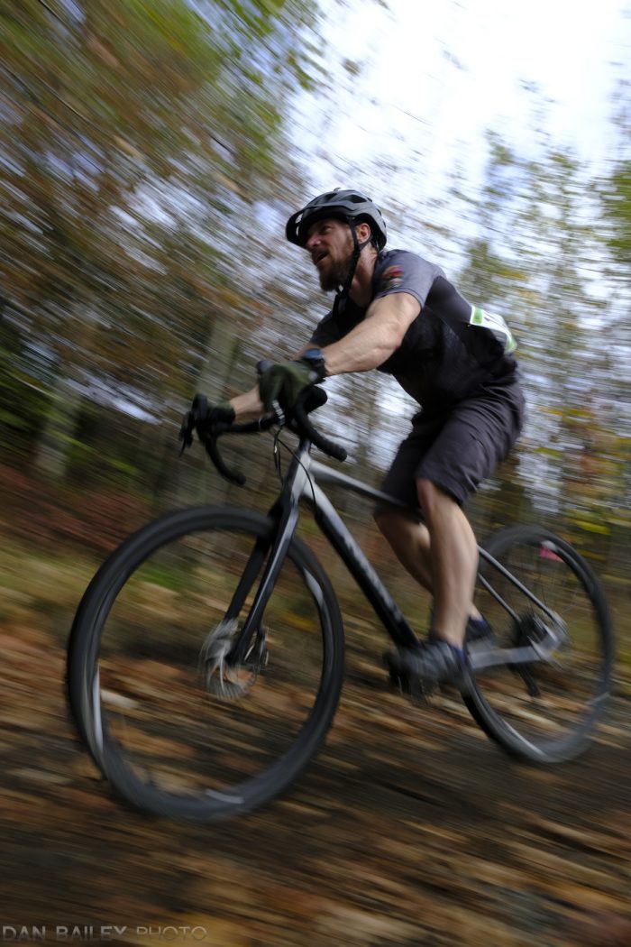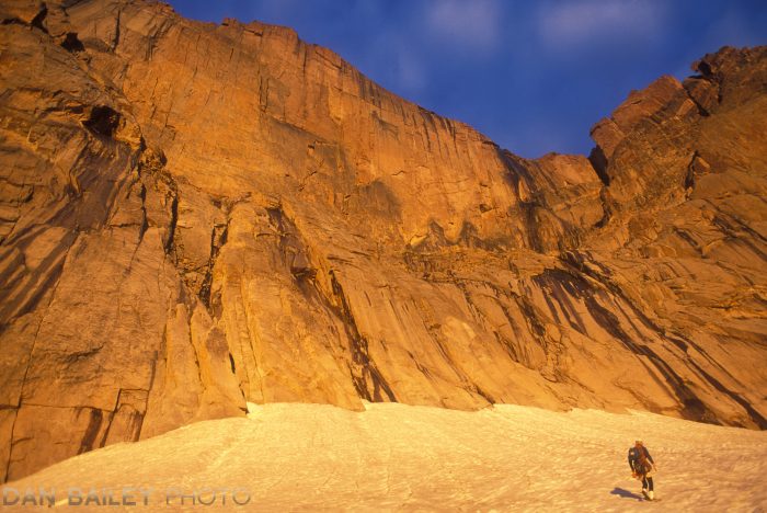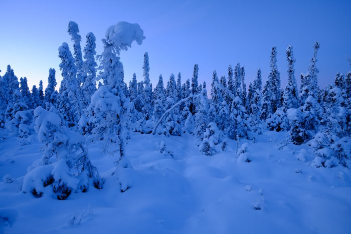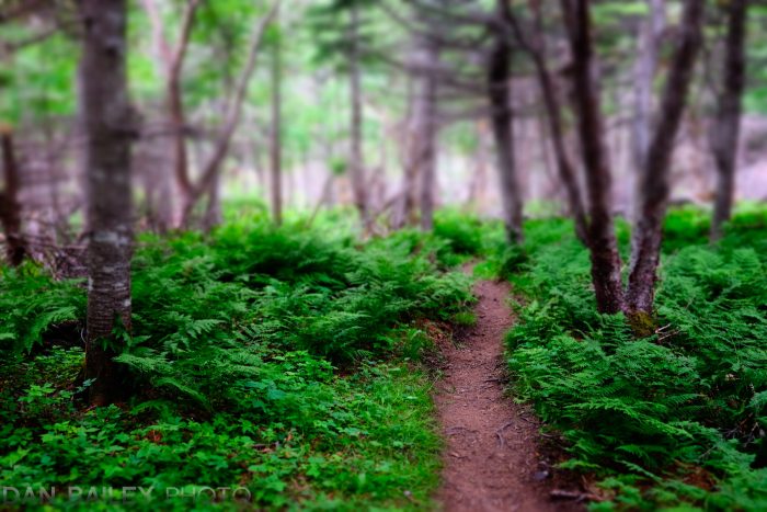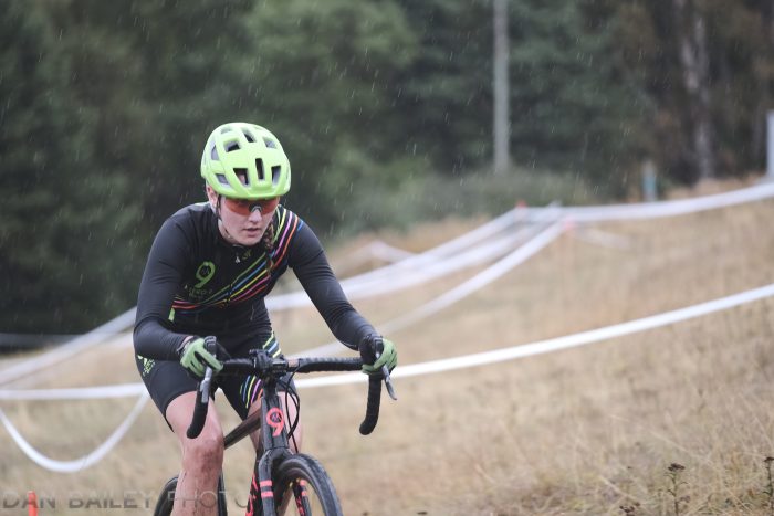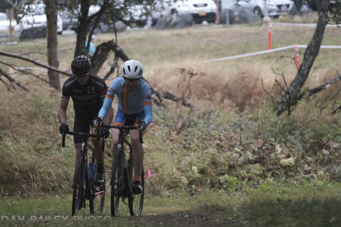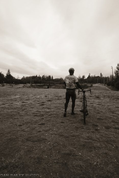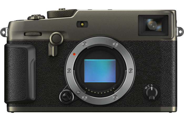
Anytime Fujifilm releases a new camera, we can look forward to many of the updated specs and features being populated into future models, and in many cases, with already current models via firmware updates.

Just as the X-Pro 2 introduced the 24MP sensor and the much faster X-Processor Pro image processing circuitry, both of which were eventually rolled into the X-T2, now we have the same thing in reverse.

Fujifilm has taken nearly all of the advancements that were introduced in the X-T3 last year and rolled them into the much anticipated X-Pro 3, which was unveiled last week at PhotoPlus Expo.
Matching the X-T3 Specs and Features

Built with the same 26.1MP Back Side Illuminated X-Trans 4 sensor and the X-Processor 4 image processing chip, the X-Pro 3 now has the same power and creative performance of its X-T brother, and it gives users a huge array of new creative options.

Essentially, the X-Pro 3 has the same low light performance, the same 2.16 million pixel autofocus system with 100% phase detect coverage, faster, more precise tracking and 2 full stops of increased sensitivity in dim conditions, and the same movie recording specs that allow for shooting up to 15 minutes of DCI/UDH 4K at up to 200Mbps.

In addition, the X-Pro 3 now has the radically updated electronic shutter, and everything that goes with that. This means the X-Pro 3 will fire at up to 11 fps with the mechanical shutter, and up to 30 fps with the electronic. It also has the immensely powerful PRE-SHOT ES feature that is so useful for shooting action and other fast breaking scenes, as well as 1.25x Sports Finder Mode, and the Electronic Front Curtain Shutter, which offers reduced camera shake at lower shutter speeds.

In other words, X-Pro shooters now have a immensely powerful machine that allows them to capture a wide range of difficult and challenging scenes and push their creativity, just like the X-T3 shooters have enjoyed for the past year. Only, it comes packaged in that traditional stylistic body design which has captured the enthusiasm of photojournalists, wedding and portrait shooters and street/travel photographers around the world.

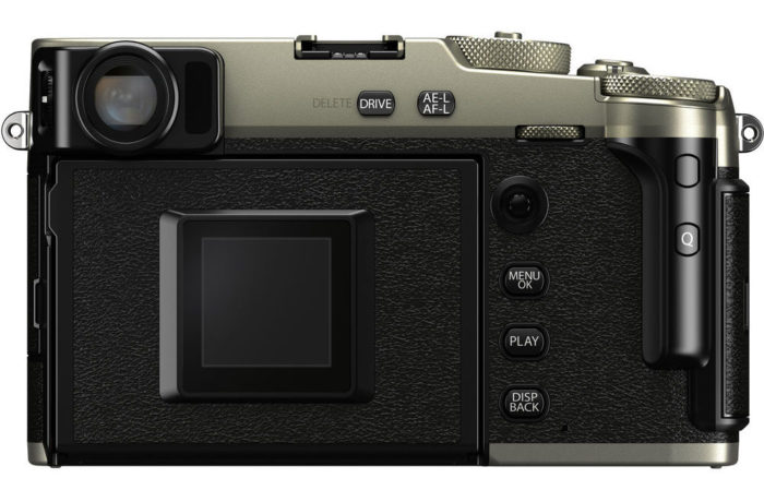
One notable change to the body, though, is that, like the X-E3, the X-Pro 3 does not have the four Thumb Pad buttons on the back of the camera. Instead, it has both touch and swipe controls on the main LCD screen, and the AF/selector joystick, just like the X-T3 has. This gives the back of the camera a much more clean design.
Hidden Screen and New Back Panel Sub Monitor

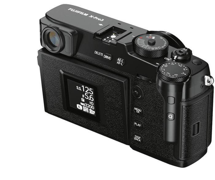
Although the X-Pro 3 retains the same familiar rangefinder design, it’s undergone a couple of significant changes. The most obvious thing is that the main LCD screen is gone. Well, not gone, just hidden.

The LCD screen is now reversed, and instead of being visible all the time, you must flip it down to see it. Fujifilm did this to foster a more traditional style of shooting, which encourages you to shoot using the Optical/Electronic viewfinder and trust your creative instincts in the moment, instead of shooting with the screen and/or checking your images after every shot.

(Note: There is some misconception online that the LCD only flips halfway down. It actually flips 180 degrees, all the way down. It does not stop at 90 degrees.)

To help in this process, the X-Pro 3 feature the Hybrid Multi Viewfinder that’s graced all of the X-Pro models. It allows you to choose between using a bright, clear optical viewfinder, or an improved 3.69 million pixel OLED Electronic Viewfinder. Or, you can combine both and display a small EVF screen in the bottom corner of your optical viewfinder so you can get a Live View of your scene and check for precise focus or see the effects of your chosen film sim.
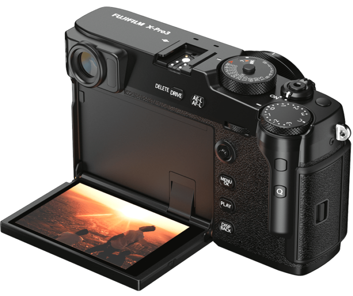
In place of the back panel LCD screen, Fuji included a second Sub Monitor screen, which give you two different functions. The default mode is to show a digital “Label” of your current film simulation.

This harkens back to the film days when you tore off the label on the box of film you were using and slipped it into the dedicated slot on the back of the camera. This allowed you to quickly and easily see what film was currently loaded inside the body.

This is such a cool design touch. I absolutely love this feature, mostly because it brings me back to those days when I shot film myself. Seeing the actual film box logo for Velvia, or whatever sim I’m using, puts a huge smile on my face and makes me feel all warm inside.

However, not everyone seems as impressed as I am about this feature. When posted about it on Twitter, I had a few people remarks in not-so-gentle terms that little film sim display was a “stupid, completely unusable gimmick.”

I can understand that people who never shot film might not quite understand the visual significance of this feature, but I would argue that it’s not completely unusable. In fact, it’s quite usable.
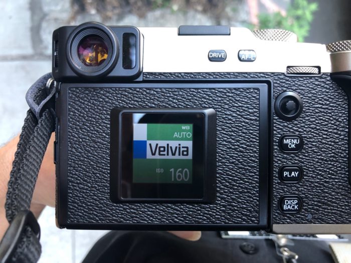
Let’s say you’re drawn to shooting with the optical viewfinder, but you still like to use some of the film simulations. Even if you shoot RAW, maybe you occasional shoot with a favorite sim, like ACROS or CLASSIC CRROME, because they impart such cool looks on your scene.

If you’re shooting optically, you’re not seeing the film sim effects on your scene, which is just like the traditional way that we all used to shoot. We never knew what the picture was actually going to look like until we got our film developed, and this was a large part of the magic of film photography.

Shooting with the X-Pro 3, you could adopt a similar shooting style, but you still want to know what look you’re going for with your images, right?

The film label shows you that, and if you like to use multiple sims and change them on the fly, all you have to do is press the dedicated Fn button that’s set to Film Simulations and turn the thumb dial. You’ll see the label change as you scroll through the options. This is much easier than flipping down the screen to do bring up this menu item, or trying to do it inside the EVF.

However, if you still think this isn’t a feature you’d use, then you can go into the SCREEN SETTINGS Menu and switch the Sub Monitor so that it displays your basic shooting info instead, as you can see above.

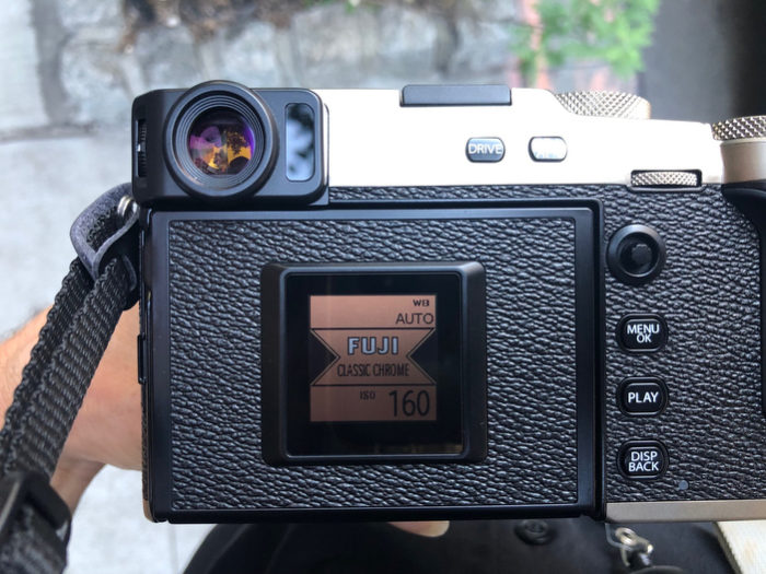
On a side note, This meant that Fujifilm had to come up with an official logo label for the CLASSIC CHROME sim, which wasn’t actually a real film. Legend says that it was loosely based on Kodachrome, but either way, here’s what they came up with:
New Film Simulation: CLASSIC NEG

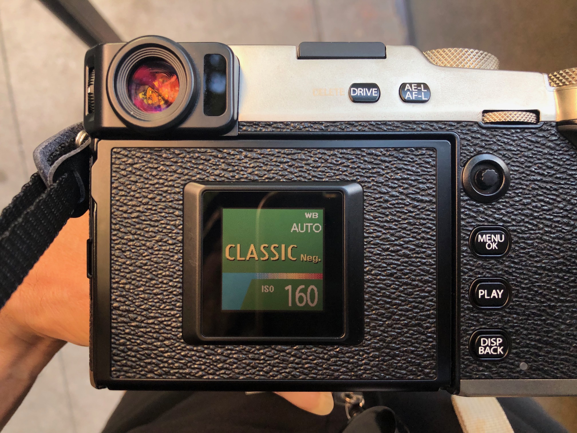
With the X-Pro 3, Fujifilm has included ETERNA, and they’ve also introduced a brand new film sim called CLASSIC Neg. Based on the old FUJICOLOR SUPERIA print film, this is designed to simulate the look of negative film, which produced the snapshots of our lives that so many of us lived back in the days before digital.

CLASSIC Neg. has a pretty interesting color palette. The way I like to describe it, is that it has the harder tonality of CLASSIC CHROME, but with the richer, Fuji-style colors of the PRO Neg sims. It has relatively strong contrast and rich colors, but with more muted tones.

I love the new sim, it has a wonderfully rich and characteristic look, and it’s yet one more tool that we have to evoke and inspire different moods with our imagery.

So much of Fujifilm’s legacy is wrapped around film and color, and the film simulations are the extension of that rich heritage in the digital world. In fact, I think that the film simulations are the lifeblood of the X Series cameras, and they foster such a unique style of creativity. If you haven’t seen my video tutorial on the film simulations, you can watch it here.
Other New Features

In addition to all the cool stuff that’s been ported over from the X-T3, the X-Pro 3 sports a number of brand new features that are not found on any of the X Series cameras yet.

One of these is the Monochromatic Color setting, which allows you to shift the overall hue of your black and white scenes. Unlike the WARM/COOL BW ADJ. setting, which only shifts up or down in two spectrums, this new setting lets you use a White Balance style graph to choose any color you like, in whatever amount suits you.

Just like the WARM/COOL setting, this adds a huge tool for experimenting with a variety of individual looks. Here are some examples below. Pretty fun, eh?
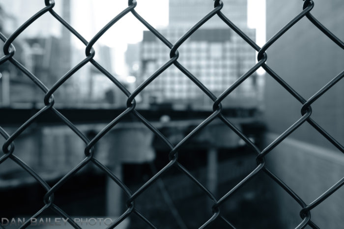

Other features include COLOR CHROME EFFECT BLUE FX, which adds more saturation and depth to only the blue channel of your images. Also, with the X-T3, Fujifilm has updated the FOCUS BRACKETING setting, and it now allows you to set a front and back focus point for your image.

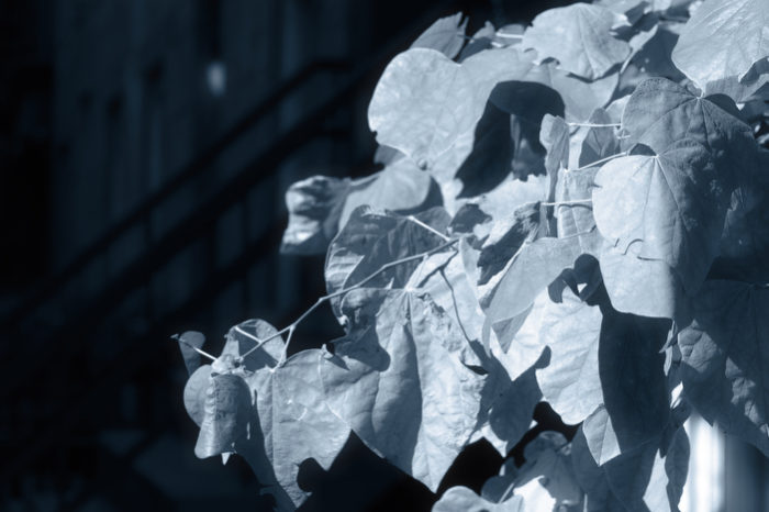
A new CLARITY adjustment setting, which accompanies your Highlight and Shadow Tone and Color controls, works much like the CLARITY slider in Lightroom. It lets you render your subject with added contrast and definition at the edges, or reduce and create softer looking scenes. Portrait shooters will love having the option to make “minus” clarity adjustments, while street and action shooters might like to add clarity to their scenes.

Here’s what the new CLARITY effect looks like in action.
Overall Thoughts and Impressions

I’ll be honest, I’m an X-T guy through and through. The X-T3 is my main camera these days, and to me, the earlier X-Pro series cameras just don’t fit as well with my style.

However, since I had an opportunity to test out the 3, I wanted to give it a fair shake. I was fortunate to be able to use the camera for a few hours during one of the days I was at PhotoPlus, and so I took it out on one of the Photo Walks that Fuji led at the expo.

I did my best to adopt a more “X-Pro shooting style,” whatever that is, and I forced myself to embrace the traditional, simplistic creative style that this camera offers. I adopted a shooting workflow that was inspired by the mojo of the X-Pro 3, often using the optical viewfinder, and not relying on the LCD screen to review every image, at least not right after I shot it.

Walking around our few-block route near the Javits Center near the rapidly growing area known as Hudson Yards, I experimented with some of the new settings and immersed myself in the process of letting my creativity run free as I got used to the camera.

Despite the notable ergonomic difference between the X-T and X-Pro series, I quickly got used to the camera and became pretty proficient with changing settings and even flipping the screen down when needed. I found the X-Pro 3 to be an incredible fun and highly capable camera to use, and even though it’s different than the X-T3, I easily recognized why this model appeals to so many people.

Overall, I think that Fujifilm did an amazing job with the X-Pro 3. It’s a pretty special camera that indeed fits with their rich heratige of traditional photography. Their goal with the X Series cameras is to encourage creativity with tools that clearly reflect their legacy, but that also offer incredible image quality and the highest level of performance, and in my mind, the X-Pro 3 fits that bill perfectly.

Aside from the few people who think the film sim label display is a stupid gimmick, I’m positive that the rest of you veteran X-Pro shooters and new Fuji users who are interested in this camera will love the X-Pro 3.

It comes in three colors: Black, Dura Black, and Dura Silver and it starts shipping on November 28. You can pre-order the X-Pro 3 here. 

See Fujifilm’s special X-Pro 3 site here.

[iframe]<iframe width=”120″ scrolling=”no” height=”240″ frameborder=”0″ style=”border:none;” border=”0″ src=”https://mer54715.datafeedfile.com/widget/aff_widget_prdt_generate-2.0.php?aff_num=6746&aff_net=1&widget_num=8425&sid=” marginheight=”0″ marginwidth=”0″></iframe>[/iframe]

October 28, 2019
See this post
My First Look Review of the New Fujifilm X-Pro 3

Wednesday, October 23, 2019 – B&H Photo Event Space

12:00PM – 2:00PM

The Adventure of Photography – Shooting Outdoor, Action and Travel with the Fujifilm X Series

Next week is the annual PDN PhotoPlus Expo in New York City, and I’ll be heading out once again for a few days of photography geekery, networking and visiting friends, followers and colleagues that I only get to see once a year.

In addition, I’m excited to announce that I’ll be giving a presentation at the B&H Event Space on Wednesday afternoon, from Noon-2PM. The Event Space is located right on the second floor of the B&H superstore at 420 9th Ave, and it’s just a short walk from both the Javits Center and Penn Station.

If you can make it in person, then I look forward to seeing you there!

If you cannot attend in person, you can watch my presentation online. Click here for info.

After shooting with DLSR gear for over 20 years, Dan Bailey made the move to mirrorless and has transitioned to using Fujifilm X Series cameras exclusively in his work. Not only does mirrorless gear lighten your load in the outdoors, mirrorless cameras offer some distinct advantages over traditional DSLRs.

In this presentation, Dan will show how you can use these advantages to expand your creative boundaries with photography and he’ll shed light on the specific gear and methods he uses in his own fast moving style of outdoor, adventure, and travel photography. He’ll also present tips on light, lenses, and composition so you can get the most from your camera, no matter what kind of gear you use.

Register here to attend in person, or watch online.

October 17, 2019
See this post
I’m Presenting at the B&H Event Space in NYC Next Week


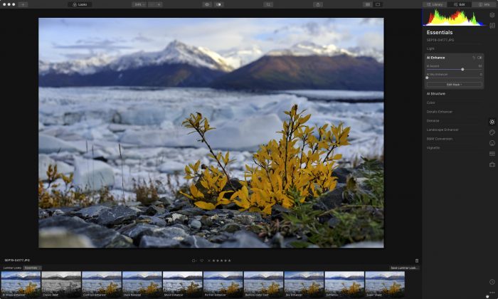
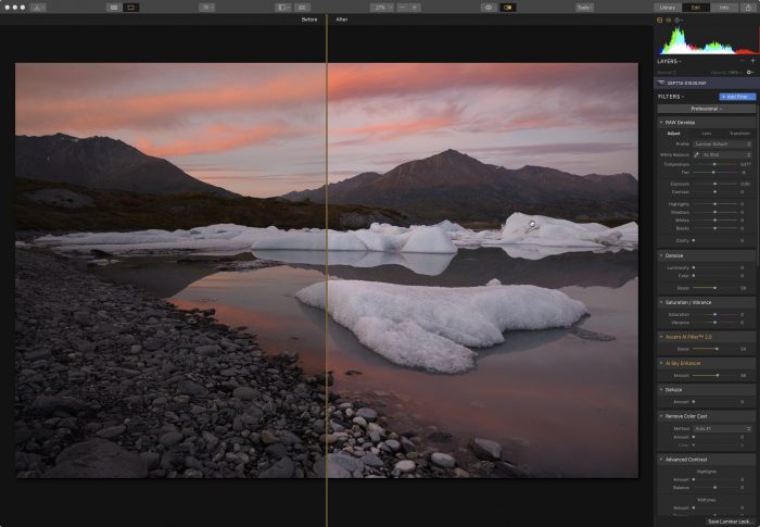
Luminar 4 is right around the corner, and as I mentioned in my recent post, it’s coming with some brand new tools, including the much talked about AI Structure tool.

In addition, Luminar 4 has reworked the user interface on the main editing screen, and they’ve made it even easier to grab the tools you need and make the necessary adjustment to make your photos stand out even more.

In this post, I’ll show you a few image examples that show off the new AI Structure tool and highlight the easy-to-use technology that’s become a signature aspect of the program.

1. Cyclocross Racing

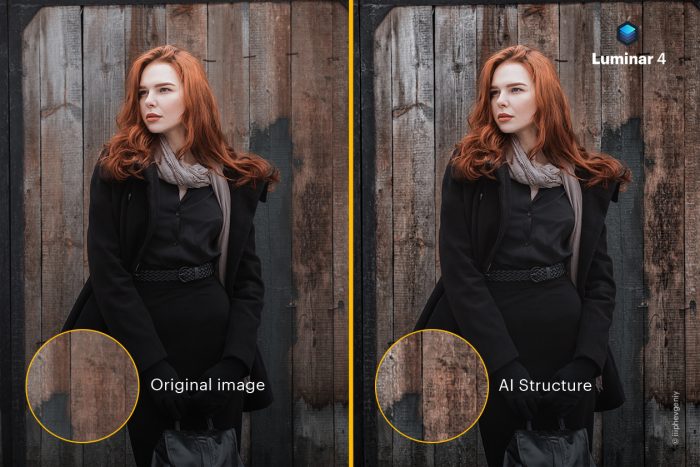
In this first image below, I made use of the AI Enhance tool, which offers two sliders, AI Accent and AI Sky Enhancer, to lighting the overall photo and bring up the shadows. Then I used the new AI Structure Tool to bring out the details in the background, without over sharpening the main subject.

I see AI Structure as being an incredibly useful tool for a wide array of subject matter. It solves the problem that you often have when making global sharpening and clarity adjustments.

In most cases, your global adjustments will apply an equal amount of sharpening and edge contrast to your foreground subject, and this doesn’t always look very good, especially if your main subjects are people.

AI Structure analyzes the entire frame and applies sharpening and clarity to your background, while mostly leaving your foreground subject alone. This prevents artifacts and other weird looks, and it helps keep you subject isolated nicely against the background.

After that, I boosted some of the blues with the Vibrance tool. Overall, it’s just three simple slider adjustments in order to add a slight, but noticeable bump to the visual effect of the image.

2. Mountain Bike Racing

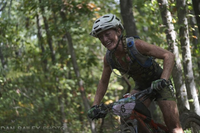
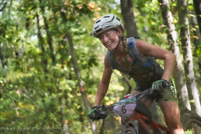
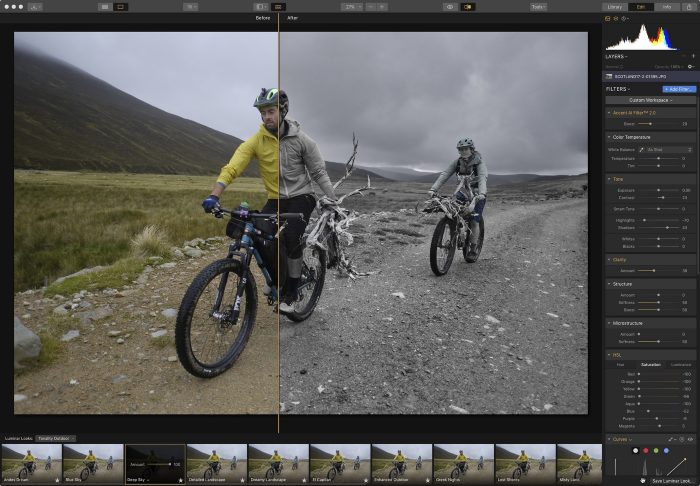
For this shot, I took the opposite approach. Instead of sharpening the background, I went the other way with the AI Structure slider. My main subject was already razor sharp, with lots of muddy detail, so I want the background to compete with that.

By applying a negative amount of AI Structure, I softened the background textures, so that the trees and foliage become more of a wash of color and less of a distracting puzzle. This helps the rider stand out much more clearly in the frame.

Since the overall image is pretty dark, I also made an AI Accent adjustment and used the Dodge and Burn tool to lighten up her face. The result is a much more dramatic and clear photo that took just a few minutes to tweak.

3. Landscape

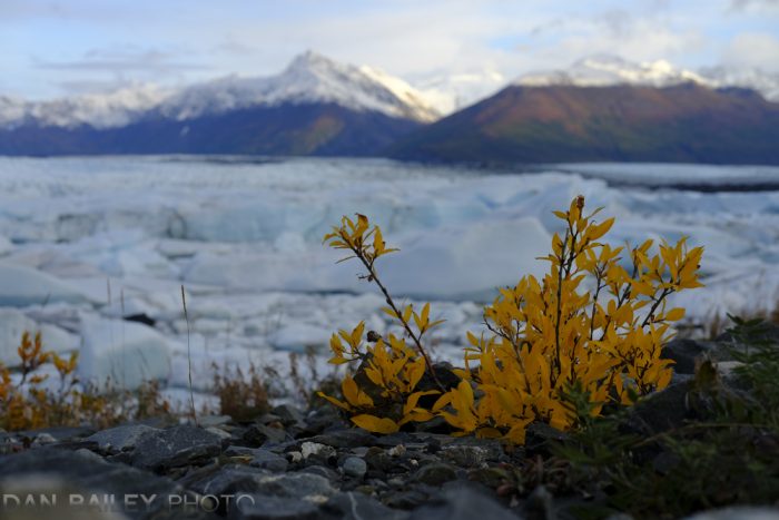
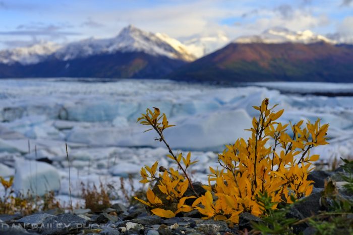
In this third example, I used AI Accent again, and Luminar’s Landscape Enhancer tool, which include the Dehaze slider, as well as Golden Hour and Foliage Enhancer. That’s one nice thing about the Luminar 4 interface, they’ve grouped tools together in a logical way instead of having every tool be separate. This reduces the amount of time you’ll spend looking for adding tools to your workspace.

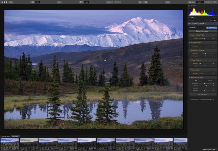
Using the AI Structure again allowed me to bring out the glacier details without over sharpening the small bush in the foreground. Even with a landscape subject, the algorithms that this smart tool uses does an effective job of isolating the foreground and applying just the right amount of definition. 

Conclusion

There’s no question, Luminar’s new AI Structure tool is a powerful new brush in an already capable box. It allows you to achieve a very pleasing amount of separation between foreground and background, and it with most instances, there’s a miniature amount of halo-ing and other artifacts that often show up when you make large moves with the clarity and sharpening tools.

In addition, the new interface in Luminar 4 is very easy to navigate, and as I mentioned, it smartly groups commonly used tools together. In Skylum’s continuing mission to make Luminar a very easy-to-use program, I think this new interface makes some pretty good compromises and it looks very clean.

And, with the power of Luminar’s smart AI tools, which I find myself using quite often, Skylum has further expanded on their mission of giving people a way to make their photos look great in a minimal amount of time.

If you want to see examples of the other new tools that are coming, including AI Skin Enhancer, AI Portrait Enhancer and the radical new AI Sky Replacement tool, read this recent post. 

Luminar 4 is due to be released this fall. It works as both a standalone program or as a plug-in for both Mac and PC: You can either use it with the Library module to organize your entire photo library, or use it inside Adobe Lightroom, Photoshop and Apple Photos. It works great either way.

If you order through this link, you’ll get a special discounted price on either the new version, or the upgrade. 

October 1, 2019
See this post
A Look at the New AI Structure Tool Inside Luminar 4

I just posted a brand new video tutorial on my YouTube Channel. It’s called The Power of Abbreviation in Photography. 

As photographers, we’re not bound to the same creative limitations that most other visual artists face. Where most artists are forced to work within the restraints of their medium, our modern cameras can show everything in perfect detail, and this is not always a good thing.

Simply reproducing the world that exists in front of our lenses rarely results in compelling imagery. Showing every single element of real life, exactly as it happened doesn’t necessarily make for good art.

What makes for engaging imagery is showing only part of your scene and inviting the viewer to dive in and imagine the rest of the scene. This allow them to engage their brains and piece together the overall message of your story by filling in the blanks of what’s NOT there.

In addition, by abbreviating your subjects, your communicate a more concise message that emphasizes the very ideas and emotions that drew you to the scene in the first place. The goal with good photography is not merely to show the subject, it’s to translate your own feelings about the scene to your viewer and evoke similar feelings in them when they look at your photo.

You can do this much more easily with a simple composition that shows very little, more so than if you show too much. Remember the term “Less is More?” That’s why.

Watch The Power of Abbreviation in Photography, and also, check out the other videos on my YouTube Channel. I’m excited to be expanding on that aspect of my teaching and share my insight with you in this new way.

If you’re interested in more in-depth video lessons that go beyond simple tips, check out my Photography On The Brain course. In that exclusive series, I discuss aspects about creativity and photography in a deeper level and give you monthly assignments that challenge you to think about your photography in new ways.

Check out what that’s all about below, or click here for more info.

September 26, 2019
See this post
New Video Tutorial: The Power of Abbreviation in Photography

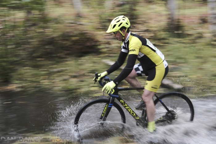
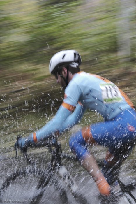
As a spastic, high energy cyclist and action photographer, I practically live for cyclocross season. I find it to be an incredibly fun way to spend a few hours on a Saturday morning in the fall, as I cheer on friends and race my own bike through the mud and whatever other obstacles and challenging terrain get thrown into the course.

I also find it to be one of the best ways to practice my photography chops and test out the fast action and autofocus capabilities of my camera gear. In fact, during the past few years, I’ve pretty much used cyclocross as my benchmark to test out just how well the Fuji cameras and lenses perform when shooting very fast subject matter. 

And as with any subject that I’m passionate about, I’m always trying to better my skills and vary my approach, in the hopes that I can come up with something really incredible. Sometimes I get really good images, and sometimes… occasionally, on rare occasion, I get a truly great image.

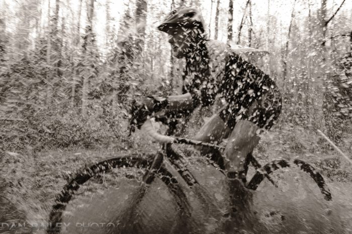
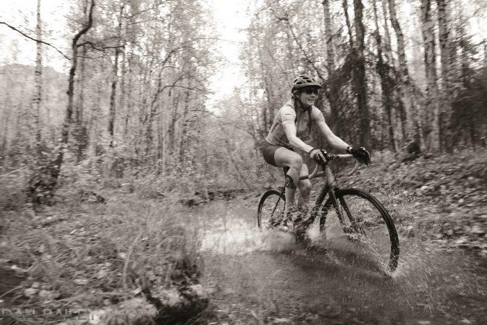
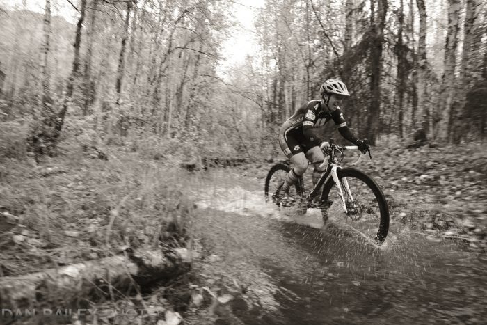
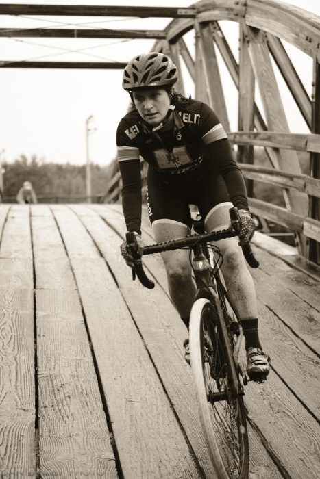
This photo above is from last year’s race at Mirror Lake near Anchorage, which featured a 30-foot long creek crossing. Just one of the 698 frames that I shot while standing by the creek during last year’s race, it’s a photo of my good friend Amber, who always seems to look great in action photos.

It was captured with my Fujifilm X-T3 and the XF14mm f/2.8 wide angle lens, at ISO 1600 with an exposure setting of 1/210 sec and f/5.6, using the Mechanical Shutter at 11fps in Aperture Priority Mode, using the super cool PRE-SHOT ES setting.

With the X-T3 set to ACROS Film Simulation, I also added a warm tint in the WARM/COOL BW ADJ settings menu.

I was blown away when I saw it, and in fact, I deemed it to be the coolest action photo that I’d ever shot in my 22 years was a pro action photographer. Here it is again.

Fast Forward to This Year’s Race

The minute I saw that the Mirror Lake course would be included in this season’s cyclocross race schedule, I got all giddy inside, because I knew I’d get to relive the magic from last year. The cheering… the splashing… the chance for another killer action photo.

Of course, I had set a pretty high bar for myself. Having made my coolest action photo ever, at least up to that point, I knew that the pressure would be on for me to come up with another awesome image.

That’s the great thing about photography, you always have room to improve. Even if you were to shoot the best, most amazing image of your entire life today, you can potentially shoot an even better one tomorrow. That’s a really cool thing to think about, and it’s what drives us, right?

All week, leading up to the race, I’d been playing it over in my mind. I’d been thinking about how I might approach the race this time, and wondering if I could indeed come up with something at least as cool as last year’s image, if not better. That said, when we’re talking photography, maybe “better” is not necessarily the right term. Let’s go with “equally cool, but different.”

Come race day, I drove out to Mirror Lake, scurried down to the creek, warmed up by shooting the intermediate men’s race, and waited for the pro women to start. Call it nostalgia, call it favoritism, I was really waiting for Amber. As I said, she always looks awesome in photos and I love capturing hero shots of my friends.

In my quest to come up with a different approach, I shifted my vantage point and moved to the other side of the creek. Shooting again with the XF14mm f/2.8 lens, I set the X-T3 to PRE-SHOT ES with 11fps bursts, this time using the Electronic Shutter.

I also set the camera to the ACROS film sim, since I love shooting cyclocross in black and white, and once again, I used the WARM/COOL BW ADJ setting, but with a slightly cooler tint than what I’d used for last year’s image.

Standing on the on the edge of the creek, and reached out as far as I could, holding the X-T3 horizontally out over the water, using the Vertical Battery Grip for a more ergonomic purchase. I set the focus to ZONE AF, adjusted the location of the zone to a medium sized box at the right side of the frame and kept my finger on the Grip’s shutter button as I waited…

During the first lap, I grabbed some shots of Laura, Jessie, Andrea and Kate.

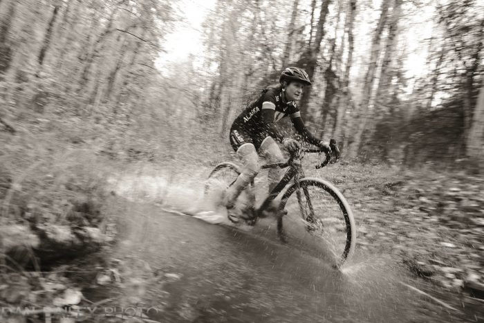
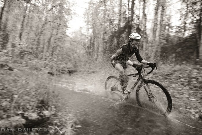
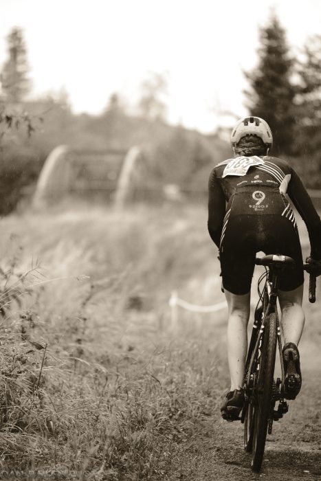
During the second lap, I could see Amber through the trees as she came flying down the tail opposite the creek and made the turn. When she hit the water, I did a front-to-back horizontal pan and shot an 11fps burst at ISO 800, 1/140 sec at f/4, with a +.7 adjustment on my EV+/- dial.

She was true to form, looking awesome with her determined expression as she splashed through the creek. This shot was the fourth in a seven-frame burst and I’m blown away by just how sharp she is, despite the amount of camera movement there was in the shot. Let’s just say that I’ve had a lot of practice with this panning thing. Still it doesn’t always come out that sharp.

After she came though, I checked the frame on my camera and was quite exited. It was good. Very good, and certainly different than last year.

My Favorite Shot from This Year’s Race

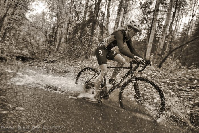
Then it happened. Amber’s daughter Cadence hit the creek forty nine seconds after I grabbed the shot above. She’s racing really strong this year, finishing 3rd place in the last two races, and she’s every bit as photogenic. I’d shot a few photos of her during the first race two weeks ago, and I was really psyched by the results.

I was ready, having shot the two other women who were spaced in between. Using the same panning technique, I angled the camera down just a tiny bit to give the shot a slight more dynamic feel. Honestly, I don’t remember if I did that on purpose, or if it just happened in with all the excitement.

This was the seventh frame out of the eight I grabbed as she flew by and raced her way to another 3rd place finish. For some reason, the shutter speed had switched to 1/300 sec, so this frame is definitely darker than the other photo, but I think it looks pretty cool. It has a lot of definition and a nice contrast between sharp and blur.

There’s something a little bit different about this photo than the other frames I shot at the creek this year, it just has a little bit more energy, more water and a more exciting feel.

Comparing it to my favorite shot from last year, I think it holds up well. It definitely shows off the action capabilities of the X-T3, and from a creative standpoint, it satisfies my itch to continually push my own boundaries as a photographer and walk away from every scene with an original image that truly excites me.

With that in mind, I wonder how things will play out next season…

Anyway, thanks for reading and I hope you’re having fun pushing your own creative boundaries as well this fall.

September 25, 2019
See this post
Comparing Last Year’s Favorite Photo With This Year’s Version

Skylum software has announced the next generation of Luminar and they’ve given us a sneak peek at some of the amazing new tools that will be included in the program. (You can preorder the software for a special discounted price here)

I’ve loved using Luminar since the first day it launched, and it’s been a real joy to watch the software progress over the past three years. I’m amazed at where they’ve taking things, but I guess I shouldn’t be surprised. I’ve met three of the lead developers, and there all brilliant engineers with backgrounds in science and technology. Really smart guys.

They’re also dedicated to making sure that Fuji users are well supported. All the Fuji models work with Luminar and the program does a great job with the X-Trans RAW files, which, as we know, is something that not every software can boast. Images retain a high level of detail and don’t produce the kinds of false colors and “snuggles” that are often seen in Adobe programs.

What I like most about the programs that it allows me to work the way I want to, which usually translates to: “I don’t want to spend a lot of time on this editing stuff…” In other words, I want great results and wide creative flexibility with a minimal amount of time, and with Luminar I get both of those.

I’m kind of a quick thinker and I tend to go with my gut much of the time. I typically don’t like to dwell on decisions; when I get an idea, I’ll usually run with it and not overthink the process. With photography, I like to run with the creative ideas and excitement that come to me right when I’m right there experiencing the scene.

While some people very much enjoy the editing process, I just don’t like to spend a lot of time sliding sliders and doing computer processing work. If I do want to tweak my photos and give them a bit more life, I prefer to do it quickly rather than get lost in the rabbit hole of a nearly infinite combination of possible adjustments.

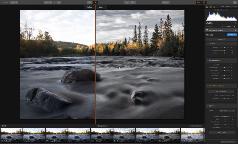
With Luminar, I can eyeball the palette of possible looks at the bottom of the screen, and if one strikes my fancy, I’ll select and dial it in until I get the results I want. If I need to adjust even more, or if there’s a specific look I’m going for, I can use up one of the many creative filters/tools, many of which are made up of just one or two simple adjustments. 

In addition, each tool also has a little thumbnail image example and description that shows you exactly what it does. This makes it even easier to find, select and apply the right tool to match the problem you’re trying to solve, or achieve the creative look you’re going for.

Advanced AI Tools and Custom Workspaces

One of Luminar’s signature feature are their AI (artificial intelligence) tools. These tools use complicated algorithms to analyze your image so that you can use a single slider to adjust the entire photo.

It’s amazing how well these tools actually work. Often times, a simple AI adjustment is all that’s needed in order to give your photos the boost they need to make them look awesome. Imagine how much time this can save in your workflow.

Of course, if you want to dig in and spend a lot of time editing, you can do that too. With a collection of 70+ presets (called Looks) and over 50 professional-grade adjustment tools, including Crop, Denoise, Structure, Details Enhancer, Sharpening, BW Conversion, HSL, Adjustable Gradient and LUT Mapping, as well as Masks and Layers, Clone, Erase and a powerful RAW engine, you can fix, edit, tweak, refine, process, restore and add brilliance in whatever way you want.

Add in the option of using Custom Workspaces, and you can personalize your workflow or set up different tool combinations to match specific types of images or your own editing preferences.

Coming in Luminar 4

Now, as they march forward and improve the program even more, Skylum software has announced the next generation of Luminar and they’ve given us a sneak peek at some of the amazing new tools that will be included in the next update.

AI Structure

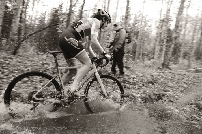
The one I’m most excited about inside the forthcoming Luminar 4 is the new AI Structure Tool. Expanding on the power of their existing AI processing tools, the AI Accent Filter and the AI Sky Enhancer, the new AI Structure gives you the power to boost details and add definition to your photo without compromising in the areas where you don’t want it.

Global tools such as Clarity and Structure work really well to enhance details and increase the drama to your image, except when they don’t.

While these tools work great with certain types of subject matter in your image, they can also present real problems by adding halos, artifacts and distortion in some areas, and they don’t always look great when used on people.

These problems are magnified when you’re including people in your photos. Making big moves with the Clarity and Structure slider can look great for the background, but they often look horrible on people. Solving these problems often requires using masks or adjustment layers… which takes time.

Luminar’s new AI Structure Tool uses “content-aware” technology to determine which parts of the photo should be left out of the sharpening process, and which should be enhanced.

The result, is that your backgrounds are accentuated with added richness and definition, but your people and other vital subjects are not overprocessed. They’ll still look natural, and you won’t have to go in and try to fix problems and cover up artifacts.

And, as with any of Luminar’s other slider-based tools, you have precise control over the entire effect, because you can apply as much or as little as needed for the look you’re going for in your image.

AI Skin Enhancer and AI Portrait Enhancer

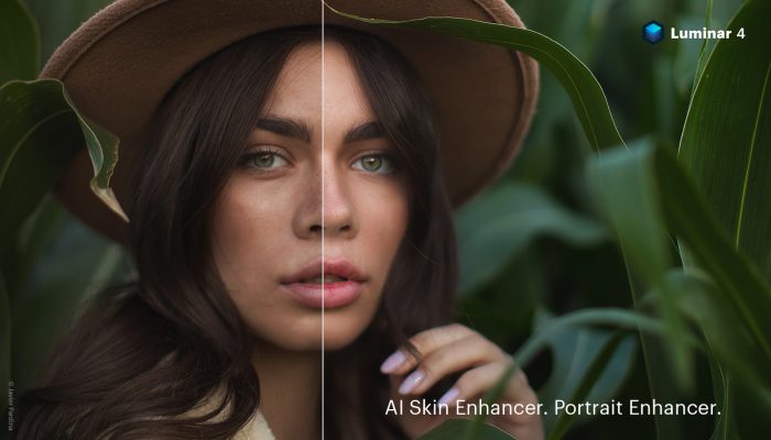
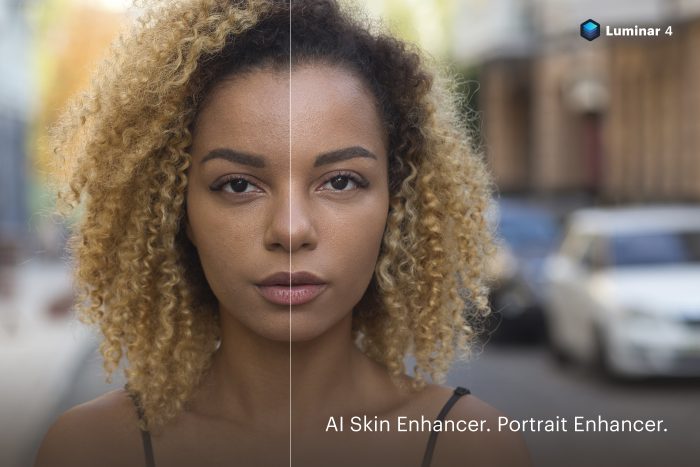
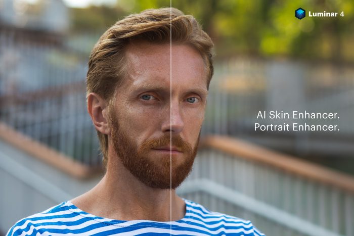
After you fix bump up the background, you can use the new AI Skin and Portrait Enhancer to refine the people in your shot. As with their other AI tools, these new additions use “Human-Aware” algorithms and adjustments to dramatically speed up the process of improving portraits.

These tools let you perform the exact same kinds of retouching functions that wedding and portrait photographers have been doing manually for years, but, in much less time.

Automatically removing slight skin blemishes, smoothing, and adding contrast to eyes and eyelashes, the AI Skin Enhancer lets you apply these corrections in a fraction of the time, and dial in the exact amount of adjustment to fit your image.

The AI Portrait Enhancer is an set of eight tools that allow you make a variety of adjustments and improve the overall look of your portraits with just a few sliders. Again, with customizable options like Face-Aware Lighting, Eye-Improvement, Eyebrows, Lips and Teeth Advancement, this lets you make the kinds of adjustment that studio and portrait photographers have been doing for years inside Photoshop.

Instead of having to resort to complicated selections, layers and masks, or outsourcing these task to outside retouching services, as many photographers do, these tools let you accomplish the tasks in seconds and potentially save you hours of extra work and money.

Apparently, these kinds of tools have been high on the list of requested features from Luminar users, so it’s awesome to see the company respond with such useful additions to the software.

AI Sky Replacement

Ok, I’ll say it right up front, this is usually not something I’m interested in doing. Replacing the sky in my photos is just not in my vernacular. However, I’ve have clients do it to my photos, and I know that there are a lot of photographers, both pro and amateur, who do this. The reality is that if you’re trying to sell your photos, they need to look as good as possible, and sometime that means doing some major doctoring.

At any rate, the technology is pretty amazing. Luminar already has the AI Sky Enhancer Tool, which is pretty cool. I’ve used that one on numerous occasions. This just takes it one step further.

Let’s say, for whatever reason, you do want to replace a sky. Normally, you’d have to draw a pretty complicated selection and mask the area. That takes time, and depending on how busy your foreground is, it might end up looking sloppy.

Then there’s the matter of lighting. So you replace a drab sky with a brilliant sunset. Suddenly, you have a horrendously obvious mismatch of light between the sky and the foreground.

Luminar’s new AI Sky Replacement doesn’t just add in the new sky, it does a variety of complicated analyzation and under-the-hood refinement, including making the initial mask, detecting the horizon line, and using tools like Smart Selection, Luminosity Masking, Overlaying, Layers, Masking and Color Range to detect and correctly match the lighting on your scene.
It’s even smart enough to match the depth of field, which makes it usable for a variety of situations and styles. The end result is a photo that looks remarkably accurate, and it only took you a couple of mouse clicks instead of hours of extra time that you don’t have.

Artificial Intelligence and Machine Learning are nothing new, they’ve been around in photography for years. Back in the 90’s when cameras start to get really smart, things like Matrix Metering used pre-programmed databases and algorithms that analyzed your scene and applied the best possible exposure. Continuous Autofocus does a similar thing, but with distance and movement.

Other types of creative software uses AI functions as well, and with excellent results. Take music software for instance:

I have a degree in recording engineer, so I know all about compression and equalization, but software presets that automatically apply the exact optimum amount of audio processing makes it really easy, and saves me a ton of time… time I can use to play more guitar or try to write more songs, instead of tweaking virtual knobs.

I’m the same way with photography these days. Even though I know how to work all those sliders in Lightroom and Photoshop, I love using the AI tools and the presets inside Luminar, which are called “Looks.” They allow me to preview and apply the exact style to my image I’m going for and dial in great looking adjustments just a few brief seconds.

Luminar’s whole approach from day one has been based the idea of making your photos look great, and letting you do it really fast. Given that most people would rather spend more time taking pictures than processing them, it’s no surprise that Luminar has won numerous industry awards and has been embraced by over half million photographers.

Luminar 4 is due to be released this fall. It works as both a standalone program or as a plug-in for both Mac and PC: You can either use it with the Library module to organize your entire photo library, or use it inside Adobe Lightroom, Photoshop and Apple Photos. It works great either way.

If you order through this link, you’ll get a special discounted price on either the new version, or the upgrade. 

September 18, 2019
See this post
Luminar 4 is Coming This Fall with Some Exciting New Tools

The cyclocross season continues, with our second Anchorage race of the series taking place this past Saturday, which, of course, meant another great opportunity for some action photography.

As always, I spent a good two hours running around with my camera like a spaz, looking for cool vantage points and experimenting with different lenses and looks as I photographed the racers with my Fujifilm X-T3.

Since I shoot this sport regularly almost every fall, I try to come at it with a slightly different approach each time. I’ll play around with different film simulations and color palettes, I’ll use a variety of lenses, or maybe I’ll shoot a race with just one lens, and sometimes I’ll even use different cameras, formats and aspect ratios. 

For this week’s race, I brought four lenses with me: the XF14mm f/2.8, which is my favorite Fuji wide angle, the darling little XF35mm f/2 WR, which I find to be incredibly versatile, the XF50mm f/2 WR, which I absolutely love, and the supremely sharp XF90mm f/2 WR, which, by all counts, is truly a special piece of glass.

To make things interesting, I switched to a new lens for each lap. This kept things fresh and it reminded me of the compositional strengths that each focal length offers. It also gave me a chance to brush up on my skills, because nothing hones your chops like regular practice.

I shot about 1,200 frames during Saturday’s race, often using the awesome PRE-SHOT ES feature on the X-T3. Here are my five favorites, with a little bit of behind-the-scenes explanation for each one.

1. Jumping The Barriers

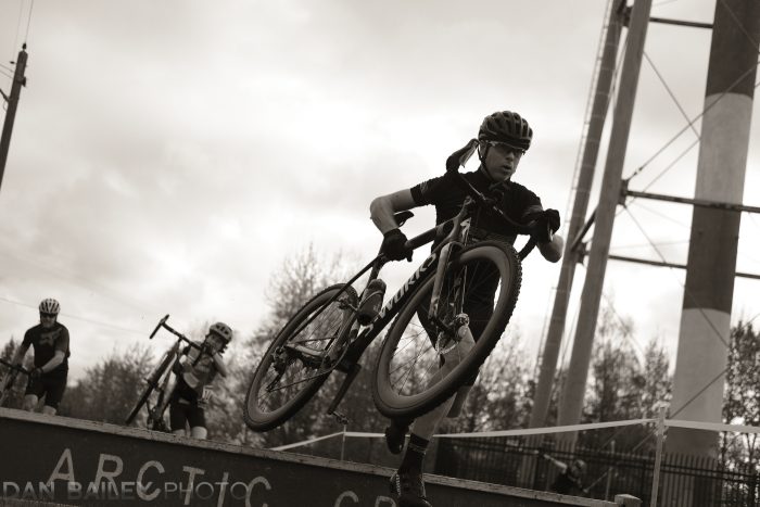
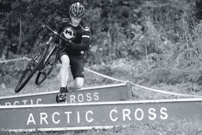
Early in the race, I grabbed a shot of my friend Pat Crabbe as he jumped the barriers under the waterpower. Pat is one of those “upper 50s and fit as hell” guys that I aspire to be like when I grow up. I’ve raced with him in the mountain bike series and he smokes me every time.

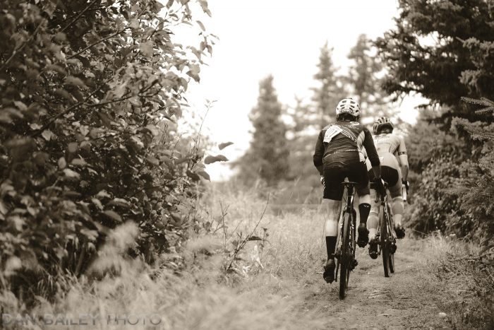
For this shot, I used a low vantage point with the XF35mm f/2, which gave me the classic “hero shot” look. Shooting low, especially with normal to wide lenses can often add a lot of drama to your people images. The 35 worked well, because it kept the scene tight, and the subject sharp, while creating enough separation between him and the background.

I used the ACROS film simulation on my X-T3 and a little bit of the warm toning effect, which is found on the X-T3 and X-T30. This is one of my favorite creative settings on the X-T3, and I make heavy use of it on a regular basis. I’ve even put this setting at the top of my “My Menu” folder, so I can access it with just one click.

2. The Run-Up

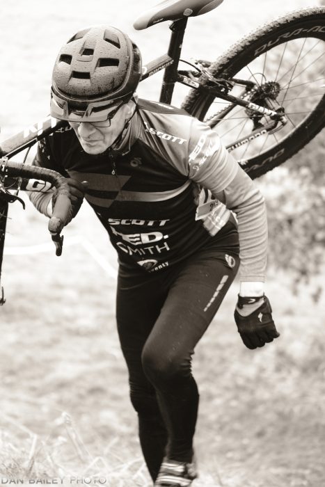
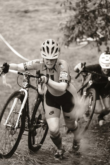
The run-up in Saturday’s race was particularly grueling, especially after about five or six laps. (I did eight total). Here’s my friend James Frederick chasing Pat and another racer on about the 3rd lap.

The XF50mm f/2 WR short telephoto gave me a nice tight view and a very shallow field of focus. In fact, the only thing that’s sharp in this frame is the tiny patch of leaves by James’s foot in the lower right corner.

Shot as part of a series at 11 frames per second, this ended up being my favorite, even though it’s mostly out of focus. Call it a happy accident.

For whatever reason, the camera’s AF system decided to grab something other than the center of the frame for this brief moment. Maybe my own highly erratic movement in trying to capture this highly energetic, fast moving scene caused me to blow it. Maybe it’s because the vertical orientation AF (Store AF Mode by Orientation setting) had the zone positioned in the lower right part of the frame.

Who knows. Either way, I love how it looks. Sometimes you can get away this kind of thing. Here, we know exactly what’s going on, and even if the racers aren’t sharp, the message of this scene comes across loud and clear.

In fact, that section of sharp leaves in the lower right corner does pull your eye, and with James’s foot being right there, it sets up a nice pathway for your eyes to track up his long diagonal leg. The combination of focus, softness, angle and prominent subject matter create a lot of motion in the image.

3. Pavement Sprint

Although the average cyclocross race takes place in the dirt, mud and grass, traditionally cyclocross races feature at least some pavement. During Saturday’s race, there was a long, 500-meter straightaway on the pavement to after a long singletrack section in the woods.

This was a nice way to break up from the sketchy gravel, the relentless roots, the soul-sucking run-up and the wipe-out potential of the tight forest trail. Of course, it also provided a key place to pass and be passed, so it’s not like you could really let up much on this “rest section.”

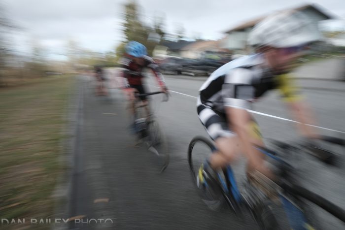
Here, I positioned myself at the edge of the road with the XF14mm f/2.8 lens and used the Classic Chrome film simulation with a shutter speed of 1/27 second, panning forwards to back in line with the racers. It’s pretty blurry, but the message of speed definitely comes through.

4. In The Woods

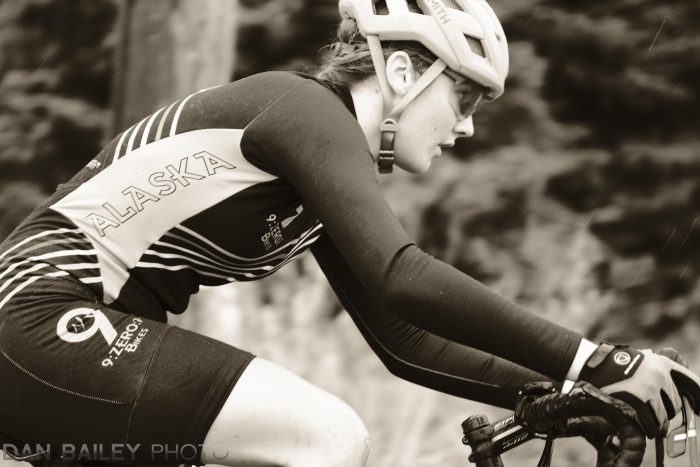
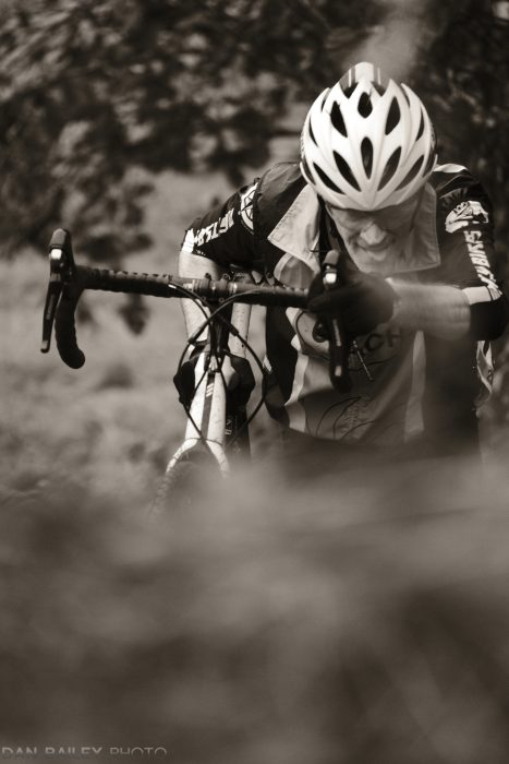
Who doesn’t love a good panning shot, especially when you nail it? They key to getting a successful pan is having a good mix of sharp and blur, and this one has just the right contrast in the places where it counts.

As you can see, the rider’s upper body is pretty sharp, and his expression is clearly visible. At the same time, there’s a lot of separation between him and the background. The leaves add nice contrast and the motion of the pan itself is quite pleasing. And, that patch of white at the top right acts like a spotlight to highlight his face. That part was just luck.

This was also shot with the XF14mm f/2.8 lens, using that low-angle “hero shot” techniqueIt’a a classic illustration why wide angles make for great action lenses.

5. Katrina in the Woods

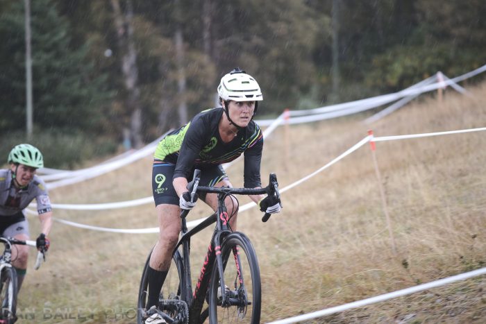
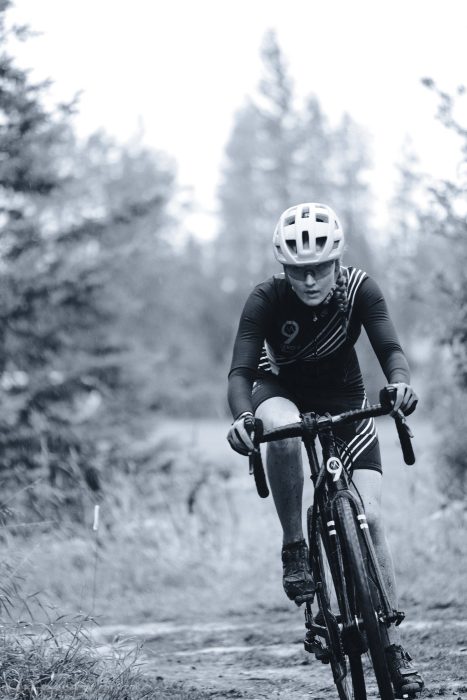
Yet another picture made with the XF14mm f/2.8 lens. This time, I’m using it to get really close, so I can feature the rider prominently in the frame, and and still show off the environment of the scene.
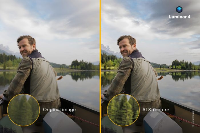
My friend Katrina has worked really hard at her cycling skills during the past couple of years, so it’s really exciting for me to grab a shot like this and make her look like such a badass. I love making my friends look like heroes, and since I’m photographing many of my friends during these weekly races, that actually drives a lot of my motivation.

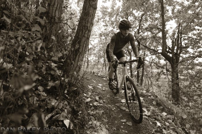
I was pretty psyched to find this exposed downhill corner. I knew that people would have very focused expressions as they whipped around the bend. There wasn’t much room on the trail, and I had stuffed myself right at the edge, which was another reason the wide lens worked so well here.

I also love the timeless feel that the warm-toned black and white imparts on this picture. I used a few more clicks towards the warm side than what was used on the first “barrier” picture above. I think the pronounced warm tone works really well with all of the foliage and it adds a lot of drama to the photo.

There you have it, my five favorite shots from Saturday’s cyclocross race, all shot with the Fujifilm X-T3, all made with small, compact Fuji primes and all made with a maximum excitement and passion, knowing that after that it would be my turn to race.

If you want to see more cyclocross shots, click here to see the photos from last week’s race.

September 16, 2019
See this post
My 5 Favorite Cyclocross Photos from This Past Weekend

I’ve long been fascinated with the concepts of how our evolution as human beings plays a part in our artistic tendencies and creative habits.

Throughout the span of human history, we humans have expressed ourselves with artistic representations and depictions of our lives and our world, and a significant element of our creative endeavors is geared around the use of color.

As with many of the behaviors and tendencies we exhibit our lives, our use of color is closely tied to both our biological evolution and our cultural history, which reflects thousands of years of evolution.

As early humans began migrating and exploring much more diverse and complex environments, we were suddenly faced with a vast increase in the amount of visual information we were taking in. This required a dramatic increase in visual processing power. Here’s a geeky, yet fascinating paper that talks about the correlation between our visual specialization and brain evolution. 

Consequently, our brains grew much more powerful to the point where 30% of the of neurons in our cerebral cortex are devoted to visual processing, and 80% of all visual processing done in our brains is devoted to color recognition.

Color recognition played a big part in our big brain evolution, and in fact, it’s one of the most fundamental aspects that separates us from most other mammals.

Where the majority of mammals on the planet can only recognize two of the primary colors in what we know as the visual spectrum, we humans evolved with what’s called Trichromatic Vision. Possessing three types of cone cell receptors in our eyes that are geared towards recognizing the colors red, green and blue.

RGB. Do these letters sound familiar?

The man difference is that evolved with the ability to easily recognize the color red. Given that many of the things in nature that are red are either things we can eat or dangerous things that we tend to avoid, our ability to quickly spot red played a huge role in helping us stay safe and well fed.

Combining Biology with Culture

In addition to our genetic evolution, we humans are also heavily influenced by our rich cultural history that spans thousands of years of civilization. Color has always played a large part in our cultural traditions and moods, and when you combine our biological and societal history, it’s easy to see the important role that color plays in nearly every aspect of outlives.

USING COLOR to EVOKE MOOD

There is multitude of ways we can use color in our photographs to evoke certain moods and visual response from our viewers. Here are a few essential tips to get you started.

Blue

Technically, there is almost nothing in nature that is the color blue. However, due to the ways that we perceive the scattering and diffusion of short blue light wavelengths, we associate blue as being the color of the sky and the ocean. And glaciers.

For this reason, blue is perceived as being a noble, highly dignified color that projects feelings of calm and tranquility.

Green

The predominant color of nature, grass, and vegetation, green evokes a timeless feeling in your images.

If you combine green with blue, you’ll create a serene, subdued image that projects endless tranquility.

Red

Red is the color of blood, the distinctive marking on a black widow spider and things like berries, apples and ripe tomatoes. Red incites energy and an immediate sense of heightened emotion.

As I mentioned above, our ability to see red so clearly marks one of the fundamental characteristics of our advanced human visual systems. Using a small splash of red in your photos will catch the attention of your viewers and draw them right into the image.

For this reason, red is very eye catching in photos. You can’t avoid looking at the red thing, even it’s just a small part of the image. However, due to a specific chemical depletion in our cone cells that occurs when we view large amounts of red for a long period of time, too much red will incite eye fatigue, and create weird optical illusions.

This isn’t to say that you should never make photos with an all red color palette, you just need to do it sparingly and use an effective composition. If it’s done right, it can generate a powerful viewer response.

Note, like red, orange can also be used as an effective spot color.

Yellow

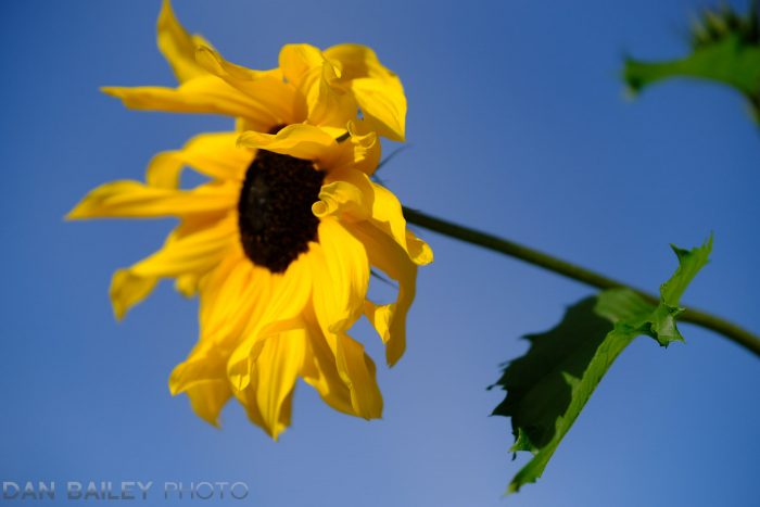
Yellow is the brightest color in the spectrum, and it’s the most stimulating and fatiguing color to look at. Even more so than red.

Things in our world that are yellow are meant to be looked at, like school busses and warning signs. For this reason, you can use yellow as a spot color and visual target to draw your viewer’s eye right into image.

Pink

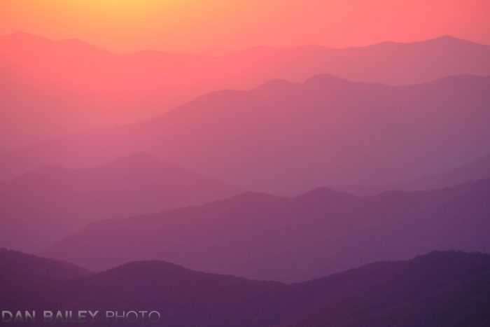
Lying between hot red and cool violet on the color wheel, pink is perceived as a warm color. You’ll find that you can be very bold with pink. It commands a lot of attention but it doesn’t incite the same level of eye fatigue as red does.

In landscapes, pink is often the color of sunset light and it can add a lot of richness to your photos, even when used in large amounts. I love using pink in my photographs, especially my mountain aerials.

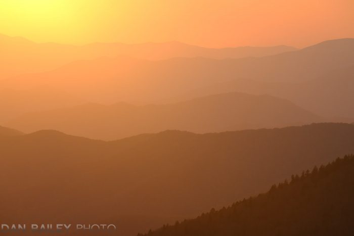
You’ll find that orange behaves much like pink in the sense that you can use it in large amounts without inciting eye fatigue.

COLOR COMBINATIONS

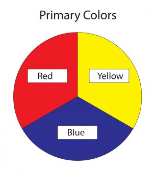
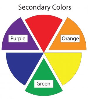
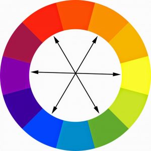
You can combine colors in your image to achieve powerful visual effects. Anytime you use primary or secondary colors together, or if you use complimentary colors together, (opposites on the color wheel), you’ll create please images that retain the viewers attention.

These kinds of colors are highly attractive to us, and so we want to see them. When used correctly, then can command an equal amount of attention, and this creates strong visual relationships that draw our eyes back and forth across the image.

With all of the colors in our world, there is an endless variation to how you can arrange them in your photography. As with any compositional technique, it takes practice to get a feel for what colors work well together and how to position them in your frame for maximum visual impact.

Keep in mind, there are no hard and fast rules here, so feel free to experiment with your use of color and see what works for you in your quest to communicate your creative ideas.

Watch the companion video to this blog post and see more image examples of how I use color in my own photography. For more compositional ideas, be sure to check out my eBook Making The Image: A Conceptual Guide To Creating Stronger Photographs.


September 10, 2019
See this post
The Science and Creativity of Using Color in Your Photography

The 2019 cyclocross season is finally here!!! I can’t tell you how happy that makes me. Ever since I shot my first race back in 2011, and did my first race the next year, cyclocross has been in my blood.

Racing skinny tire road-style bikes on a short track, obstacle-laden course that encompasses a variety of challenging terrain, including dirt, mud, wet grass, off-camber hills, steep run-ups, shin-high barriers and maybe a tiny bit of pavement, ‘cross is a full-on burst of all-out energy and classic Type 2 fun. In other words, Cross is Boss.

I love the challenges that cyclocross offers, and I often use it as my benchmark to test new camera bodies, lenses and specific settings. I also find it to be a perfect opportunity to push my creativity and practice shooting new styles and techniques.

With very fast action and often times difficult light, shooting ‘cross has made me a better action photographer, and it’s helped me become even more proficient with my cameras.

Every single year, I try out different approaches and I always get photos that I absolutely love. During a race last year, I got what I felt was the best, most exciting action photo I’ve ever shot, and so with a new season upon us, my goal is to continue to push myself and play around with new ideas as I run around the course and look for cool vantage points.

As with last year, I’m shooting with the Fujifilm X-T3, which is, by far, the best, most capable action camera I’ve ever used. With the increased performance and new features they added when the upgraded from the X-T2, I feel as if the Fuji engineers designed this camera specifically for me.

With the ultra fast electronic shutter that will fire at up to 30 fps, and the highly improved autofocus system that will track at those speeds, and the new creative features they added, I find that shooting with the X-T3 gives me an incredible amount of creative flexibility and total hot-shot performance.

One of the features I love the most is the new Warm and Cool Black and White adjustment settings, which I wrote about in a previous post. (You can watch my YouTube video tutorial about this setting here.) This setting is also found on the X-T30.

This setting expands on your creative options when shooting in black and white and it allows you to get some really cool looks. I’ll often go back and forth between shooting “warm” for some shots and “cool” for others, sometimes one right after another. (I’ve put this setting in my My Menu, so I can bring it up with one click.)

This is similar to my approach with the film simulations, where I might vary my looks numerous times throughout a race, sometimes shooting two or three different looks for a single fast breaking scene. It’s all about trying things out and seeing what works, and if you’re proficient with your camera, you can change up your settings to match new ideas that pop into your head at a moment’s notice.
I also like to play around with my Q Menu setting and adjust the Highlight/Shadow Tones and the Color control, in order to vary my looks even more. This shot above is CLASSIC CHROME with the Shadow Tone bumped all the way up. I think it makes for a really gritty, hard look, which makes for an exciting shot in the right moment.
The other setting I find essential for shooting this kind of action, is PRE-SHOT ES, which you can read about in this post.

PRE-SHOT ES works when you’re shooting in Continuous High and using the Electronic Shutter. When you enable this setting, the camera not only starts tracking your subject as soon as you do a “half-press” on the shutter button, it actually starts writing images into the buffer as it’s tracking.

Then, when you press the shutter all the way, the camera will save those “half-press frames” and write them onto your memory card. It’s a highly useful tool for shooting fast moving subjects, because it makes up for the lag time between when you start tracking and when you actually slam that index finger down all the way.

In effect, it lets you capture frames that you would normally miss because your finger is slow than your brain. Pretty cool, huh?

Of all the sports I’ve shot, there’s something about cyclocross that holds a special place in my heart. Maybe it’s because it perfectly matches my own one-thing-to-the-next, spastic energy style. Maybe it’s the camaraderie and because I love seeing my friends suffer out there on the course, knowing that I’ll have my turn next.

Maybe it’s just because cyclocross is just so damn cool. There’s a unique style to this kind of bike racing, and anyone who’s every seen or done a ‘cross race knows what I’m talking about.

Now that it’s fall, ‘cross is here, and wherever you live, there’s good chance that there’s a race series near you. Even if you’re not a bike racer yourself, it’s an exciting sport to watch, and a fun, challenging sport to photograph.

I would encourage you to check the listings in your area and go watch at least one race, just to check it out. And don’t forget to take your camera.

To see my own photography evolution with shooting cyclocross over the years, you can check out my archive of cyclocross-related blog posts here. 

Stay tuned for more ‘cross photos next week.

September 9, 2019
See this post
Photographing Cyclocross with the Fujifilm X-T3

One of my favorite features on the X Series cameras is the new B&W Adjustment settings that lets you apply WARM/COOL tones to your black and white images.

First introduced in the X-T3 and also included in the X-T30, the B&W ADJ. setting allows you to dial up or down with 9 increments into either the warm or cool spectrum when you’re shooting with either the ACROS or MONOCHROME Film Simulation.

As with many of the other X Series features, this setting lets you apply the look right inside the camera. I love this approach, because it fits right in-line with my current photography mindset of getting it right in the moment, instead of shooting RAW and processing later or having to resort to plug-ins.

This continues to be one of my favorite features on the X-T3, and I find myself using it all the time to add richness and style to my scenes. The warm tones harken back those days of sepia-toned platinum prints, while the bluish cast replicates the cool look that gold-toned prints traditionally had.

I see this as one more arrow in the awesome “creative quiver” we have with the X Series cameras. As much as have a deep fascination for color in photography, I love shooting in black and white on my Fujifilm cameras, especially with the ACROS film simulation.

There’s something special about rendering your scene in monochromatic tones that triggers the brain in a different way. Since most of us don’t normally see in black and white, this forces your viewer to focus more on the elements of shape, shadow, tone and the placement of your subject matter. With no color present, the particular message and feel of your image gets translated with a different level of visual impact.

It’s really fun to experiment with these settings and vary between adding a slight twinge of warm or cool tone to your scene, or going full bore and maxing out the slider at +9 to create a bold, deeply toned photograph.

And then, with a few clicks, you can go back to normal and capture your scene with a straight neutral gray color scheme, or even revert to color by choosing a different film simulation.

The adjustment is so easy, you can dial up or down with ease and experiment with different creative looks right there on location. On my X-T3, I added the B&W ADJ. setting into the My Menu for even quicker access.

I just love the creative options this new setting offers and I find myself using it on a wide variety of scenes.

One thing to note, this setting is not available if you’re bracketing film simulations, even if one or more of your chosen film sims are set to ACROS or Monochrome.

Also, if you shoot RAW only, it’s almost guaranteed that most RAW conversion software, like Adobe Camera RAW, Capture One and Luminar will trash the nice warm or cool color look you’ve applied as soon as you upload the image.

However, if you’re shooting RAW and doing in-camera conversions on the X-T3 or X-T30, you can apply the B/W ADJ. setting in the conversion menu and save a JPEG copy with the embedded tone, but only if you’re already using a black and white film sim. If your original RAW was shot with a color film sim, this option is grayed out.

As of right now, this setting is only found on the Fujifilm X-T3 and X-T30. My guess is that it requires faster processing power, so it’s unlikely to be added retroactively to the earlier X Series cameras, but it will probably appear in all future models.

If you have one of these cameras, then I highly encourage you to play around with this setting and see what you can come up with. If you have an older model Fuji and are thinking about upgrading, then the B&W ADJ. setting just might be the reason to make the jump.

If you’re curious about the main differences between the X-T3 and X-T30, then check out my comparison post here.

August 27, 2019
See this post
Shooting WARM/COOL B&W Tones on the Fuji X-T3 and X-T30