I’m currently road tripping in the southwest US on my Desert Heat Speaking Tour. I started in Vegas last Friday night, where I blew a couple bucks on nickel slots at the Bellagio before giving a presentation at B&C Camera on Saturday.

After that, I swung down Arizona for a couple days to meet up and ride with some of my Alaska mountain biking friends who came down to find warm sunshine and dry trails. Both of those things are in short supply right now in Anchorage.

Then I high tailed it across the desert to California for my next two events and took a pleasant diversion through Joshua Tree National Park. I hadn’t been there in years, and as soon as I turned north and entered the park, I remembered just how much I love this place.

I’ve visited Josh a few times; the first was during a 10,500 mile photography road trip I did with my friend John in the summer of 1991, right before I graduated from college. Back then, it was still designated as a National Monument. I did two or three climbing trips here in the late 90s, but sadly, I hadn’t been back since.

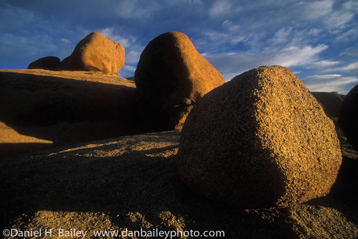
Named for the plentiful and uniquely shaped Joshua Trees that grown native throughout this region, the park is also famous for the extensive collection of roundish, tan rock piles scattered around the landscape. That’s what brings the climbers. And the photographers.

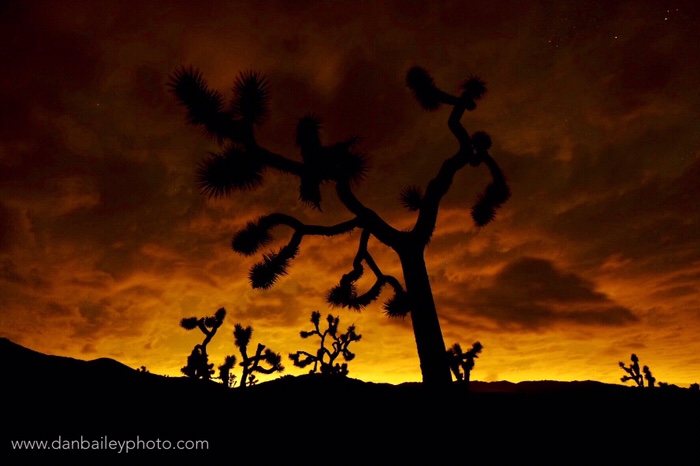
Here’s one of my favorite Joshua Tree photos I shot on Velvia slide film back in the day.

With a couple days before my next talk, I was looking forward to capturing some more orangey rocky pictures and maybe even some nighttime photos of the trees.

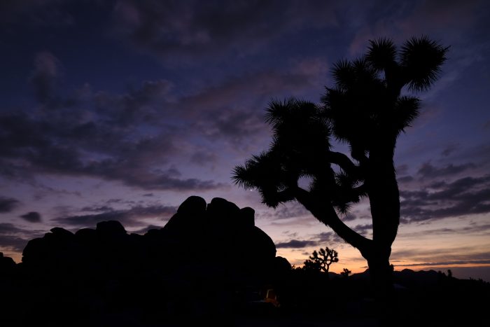
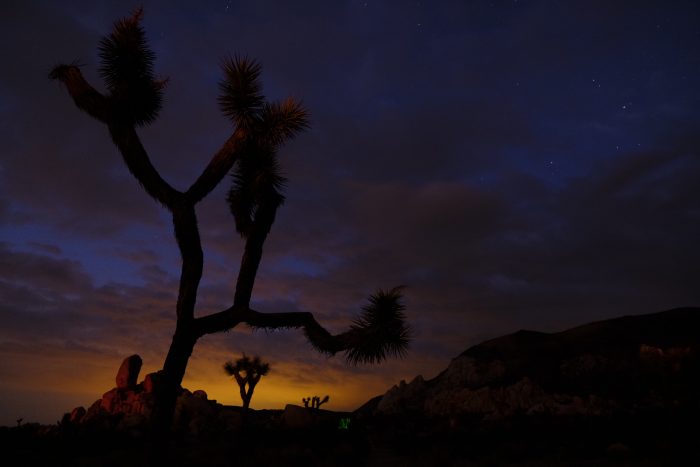
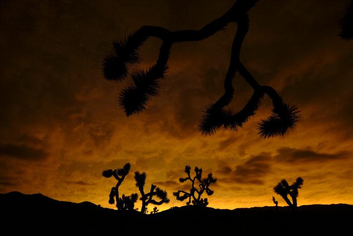
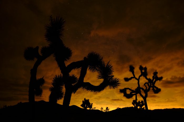
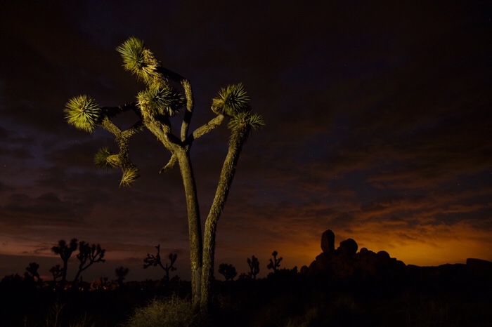
Unfortunatly, while trying to secure one of the “first come, first served” campsites, I missed the opportunity to photograph the short display of golden sunset light. Turning to plan B, I grabbed my little Gitzo tripod and tromped off across the desert in search of some especially photogenic Joshua Trees under the dimming aura of twilight.

Just as with film, digital sensors are much more sensitive to color than our eyes are in low light conditions. Although most of the visible sunset light in the sky was gone, the sensor on my X-T2 was able to capture some residual color in the darkening sky. I was helped by the residual light from the Palm Springs valley to the west.

Using my Fuji 14mm f/2.8 lens and an exposure setting of 10 seconds at ISO 1600, I shot a number of compositions and soon forgot all about missing magic hour.

Looking back, in all the times I photographed at Joshua Tree, I actually shot very few night images. I spent most evenings here woofing down camp meals and drinking beer with my climbing buddies after sunset before resting up for yet another day of hard climbing.

So, this was a special opportunity for me and I was pretty psyched by the images I got on this night so many years later. After this reminder, I hope I don’t wait so long again before coming back.


May 5, 2018
See this post
Return to Joshua Tree National Park

I’m giving three presentations down in The Southwest this week: one in Las Vegas this coming Saturday, and then two in California next week, in Riverside and Palm Springs. I’m calling it the FUJIFILM Desert Heat Tour. Here are the details about where I’ll be and when. I hope to see some of you there!

B&C Camera, Las Vegas, NV – Saturday, April 28, 2018

1:00-3:00 PM

The Adventure of Photography:
Shooting Outdoor, Action and Travel with the Fujifilm X Series

This Saturday afternoon, I’ll be speaking at B&C Camera in Las Vegas, NV. During my two-hour presentation, I’ll talk about my own transition to mirrorless cameras, and show you how you can take advantage of mirrorless technology to expand your own creative boundaries with photography.

I’ll talk about the specific gear and techniques I use, and I’ll also share my insight about light, lenses and composition, so you can get the most from your camera, no matter what kind of gear you use.

Afterwards, there will be plenty of time for you to ask me questions, pick my brain and quiz me on all kinds of photography and non-photography related topics.

My B&C talk is free, but space is limited so you’ll want to register here at the B&C website.

Image One, Riverside, CA – Thursday, May 3

3:00-5:00pm

After a few days soaking up the heat across Nevada, Arizona and Southern California, I’ll land in Riverside, CA on Thursday afternoon, May 3 for an afternoon of photography fun and inspiration.

I’ll be giving my “The Adventure of Photography: Shooting Outdoor, Action and Travel with the Fujifilm X Series” presentation and answering your questions about gear, photography techniques, my new book and how someone from Alaska can tolerate 90+ degree weather.

Visit the Image One Facebook Page for details.


Camera West, Rancho Mirage/Palm Springs, CA – Saturday, May 5, 2018

Fujifilm Adventure Talk and Photo Hike. 12:00-4:00 PM

On Saturday, May 5, I’ll be in Palm Springs for a fun day of outdoor photography with Camera West. I’ll do a presentation at the store and share my insight about light, lenses, gear, and the techniques I use to create my adventure-style imagery.

In addition, one of the Fujifilm reps will be on hand with some X Series (and maybe GFX) cameras and lenses for you to demo and try on our afternoon hike.

At 2:00, we’ll drive to Tahquitz Canon State Park for a two-hour photo hike. Rumor has it that afterwards, we’ll convenient at a local watering hole for pizza and beers.

Visit the Camera West website for more info. 

April 26, 2018
See this post
My Upcoming Presentations in Las Vegas and Southern CA

I’m excited to announce that I have a brand new Dan Bailey Photo Store on Amazon, which features a wide selection of my own favorite items- everything from camera gear, hard drives, solar chargers, useful accessories, books, and even some outdoor stuff I use on my photography trips.

And, the best part is that my store has a really easy-to-remember URL:

http://amazon.com/shop/danbaileyphoto

In other words… it’s:

Amazon dot com (slash) shop (slash) danbaileyphoto

This new storefront offers a lot of convenience for both of us. It allows me to share the gear and accessories that I recommend to my readers all in one place. I’m also able to add my own personal comments about the items, which means you can easily find all my recommendation and insight, and my other social links, all in one spot.

I do a number of reviews here on my blog, but as longtime readers can attest, I only review products that I’m really excited about. They’re either things I use, or have used extensively in my photography and outdoor life, or things that I feel would be of interest to other outdoor photographers who have a similar photography style or interest.

In other words, this blog is not your standard review site. I don’t write about every single thing that comes along. I simply don’t have time to review gear that I honestly feel I wouldn’t use, or that I don’t think is exceptionally noteworthy.

There are lots of sites on the web where you can read reviews, and I like to think you come here to get something a little different than just a collection of technical gear write-ups. Your time is valuable too, so I work hard to extend that level of respect to you as my reader.

Here’s the thing. I get a small commission on purchases that people make from my store. I’m up front about that, for a couple of reasons.

One- It’s just better to be honest about this fact, given that my blog is part of my business as a pro photographer.

I put a lot of effort into my blog with the notion of helping other people become better photographers, but it does produce income for me through clicks and affiliate links.

Two- Some of my readers care about that and they want to support me in my efforts.

I know that a lot of you actually WANT to help me out. Nearly all of my content on the site is free, but I make a genuine effort to get to you know my readers as people through email, social media and at my workshops. Also, I do my best to respond to nearly every comment and email I get, even though my email inbox sometimes eats me alive.

I really appreciate the support you guys continue to give me, and I know that many of you want to continue that. Shopping from my Amazon store, or even just entering Amazon through my store link when you shop for other products, whether you’re buying cameras or cat food is a great way for you to show this support. 

And of course it doesn’t cost you anything extra, whether you live in the U.S., Canada, or overseas.

I’ll continually update my store with new products, so check it out and let me know what you think!

Thanks again for your support. Have a great weekend.

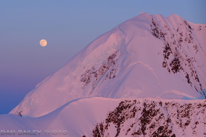
Moonrise over Mount Gilbert.
April 20, 2018
See this post
Visit My New Amazon Dan Bailey Photo Store

One of my favorite things is riding my bike. It’s always been that way, ever since I let go and launched myself forward on our little downhill gravel driveway in Evergreen, Colorado back when I was 4.

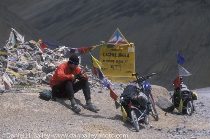
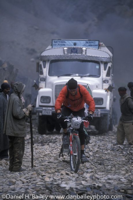
That day, the world opened up for me and I’ve been chasing adventure on two-wheels ever since. I’ve climbed high passes in the Himalayas of Ladakh, pedaled along the along the sunny shores of the Mediterranean Sea in Morocco, ridden through the endless olive groves of Andalućia and chased vampires in Transylvania.

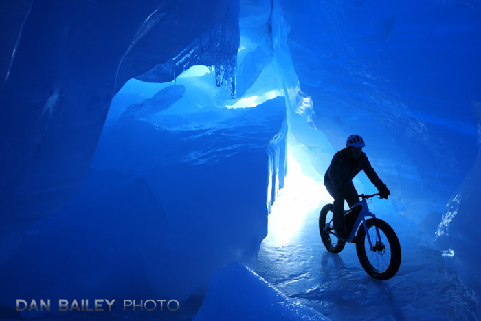
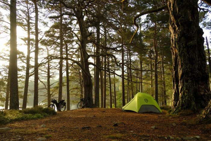
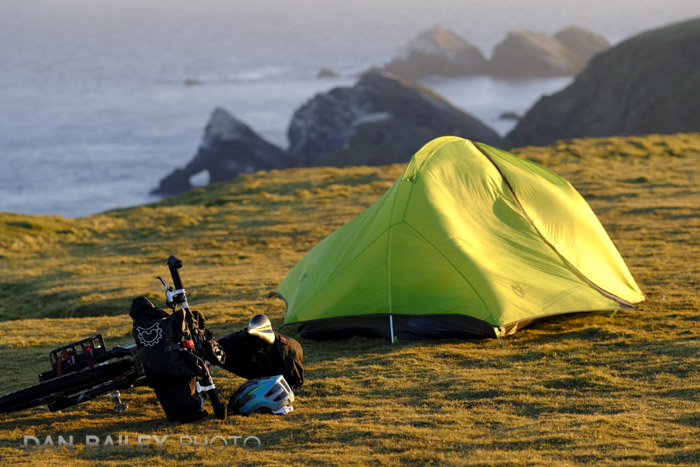
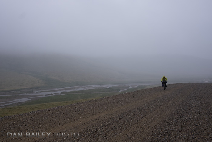
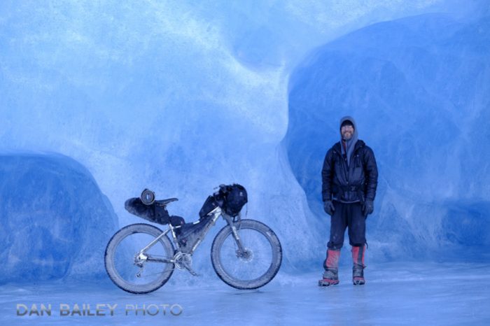
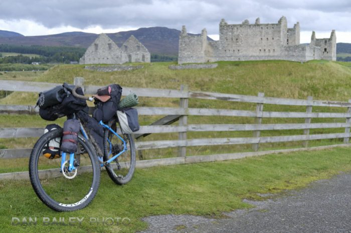
I’ve crossed The Alps, traversed frozen trails and rivers on my fat bike, cycled on glaciers and icebergs, toured under the midnight sun, beneath the northern lights and at the edge of the Bering Sea in Alaska. Last year, I bikepacked for a total of five weeks on the Shetland Islands and through the Highlands of Scotland.

Needless to say, I’ve had at least one camera with me during all of these trips, because all of my bike trips have been memorable photography adventures. I’ve also had a wide variety of gear that’s required for living off of your bike for anywhere from days an weeks at a time.

In a series of three posts, I’ll give you a full rundown of the bike touring and bikepacking gear I use- everything from bikes, to cameras to lenses to bags. In this installment, we’ll start with bikes and bags, and then move on to camping and outdoor gear and finish with the camera gear I use while bike touring.

It All Starts With The Bike

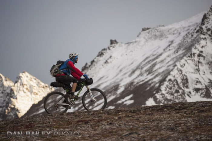
I’ve mostly toured on mountain bikes, largely because they can handle any kind of terrain. Sure, they’re a little slower on the pavement than a road bike, but once you head off-road, they’ll withstand much more punishment on rough roads and allow you to cover more ground more quickly and with much less effort.

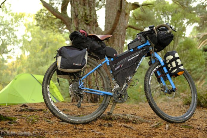
My favorite adventure bike of all time is my Bomb Pop Blue 2015 Salsa Fargo. Designed for off-road touring and bikepacking, the Fargo is the ultimate do-anything bike. It’s a two-wheel jack-of-all trades for long days on the gravel and not-too-technical dirt, all well as grocery getting and commuting.

With a durable steel frame, rigid fork, mountain geometry, 29″ wheels, knobby tires, lots of attachment points for racks and stuff and it’s unique flared “Woodchipper” handlebars that offer a variety of hand placements, the Fargo will go just about anywhere with a huge degree of fun-ness. Add in my classic brown leather Brooks B17 saddle, and it becomes a long haul comfort machine.

It’s fine on pavement too. I know lots of people who put slicks on their Fargo for city riding. When I tour, I put low rolling resistance tires that offer enough grip for dirt and gravel, but don’t slow me down too much on the pavement. And because I’m a bike geek at heart, I put carbon wheels on it last fall, which make it lighter and more responsive.

Winter Fat Bike

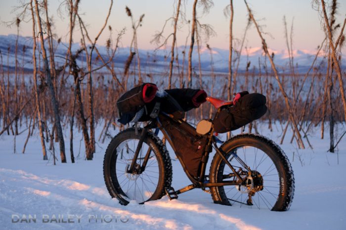
In the winter, I ride a Carbon Fatback Corvus, which is designed by Greg Matys, owner of Fatback Bikes and Speedway Cycles here in Anchorage. A lifelong Alaskan, Greg was one of the first people to build a true winter fat bike. I’m currently running it with 45NRTH Dillinger 4 studded fat bike tires.

I’ve been riding Fatback snow bikes for about eight years and have done everything on them, from long cold days, short wintery singletrack outings, 100-mile ultra winter endurance races and multi-day winter tours.

Revelate Designs Bike Bags

I’ve toured with a variety of setups- trailers, racks, panniers, backpacks, but nothing compares to Revelate Designs bikepacking bags.

Made by innovator and often-copied genius Eric Parsons, who is a former civil engineer and one of the most adventurous souls I’ve ever known, Revelate bags offer the ultimate solution for carrying stuff on your bike in all conditions, on any kind of terrain.

A rack and panniers will work fine on the road but if you start bashing on washboards or rocky, bumpy trails and jeep tracks, your rack bolts will sheer off in no time. I know, because I’ve had to loan more than one person handfulls of zip ties so they could try and jury rig their rack back on. At the very least, your bags will just bounce way to much for any kind of comfortable ride.

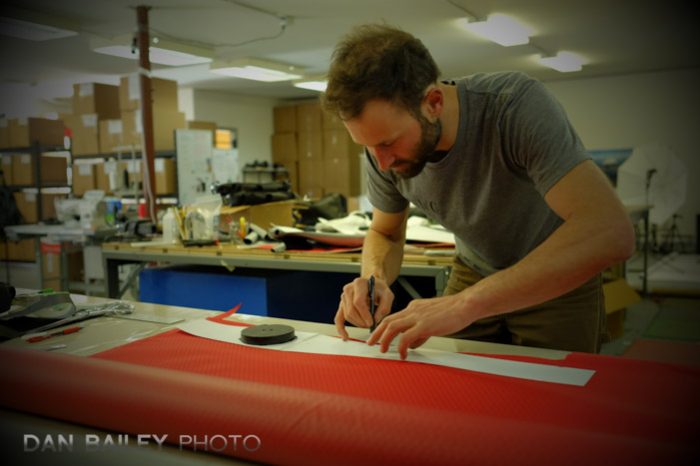
Eric Parsons at the Revelate Designs Mothership
Eric, during a product testing session.

After our 2001 India mountain bike trip, where we pulled trailers up the highest road passes on the planet, Eric swore off trailers and set about designing a better system for carrying gear on mountain bikes.

In addition to them being heavy, Eric had broken his trailer and had to find some guy in the village of Keylong on the Manali to Leh road to weld the bars back together. The weld didn’t last long, so he ended up hose-clamping a carabiner across the break.

Anyway, his solution revolves around a system of bags that fit strategically and securely inside the main frame triangle, behind the seat, on the handlebars and along the top tube.


Revelate Designs gear is simply the best bikepacking gear available, which is why just about everyone else has copied them, or else they private label his stuff. Of all the bike bag companies that have sprung up in the past few years, almost all of them are based on Eric’s ideas.

However, being a mad scientist engineer who’s harder on his gear than anybody I know, Eric thinks of all those little details which make the gear function extremely well in a variety of situations.

Last year in Scotland, we rode with some guys one morning who had some other brand of bike bags, and their bags were swinging back and forth in the wind. Ours weren’t, because they had those extra little straps that Eric had sewn on his.

Eric’s ideas and gear have revolutionized the entire bike industry and popularized the term “bikepacking.” Back in the day, we just called it “mountain bike touring.”

My Current Revelate Designs Setup

Here’s what I use on my Fargo for 3 season touring and also on my Fatbike for winter touring:

Ranger Frame Bag

This is the workhorse foundation of the entire Revelate kit and it was Eric’s first bag he ever designed. Even for around town riding when I may not have any other bags on, the frame bag is almost always on the Fargo, or on the Corvus in the wintertime.

Sized to fit a wide array of bikes of all kinds, from road to mountain, the Ranger Frame Bag fits snugly inside the triangle and offers bomber zipper access to your gear. On long tours, this is where I carry my stove, fuel, food, tools and maybe a thin layer. For short tours or long day rides, I throw a water bottle, food and extra layers in there.

Eric has some different frame bags that cover a variety of uses. The Tangle is a half size frame bag that is an ideal solution that fits above your downtube water bottle cage.

Viscacha Seat Bag

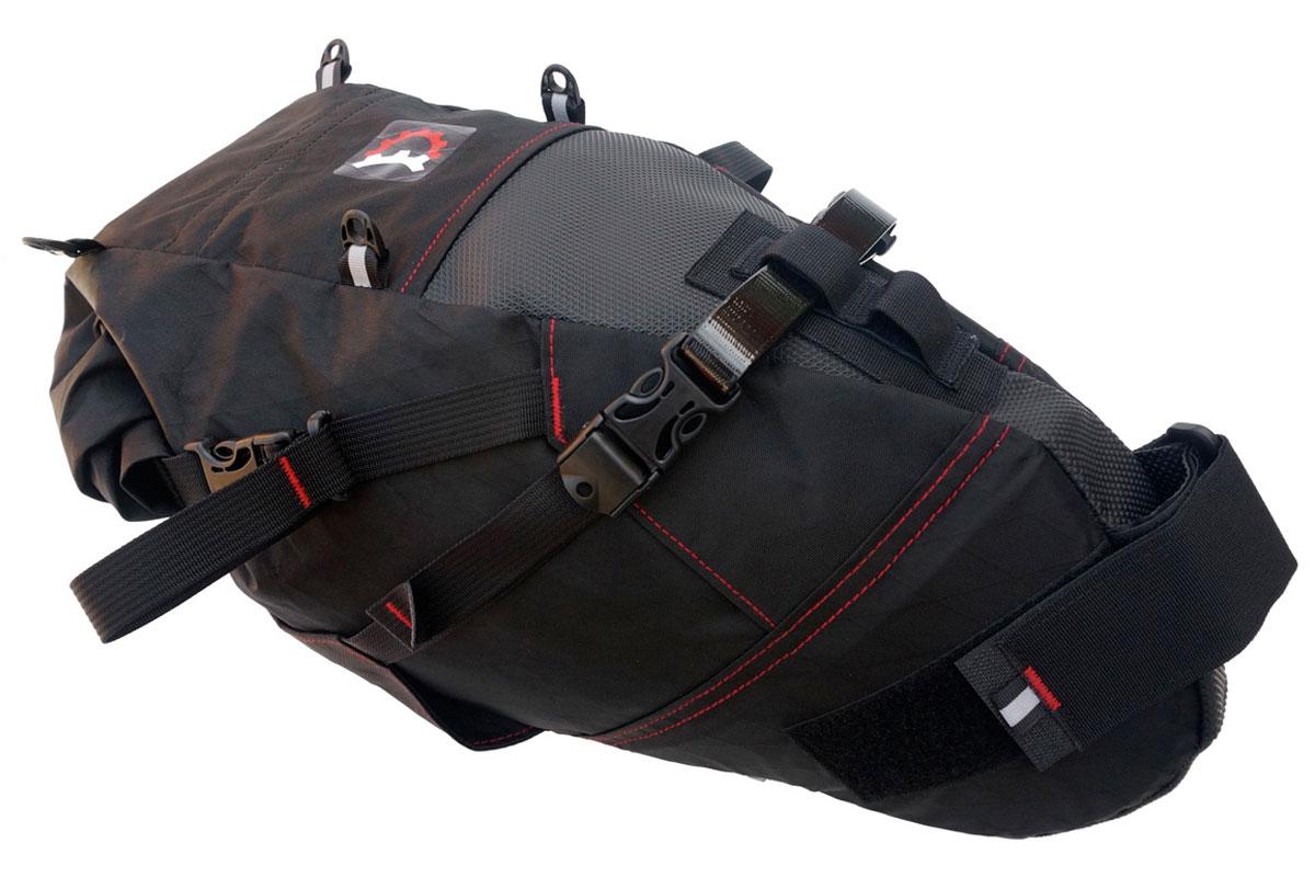
Eric has a number of behind-the-seat bag designs, and the one I’ve been using for years is the Viscacha. It’s a classic, simple, highly functional seat bag that attaches so securely, you can stick it on your mountain bike and go ride technical trails with it.

I usually carry my clothes and jackets inside my seat bag. I’ve also hauled extra cameras bodies, spare lenses and even my little tent in there. I usually attach the little Spocket Pouch on the top of my Viscacha, which keeps little tiny things very accessible, like my Brooks rain cover, a multi-tool or Spot Tracker- that’s how it the Spoket got its name. FYI, the Spoket was designed by Eric’s lead sewer Dustin Eroh, who recently rode to a 2nd place finish in the 750-mile Arizona Trail Race.

If you have a smaller bike, the Viscacha might rub on the tire, so you’d want the slightly smaller Pika bag. For a total waterproof solution, Eric has the Terrapin System, which uses a holster-like mount and welded seam dry bag.

Revelate Designs Viscacha


Sweetroll Handlebar Bag

The Revelate Designs Sweetroll is a waterproof handlebar bag that uses a double dry-bag style closure; one on each end. It fits on most handlebars, even on road-style drop bars, and it’s a great place to hold your clothing, sleeping bag and other stuff you don’t want to get wet. I’ve occasionally used it for spare camera bodies and lenses as well.

On the front of my Sweetroll, I usually run either the Yakataga Dry Pocket or the Egress Pocket. This gives me waterproof storage for things I want more accessible, like guidebooks, maps, sketchbook, a small camera, windbreaker, iPod, iPad Mini, etc…

In the wintertime, I use the Harness, which allows me to carry a large winter sleeping bag on the handlebars.

Cockpit Bags

Eric’s cockpit bags are where you keep your essentials, like snacks, windbreaker, water bottles, tools, and even small camera and lenses. I use the ever-useful Gastank, which I fill with stuff like bars, candy, fudge and 5-hour energy drinks, which are about the same size as those tiny single sample whisky bottles.

I usually run with two Mountain Feedbags up front, which fit on either side of your stem behind the handlebars. This lets me keep a pair of water bottles handy, or one water bottle and one can of bear spray for when I ride in Alaska.

A Feedbag will also hold a spare camera lens, a tripod head, a beer, about two pounds of loose M&Ms, a jacket or spare clothing layer, a handful of Clif bars, and the little mesh pockets on the side hold any other small item you want at your fingertips – GU packs, sunglasses, chain lube, lip stuff, candy bars and empty wrappers from all those bars you’re carrying.

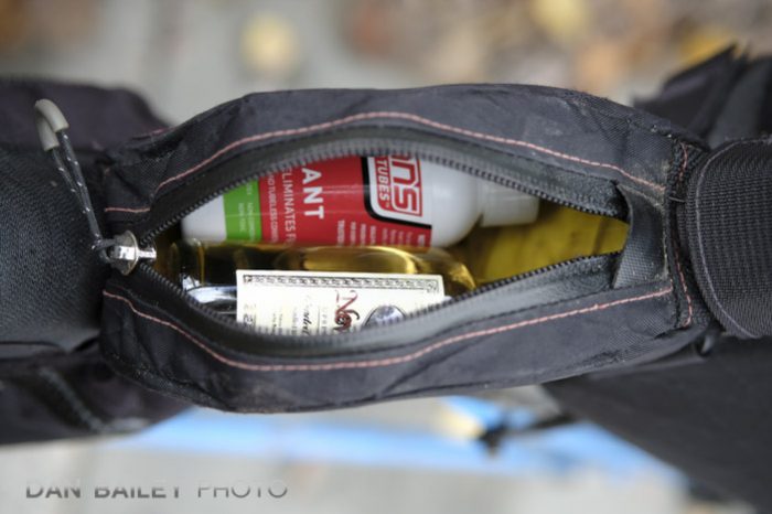
I also run a Jerrycan, which sits at the back of the frame, under the seat. It usually hold a little bottle of Stan’s tire sealant and a couple of bike tools.

What else fits in the Jerrycan…?


Nano Panniers

For most longer tours, I use a set of prototype Nano Panniers on my Fargo. They’re super light, have a narrow profile and offer that extra bit of space for carrying dense or bulky items that won’t fit inside the frame bag; things like a pair of running shoes, puffy jacket, bigger food items.

Since they’re so small, they don’t get in the way when you’re riding off-road, and since the attach to your rack with straps instead of clips, like most panniers, any excess movement or bouncing will stress the fabric and not the rack/bolts.


Racks and Cages

I use a couple of different rack options. The Salsa Alternator Rack always lives on the back of my Fargo, because you never know what you might end up needing to carry, even when you’re not touring. It makes grocery gitting that much easier. Sure, it adds some weight, but the cargo factor adds great versatility to the bike.

I also use Salsa Anything Cages. They have two kinds- the plastic Anything Cage, which works really well on the Salsa or Surly forks and other 3-bolt mount forks, and the standard metal Anything Cage, which fit either on the fork or on over & under downtime mounts that are found on the Fargo and on other Salsa and Surly bikes.

My regular fork setup involves carrying the sleeping bag on one side and sleeping pad on the other. Both are stored in dry bags and secured with either the Salsa Anything Straps that come with the cages, or Eric’s Revelate Washboard Straps.

The underneath-the-frame cage is nice for carrying extra fuel and water. It gets pretty dirty under there, so if you’re putting a water bottle down there, you might consider

Ok, that’s the gear part. In the next installment, I’ll cover some of the camping essentials I use while bike touring, and then I’ll finish with the photography stuff.

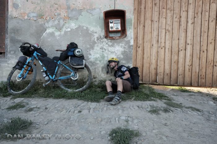
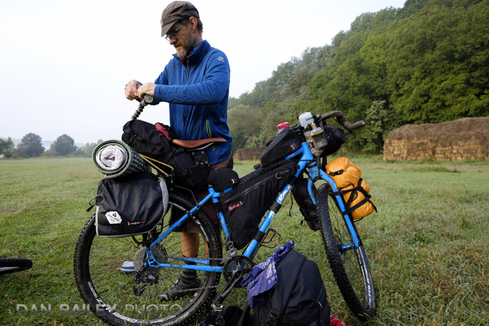
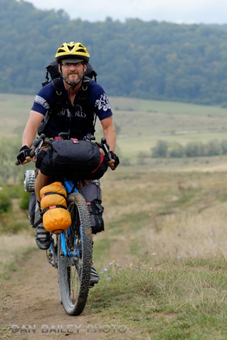
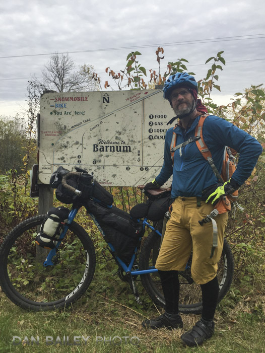
In Barnum with Bailey.
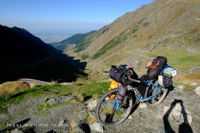
At the top of the Transfăgărășan pass in Romania.


Waiting for the Ferry.
April 17, 2018
See this post
My Complete Bikepacking and Bike Touring Setup, Part 1 – Bikes and Bags

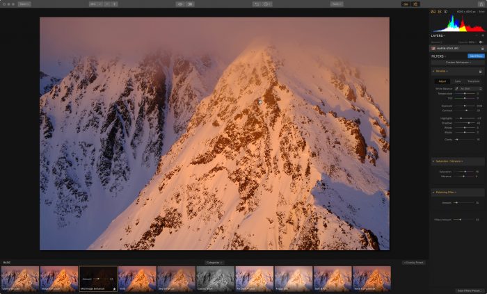
When I was a kid, Jupiter was always my favorite planet. I was blown away by it’s massive size, (it’s so big that 1,300 Earths could fit inside it), and I was utterly fascinated by the Great Red Spot, a giant high pressure anticyclonic storm, currently over 10,000 miles across that’s been going for at least 350 years. I drew a lot of pictures of Jupiter back in day.

With this in mind, I’ve been wondering when Luminar was going to get its long-awaited Jupiter update. Skylum (formerly Macphun) has so far named each update for one of the planets. We had Pluto back in December, 2016, and Nepture in June, 2017. (We’re still looking for Uranus…)

However, you can’t just throw out any old update and call it Jupiter. You have to wait until your software has earned its right to be named after the supreme planet of the solar system, which, of course, is named after the supreme god of the Roman pantheon.

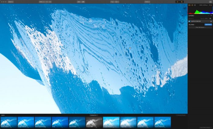
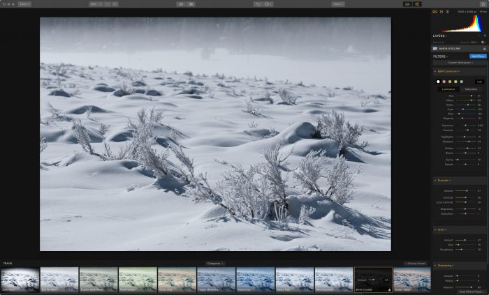
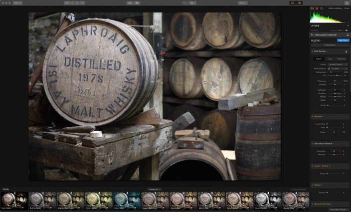
The wait is over, because today, Skylum finally released the Luminar Jupiter update. This free update to Luminar 2018 contains over 300 improvements which make the app even faster, more responsive and more powerful.

(If you’d interested in Luminar, use discount code DANBAILEY and you’ll save $10 on the software. )

And it has brought most of the remaining Mac-only features to Windows, like Faster Image Export, Batch Processing, Free Transform, Flip/Rotate and general stability improvements.

In addition to a general speed bump, Luminar Pluto adds a number of new features:

  • Automatic Lens Correction
  • Better RAW Conversions with better explore calculation, reduced halos and more compatibility
  • Enhanced Image Quality View with Improved Demosaicing
  • DCP Profile Support (Mac only, but coming to Windows soon)
  • More Language Localizations
  • F Hotkey Preview Mode for Windows
  • Overall Stability, UI and Speed Improvements


Depending on your machine and what kind of processing task you’re doing, Luminar Jupiter will run anywhere from 3-25 times faster than the previous version. Unlike some software, which tends to leave old computers behind when they release new updates, the Luminar developers keep trying to optimize it for a wide variety of computers.

I’m still on my Mid 2010 MacPro and I’ve already seen a huge jump in performance. It’s still an app I can use every day without worrying about spinning beachballs or huge slowdowns.

The most notable enhancement to the program is that it’s way faster when opening up RAW files. The original version of Luminar took my computer about one full minute to open a RAW file from my X-T2. Luminar 2018 cut this down to about 20 seconds. Luminar Jupiter is down to less than 10 seconds. If you have a brand new machine with a faster processor, you’ll see and even bigger jump – up to 500% faster.

Overall, you’ll see remarkable performance and quality improvements, especially when importing, viewing, processing and exporting RAW files, especially from Fujifilm cameras. That’s something the Luminar people have been wanting to refine, since a large percentage of their user base are Fujifilm users. In fact, one of their head developers happens to be an X-T2 user.

Not every software has done well with the X-Trans RAW files (ahem…Lightroom), but I know that the Luminar people have been talking with Fujifilm, who are eager to lend their support.

With the Jupiter update, Luminar offers even more powerful, pro-quality RAW editing capabilities. You have a comprehensive set of develop tools that offer professional-quality image editing solutions, “issue fixers,” utilities and creative solutions that let you adjust your image in any way you want.

You also have things like masks, adjustment layers, customizable workspaces, and a wide variety of overlays, textures, LUTs and an expandable library of user presets.

Nearly every user will see snappier performance, as well as some tweaks to the interface, which should provide for an even more enjoyable photo editing experience.

That’s pretty much the key. Since day one, the Luminar developers have strived to produce an excellent, professional quality photo editing program that’s powerful, easy to use and fun.

After all, most of us do photography because it’s a fun, rewarding, fulfilling activity, so why wouldn’t we want a processing program that fosters creativity and productivity that enhances this fun?

Not to take anything away from a powerful and awesome program like Photoshop, but the reality is that being a Photoshop expert requires a lot of time spent with the program, and in many cases, some extensive training.

That’s different than just being a photographer who wants to produce highly creative imagery. What I like about Luminar is that it’s so easy to use, and it’s fun. I’ve used Luminar regularly since it was first introduced back in the fall of 2016, and I find that it works well with my style of creativity, where I often look, see and come up with ideas very quickly.

I don’t like to get bogged down in sliders or spend lots of time tweaking images. Just as I do in the field I often like to make creative decisions that reflect my creative ideas in the moment, and run with it. I feel that questioning and agonizing over creative decisions or minute changes defeats some of the purpose and the magic of spontaneous creativity.

With Luminar, I’m able to preview a broad style of possible “looks” with the included presets, apply one that “feels” right for my image, then dial it up or down until I get the result I want.

Whether you’re a pro photographer or a creative weekend camera warrior, Luminar 2018 offers you a comprehensive, powerful and enjoyable photo editing experience, and it just got better.

Also, as we’ve been hearing, Skylum is working on an asset management system that will be introduced into Luminar as a free update later this year. Nearly all of my processing is done with Luminar these days, and if their DAM is as good as they’re promising, it could be a viable catalog alternative to Lightroom.

If you’re already a Luminar 2018 user, Jupiter is a free update. If you still use the original version of Luminar, you can update to Luminar 2018 for only $39 with discount code DANBAILEY

If you’re not a current Luminar user or if you’re still using the original version of the program, I highly recommend taking a look at what this software offers. It’s a great solution at a very reasonable price, with no subscription necessary. 

There’s even a free demo so you can try out the program and see if you like it.

And coupon code DANBAILEY still applies, which will allow you to save $10 on the program.

Special Offers – April 12-29

If you purchase Luminar 2018 during the rest of April, you’ll get a handful of bonus materials and educational content:

  • The Complete Landscape Photography Guide ebook from Photzy (worth $50) – An outstanding guide written by professional photographer and writer Kent DuFault. This ebook has something for everyone, with 237 pages packed full of information and assignments that will transform your landscape photography.

  • Aerial Photography & Video with Matt Granger (worth $79) – World-renowned photographer, Matt Granger will share planning, shooting and editing aerial stills and video. Matt will also demonstrate editing with Luminar 2018 on his still aerial images..

  • Photography Tutorial by Daniel Kordan (worth $29) – Extensive tutorial with a full workflow demonstration by expert landscape photographer Daniel Kordan. This tutorial includes shooting and post-processing images in Luminar 2018.

  • 119 Dramatic & Romantic Sky overlays (worth $29) – This is an amazing addition to your photo editing workflow, and will help give boring skies that ‘wow!’ factor.

  • Splitsville Presets By Brian Matiash (worth $15) – Add a professional polish to your images with these cool presets.

April 12, 2018
See this post
Skylum Releases Luminar Jupiter Update with Huge Boost in Performance

The Fujifilm X Series cameras all have a diverse set of buil-in color palettes which have been been modeled to match some of Fuji’s most classic film stocks.

Cameras like the X-Pro2, X-T2, the new X-H1, and even the less expensive models, like the X-E3, all feature 15 different Film Simulations, as they’re called. These include representations of storied slide films like PROVIA, Velvia and ASTIA, the subtle PRONeg colors, which are based on Fuji’s Neopan 160 print films and the stunning tonal contrast of ACROS black and white. There’s also CLASSIC CHROME, which is modeled after Kodachrome, although they can’t really call it that for obvious legal reasons.

For many X Series shooters, the Film Simulations are the lifeblood of the Fujifilm X Series camera system, and they’re one of the first things that drew me to the X Series over 6 years ago.

We photographers are driven by subtle variations in color and tone, and having used many of those classic films back in my film days, I was excited to be reunited with the color palettes I great up with during my initial development as a photographer.

The basic idea behind the Film Simulations is that you choose one of these specific color palettes, based on your subject and your creative ideas in the moment, just as you would have chosen a specific box of film. Since there was no processing in the film days, the look of your image was based entirely on your own creative approach and your chosen film.

The diverse selection of color and contrast choices included in the X Series cameras give you a relatively wide and diverse set of color and tonal choice with which to explore and represent your subject. It’s not an unlimited set of choices, though, and that’s the key. You have enough variation to satisfy a wide array of creative options, without too many choices that would overwhelm you.

In addition, the Fuji JPEGs look so good right out-of-camera, they can easily be considered as “finished images.” Many Fuji photographers, including myself, rely on the Film Simulations so much that we actually save ourselves endless hours of computer processing time. Rather than spend out time sliding sliders, we simply outsource our color and tonal to the guys with the 84-year history with film and color reproduction.

How to Customize the Film Simulations for Added Creativity

That’s not all, though. The X Series cameras give you an addition set of tools that allow you to customize the Film Simulations. This allows you to use the Film Sims as a starting point and take your creative vision even further with your imagery.

Tucked inside the Q Menu, you’ll find the following settings: H-TONE, S-TONE (for Highlight & Shadow), COLOR and SHARPNESS. Using these four controls, you can vary the look of your imagery even more by increasing or decreasing the highlights, shadows, saturation and overall sharpness of your photo.

For example, what if you wanted to make you Velvia image pop even more, or bring down the colors and further desaturate one of the PRO Neg films? Or do a couple of things, like create a muted, yet high contrast version CLASSIC CHROME?

Easy! Just grab those Q Menu controls and adjust to your liking. Each of those controls can be set with either a + or a – setting. The easy rule of thumb is that “Plus” always adds more contrast and “Minus” always reduces contrast.

When you combine these with different exposure settings and added “film grain” you can get from using higher ISO settings, (Or the GRAIN setting found in the IMAGE QUALITY Menu) you’ll find that have some very powerful creative options right there at your fingertips. This really opens up the options for further exploring your artistic ideas and producing a very personal style of imagery.

The best part about shooting this way is that you don’t have to wait until later to see how your images will look. You’ll be able to see the visual effect of most of these changes in your viewfinder.

In addition, if there’s a particular “look” you really like, you can save that combination as one of your CUSTOM SETTINGS in the IMAGE QUALITY Menu for quick recall next time. On the X-T2, X-Pro2, X-H1 and X-E3, you can even give this setup its own custom name.

I really like this approach to my own photography. I feel there’s value in running with your creative ideas in the moment, instead of deferring your creative decisions until later, when you’re far removed from the scene and any emotions and ideas you were experience in that particular moment.

Here are a number of examples to show you some different ways I use these techniques. I hope this post inspires you to explore some new creative idea with your own camera. For further reading and additional tips on maximizing your creativity with the Fuji cameras, be sure and check out my comprehensive ebook, X SERIES UNLIMITED.

Shot using the straight PROVIA Film Simulation
PROVIA, with +2 SHADOW TONE and -4 COLOR, to add contrast and mute the colors.
Straight Velvia Film Simulation, with rich colors.
Same scene, but using the CLASSIC CHROME Film Sim.
CLASSIC CHROME with +3 SHADOW TONE, -2 COLOR and +1 SHARPNESS.
Velvia with +4 COLOR
ASTIA with -2 SHADOW TONE
ASTIA with +2 SHADOW TONE
ACROS with -1 SHADOW TONE, +1 SHARPNESS
CLASSIC CHROME with +3 SHADOW TONE, -2 COLOR, +1 SHARPNESS
CLASSIC CHROME with +4 SHADOW TONE and -4 COLOR
VELVIA with +4 SHADOW TONE and +4 COLOR
April 9, 2018
See this post
Customizing the Film Simulations on the X Series Cameras

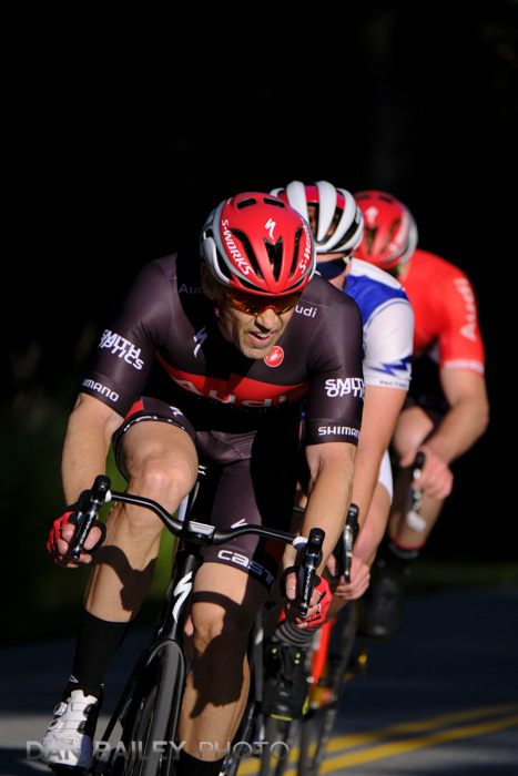
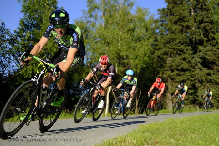
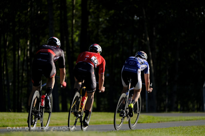
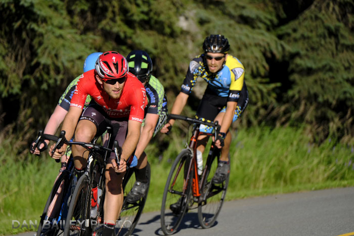
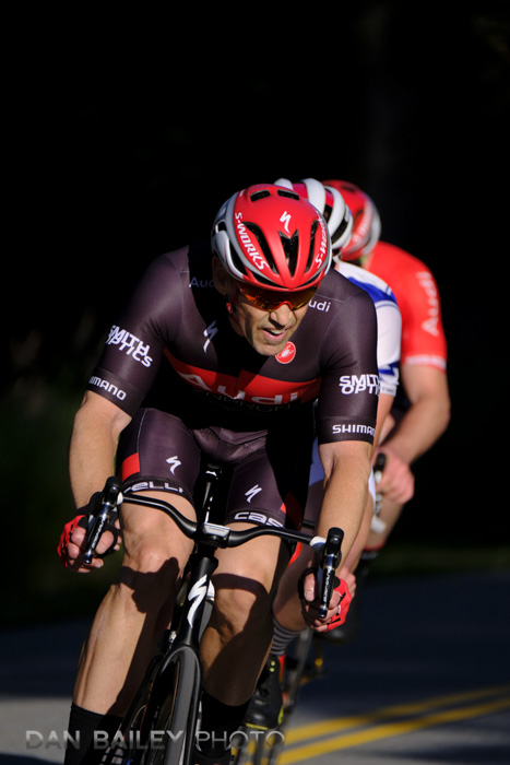
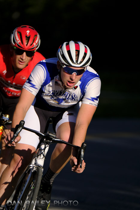
One of my favorite things to shoot during the past couple of summers here in Anchorage are the short track road bike “crit” races that happen every Wednesday evening from May through August. I got this image back in July of 2016, and it’s quickly become one of my favorite images.

I love how dynamic it feels, I love the simple palette of strong colors, and of course, I love the light. Such bold sunlight contrasting against deep, dark shadows and caught just at the right moment, when the riders are stacked 3-deep as they come out of the blackness and turn the corner.

This was a very challenging scene to tackle, and it certainly put both my skills and my equipment to the test. Although I’ve shown and talked about this image in my classes and presentations, and it’s featured in numerous posts here on my blog, I’ve never broken it down and talked about it was made.

First a little background. I’ve been an action photographer for over two decades, but I’ve never really considered myself an “event” or “race” photographer. However, shooting races is a great way to practice action technique and try out new styles and equipment.


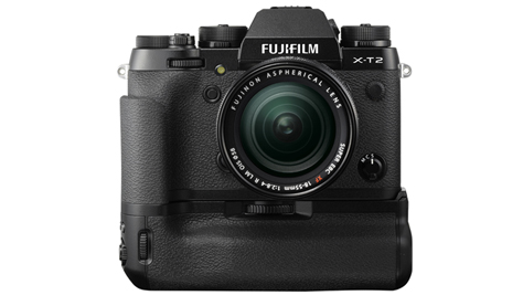
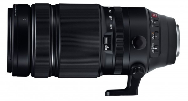
I had just gotten the Fujifilm X-T2, which was designed as an “action camera,” the Vertical Booster Grip, which makes it even more “action ready,” and the XF100-400mm lens. This seemed like an excellent opportunity to put all three to the test and see just how capable these tools were for relatively high speed sports photography.

After all, what better way to test your autofocus tracking system than by capturing races with a long zoom lens at 11 fps when they’re racing directly towards you at over 25mph in strong, contrasting light?

I’ve also been a bike rider for well over four decades, but I’ve never considered myself a “road bike racer.” However, racing with a bunch of dudes who are stronger than you is a great way to stay in shape and keep the heart and legs strong.

Plus, it’s a really fun scene out there, hanging with friends and teammates on a summer evening, riding bikes, shooting photos while standing really close and not trying to be run over, and yes, drinking beers afterward. What’s not to love?

Anyway, let’s get down to business.

When I shoot subjects like this, I’m always trying to change things up by looking for different vantage points, varying my technique and using different lenses. I started with the XF35mm f/2 lens, because even though it’s not really considered an action lens, it’s good practice to get outside of your comfort zone.

As you can see above, the light is nice and strong, with direct sunlight. However, on that backstretch of the loop, there are a coupe of sections where the light is blocked by trees. This creates large areas of shade, or as we like to call them in photography, “Shadows.”

Shooting in the shade doesn’t often make for bold photographs, but shooting against the shade is a technique that can really make the subject pop. Not only do you get that isolation against a solid black background, anytime you put bright colors against dark, those colors appear more saturated.

After trying out a couple of different locations, I found a great spot on the back corner. Shooting straight on with the 100-400 lens, my plan was to capture the racers right as they emerged from the shadows.

Although I had been shooting horizontally, I noticed that if I positioned myself just right, I’d be able to catch them “stacked together” as they drafted off of each other in the downhill turn. For that reason, I decided to switch to vertical, which I felt would play well with three closely stacked racers.

Manual Exposure

I knew that this extremely contrast of light and predominant shadow might make for a tricky exposure. If I used an auto exposure mode, that big wall of dark behind them would likely cause the camera to overexpose the scene, blow out the highlights and reduce the impact of the super bright colors, as it did in the shot below.

Also, autoexposure could very well have shifted things a bit as the riders got closer and filled more of my frame. In this kind of situation, you want consistency with your exposures.

In order to preserve the scene and keep all that wonderful contact, I chose to shoot in Manual Exposure mode. Basing my exposure on the bright sunlight, I set my camera to 1/2500 sec @ f/5.6 at ISO 400. Since I was trying to freeze super fast action with a very long lens, I wanted a very high shutter speed, and bumping up one stop to ISO 400 would give me a good jump with no loss in image quality.

AF-C and Zone Autofocus

The last problem to solve was focusing. The X-T2 has an incredibly capable autofocus system which features highly intelligent tracking algorithms. The XF100-400 lens has twin linear autofocus motors, making it one of the fastest AF lenses in their entire lineup. Although it’s a slower lens with regards to maximum aperture, it has a slightly faster AF motor than the XF50-140mm f/2.8. Both are pro-quality workhorse zooms.

Using Zone AF, I set the camera to AF-C to track the motion. I wanted to make sure I caught the riders before they came out of the shade, so I actually started tracking them while they were still in the shadows. Although the final image shows a background of inky black, the human eye, and the camera, can actually see into those shadows.

I was able to acquire and lock onto the riders, so that when they came into the sunshine, there was no delay. I could fire at will. With the Vertical Booster Grip on the X-T2 and the lens zoomed all the way out to 400mm, I was able to grab at a quick burst of four shots at 11 frames per second.

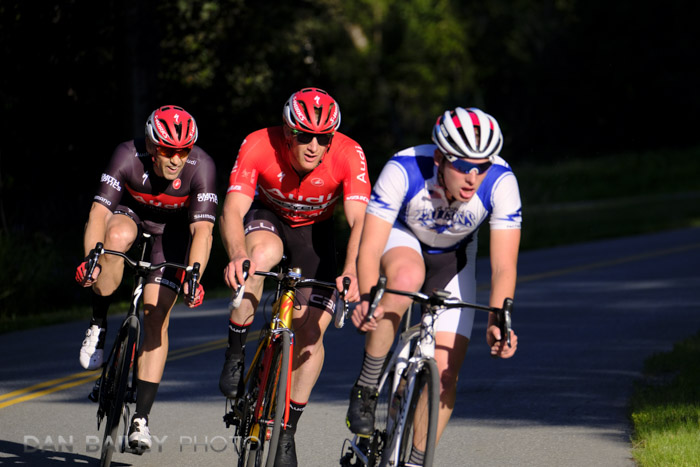
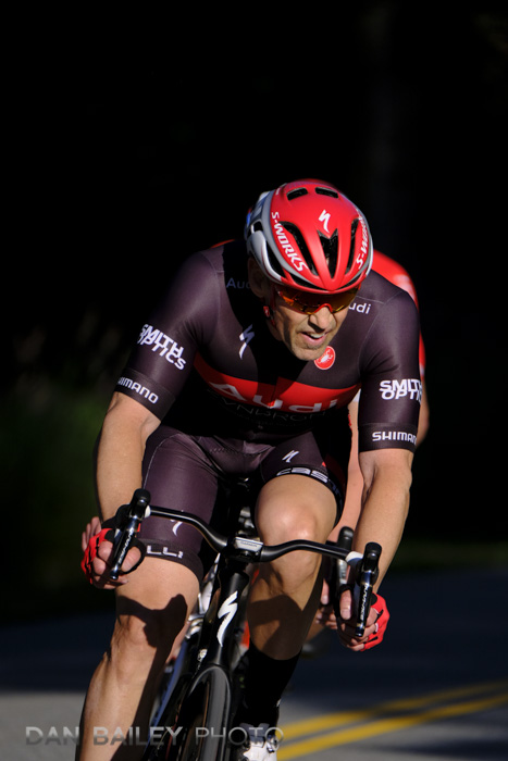
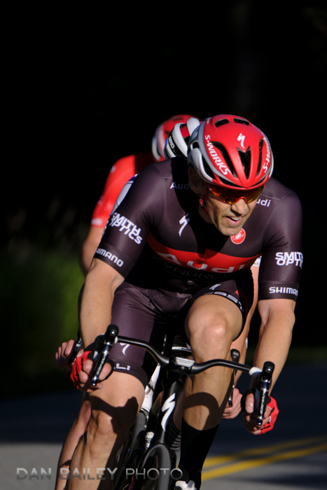
At that speed, even a split second can make a big difference framing. A second later, it’s over. In this sequence, the first frame was my favorite. I felt it had the best body position in the lead rider and the best “stacked” framing of the other two guys behind him.

I parked myself in this location and shot a few more laps, but I never got anything quite as good. The next best one was this last image below, which is significant for two reasons. Not only did the guy in white make his move on the last lap and get the win, he’s the son of my friend John, a fellow photographer and bike rider.

So, to wrap, Manual Exposure, AF-C autofocus and the Vertical Booster Grip on the X-T2 make an excellent combination when you’re shooting sports and action with bold, high contrast light. If you use a different camera setup, then it’s all about bold light and manual exposure.

Ok, your turn. Spring is here and summer is right around the corner, so get out there and shoot some action!!

April 2, 2018
See this post
Behind The Scenes – How I Got My Favorite Road Biking Photo

In my early days as a photographer 20-ish years ago, the ultimate workflow tool was a big light table. I used to fawn endlessly at the double 4-foot bank my friend Paul had at his photo lab in Fort Collins. My “big” lightbox at home was something like 20″ x 12″. I could view two full pages of slides on it. Paul’s setup would hold 10 or 12 pages.

How times have changed. Today’s main visual photography workflow tool is the monitor. As any photographer would say, bigger is better, but that’s not the only concern. For critical viewing, color accuracy and consistency is an even more important concern.

I’ve gone through numerous screens during my career, ranging from the stock Apple CRT that came with my PowerMac 7300, to Apple’s original 15″ LCD flat panel display, which lasted me for years, and my two workhorse Dell monitors.

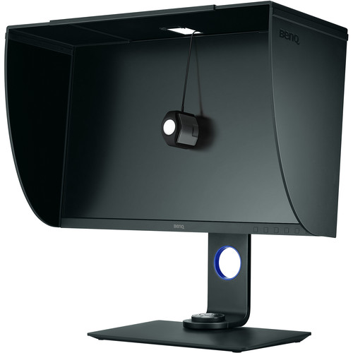
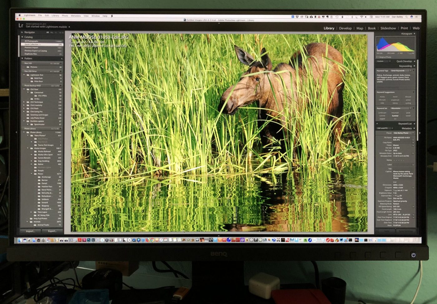
The anchor of my current two-screen setup is the new BenQ SW271. It’s a 27″ IPS display with 3840 x 2160 UHD 4K resolution. It has outstanding color accuracy, supports 99% of Adobe RGB color space, and the large 16:9 viewing size allows for an immersive photo editing experience, whether I’m browsing my catalog, culling a batch of new captures, previewing images at full size or performing creative edits to my work in Luminar or Photoshop.

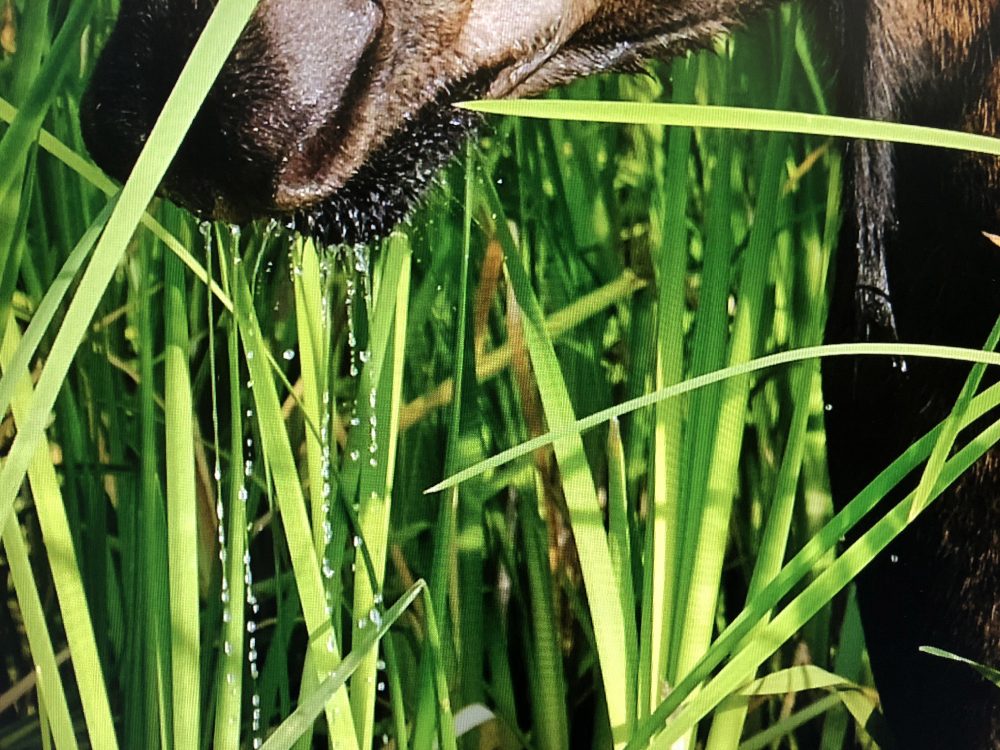
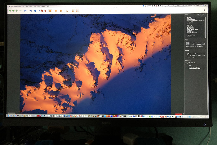
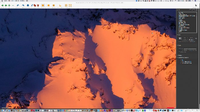
With the SW271, I’m able to view my images with a level of sharpness, clarity and color precision I’ve never experienced before with any of my past monitors. Here’s a full screen shot of the monitor on my desk, taken with my iPhone, and a zoomed-in view of the detail it’s capable of producing:
Main Features

Here are the key features the BenQ SW271

• 27 inches, with a 16:9, 3840 x 2160 4K resolution

This matches the aspect ratio and resolution of 4K UHD devices, which provides exceptional clarity for viewing and working with large images and video files.

• 10-Bit Color Display

The BenQ SW271 can produce more than one billion colors, which ensures extremely smooth color gradations across your images. Most monitors have 8-bit displays, which can only produce 16 million colors.

Although our eyes can’t discern all the colors in a 10-bit image, the additional headroom allows for decreased “stretching” or “banding” when you’re processing images with a lot of color depth. Most modern cameras and printers can produce images with a very high color gamut, so having a 10-bit display allow you to take full advantage of your camera sensor and your processing software.

• 99% of Adobe RGB color space coverage and 100% sRGB color space

This ultra-wide gamut offers vibrant color reproduction across the entire spectrum, ensuring a high level of consistency and true-to-life colors when preparing images for both print and web/on-screen display.

The color palette of Adobe RGB is closer to what the human eye sees, and it’s a larger gamut than the range of colors that sRGB color space contains.

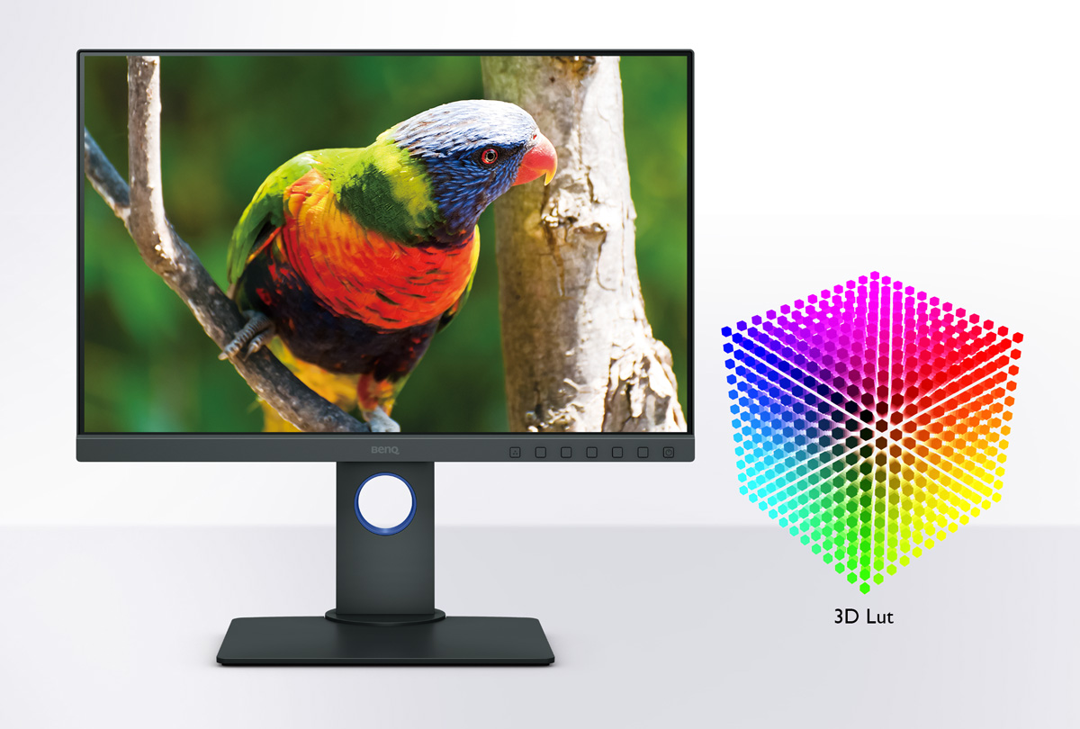
• 14-bit 3D Look UP Tables

14-bit LUT allows for improved color accuracy and extremely fine tonal gradations with both color and BW.
• Hardware Calibration

Using BenQ’s Palette Master Element Calibration Software and a colorimeter, you can calibrate your monitor using the internal image processing chip inside the monitor, which is separate from your computer graphics card. You can also use third party system/software to calibrate with professional-grade results.

• HDR Mode

If you use HDR compatible devices to view content, such as Blu-ray players or Apple 4K HDR TV, the monitor will automatically adjust the contrast levels between black and white to match the output of the device and give you a view that better matches the contrast levels your eyes are capable of detecting when you see the real world.

You can also set your screen manual to HDR Mode to view images with extremely high contrast levels.

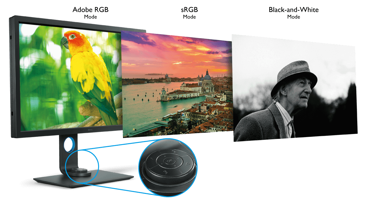
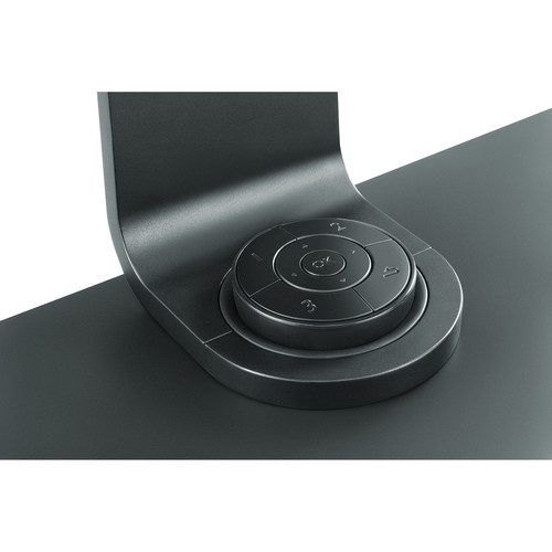
• HotKey Puck, with One Touch Color and Black and White Modes

This is a very handy tool. With a simple button press on the included HotKey Puck, you can view your photos in either Adobe RGB, sRGB or black and white, using one of of three B/W “film presets.” This allows you to easily gauge what your images will look like in monochrome before you make any actual adjustments in your photo editing software.

The Hotkey Puck also lets you control other parameters of the monitor with a single button press. It rests nicely in a built-in next at the base of the monitor stand, although you can make use of the cable and position it in another area of your desk is that’s convenient.
• Included Shading Hood

the BenQ SW271 comes with an easily detachable shading hood that helps you block ambient light and reduce glare, giving you the most color and tonal accuracy possible when viewing your work.

• Wide Computer Compatibility

With a variety of ports, including HDMI, Mini DisplayPort and USB-C and included cables, the BenQ SW271 will hook up to just about any Mac, and Windows systems all the way back to Windows 7. I’m using it on my Mid 2010 MacPro using the Mini Display Port. It also hooks up to my laptop, and with Apple’s Lightning to HDMI adaptor, I can even hook up my iOS devices.

• Dual Gamut and PIP/PBP Modes

The BenQ SW271 allows you to hook up two different computers to the monitor, so you can view your imagery in two different color spaces side by side. You can also use PIP/PBP mode to view the input from two different computers, whether you’re comparing similar images, or working on part of the screen and watching a video at the same time.

• Technicolor® Color Certified

The BenQ SW271 has obtained Technicolor’s certification for color accuracy and consistency. It meets the strict standards that are used in Hollywood and throughout the entertainment industry for professional media productions.

Setup, Calibration and Use
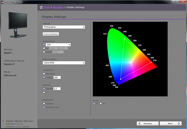
 

Setting up the display was very easy. After you clear a space on your desk that measures 24″ wide, its plug and play. With a variety of connection options, you can have it up and running in minutes. Then it’s just a matter of deciding whether you want to use the included hood. I haven’t installed mine yet, due to lack of desk space and the proximity of my other monitors.

As with most modern displays, you can swivel the SW271 and use it as a vertical display. This allows you to view vertical photos, such as portraits, with an incredible level of clarity and wow factor. You can also mount it to a wall.

In addition to your input connections, the SW271 also has 2 USB ports and an SD card slot on the left side, just like my Dell has. My only complaint is that the ports are recessed about four inches behind the screen, so they’re kind of hard to reach. It would be nice if they were flush with the screen.

The next step is calibration.

BenQ’s proprietary calibration software is called Palette Master Element. It ships with the monitor, but it can also be downloaded from their website, along with a helpful How To guide.

Once you fire up the software, it’s pretty straightforward. The accompanying How To guide will walk you through the process. As I mentioned above, the system works with the processing chip inside the monitor, which is separate from your computer operating system, and it allows for a variety of calibration options and color temperatures.

You can also calibration the SW271 with third party calibration software, such as the X-Rtie i1 and Datacolor Sypder 4 and 5 systems. (The X-Rite ColorMunki is currently not supported.)

I use the Datacolor Spyder5Elite system because it has a “Studio Match” option that easily lets me match colors across my two displays. I find the Sypder5Elite to be an excellent alternative to Palette Master Element.
In Use

I’ve been using the SW 271 monitor for about two months now, and I’ve been nothing short of impressed at how well it performs in professional applications. The color reproduction is amazing and the clarity and sharpness exceed any monitor I’ve ever owned.

With cameras and video capture devices that produce increasing larger file sizes and image processors that are better able to render the wildly varying levels of colors in the world, a large, high resolution monitor like this is an absolutely essential tool for any serious photographer.

Given the diverse subject matter I shoot, I’m capturing everything from the extreme high contrast and hot colors of my sunset mountain aerials, to muted tones of quite, misty landscapes to skin tones, products, the color palettes of the Fuji film simulations and even black and white.

Accurate color reproduction is key, as is the ability to view the entire image at both full screen, and in zoom, or crop modes. In addition, with the level of detail that today’s lenses can resolve, a large monitor makes it considerably easier to critically examine your images on the pixel level.
Another thing I really love about the SW271 is that it has a matte screen. As much as I loved my original Apple LCD, all their current displays have a glossy cover on their screens, which makes for an excessing and unacceptable amount of reflectivity.

Not everyone has a perfect work environment, including me, and unless I were to block out my windows, which is never going to happen, I’d never be able to use a glossy screen. As powerful and convenient as they are, this has made the iMac an unworkable option for me.

The matte panel on the BenQ SW271 looks bright and clear, and it has minimal reflectivity, even in my office, where I sit with a window about 7 feet directly behind me. Although I’m forced to close the blinds on those brief winter days when the sun shines right in, on a regular, bright sunny day, I’m still able to see the monitor clearly with very little distraction from the reflecting window light.

Although it’s capable of running with a max resolution of 3840 x 2160, I often run it in 2560 x 1440 mode. This makes it more a bit more seamless when I’m swapping windows and files between this one and my 1900 x 1200 Dell, and it makes “general computing” quite a bit easier.

However, it’s easy to switch, and during a critical editing session, I’ll occasionally bump the res up to full size for maximum sharpness.

Although the documentation states that lower resolutions are displayed through an interpolation circuit, and can result in image blurring across pixels, I haven’t seen any loss of quality at 2560 x 1440. Image still look awesome at this resolution, and for most photo editing, I find this setting to be more than adequate.

Overall Thoughts

BenQ is an interesting company. They make very high quality displays specially designed for different uses, such as photography, graphic design, video post-production and gaming. Each type has a very specific set of calibration controls, viewing options and color management.

The SW271, being a photography specific monitor, performs extremely well in a high-end photo editing workflow, and it also meets the needs of today’s photographer/videographer who shoots a variety of stills and 4K video.

In my two decades as a pro photographer, it’s the best monitor I’ve ever used. Between the size, the clarity and the color accuracy, and its simple, professional styling, it’s been a welcome addition to my workflow and an invaluable tool for reviewing and editing my photographs.

The SW271 is also a great value. While it costs more than the average 4K LG or ASUS monitor, it’s actually less expensive than Dell’s 27″ 4K display, and almost one third the cost of the Eizo 23″ 4k screen. And as I mentioned above, the SW271 USB Type C compatible right out of the box, so you can hook it right up to your brand new MacBook Pro without needing an extra dongle.

When you consider just how vital a good monitor is in your photography life, a slightly more expensive monitor is certainly worth it. The reality is that a good monitor costs less than your camera, but your display will probably outlast your current camera, and maybe even the next one.

If you’re looking for a high quality 4K monitor for photo editing, video editing, color grading or any other kind of critical photography work, the BenQ SW271 is an excellent choice.

For more information about the SW271, check out BenQ’s website or visit their Facebook Page here.

[iframe]<iframe width=”120″ scrolling=”no” height=”240″ frameborder=”0″ style=”border:none;” border=”0″ src=”https://mer54715.datafeedfile.com/widget/aff_widget_prdt_generate-2.0.php?aff_num=6746&aff_net=1&widget_num=8058&sid=” marginheight=”0″ marginwidth=”0″></iframe><iframe style=”width:120px;height:240px;” marginwidth=”0″ marginheight=”0″ scrolling=”no” frameborder=”0″ src=”//ws-na.amazon-adsystem.com/widgets/q?ServiceVersion=20070822&OneJS=1&Operation=GetAdHtml&MarketPlace=US&source=ss&ref=as_ss_li_til&ad_type=product_link&tracking_id=danhbaisadvph-20&marketplace=amazon&region=US&placement=B076CTL3BD&asins=B076CTL3BD&linkId=cc470303f32375e9a86958d8c98b5873&show_border=true&link_opens_in_new_window=true”></iframe>[/iframe]
March 27, 2018
See this post
Review of The BenQ SW271 27 Inch 4K Wide Gamut Monitor

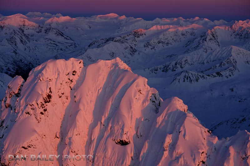
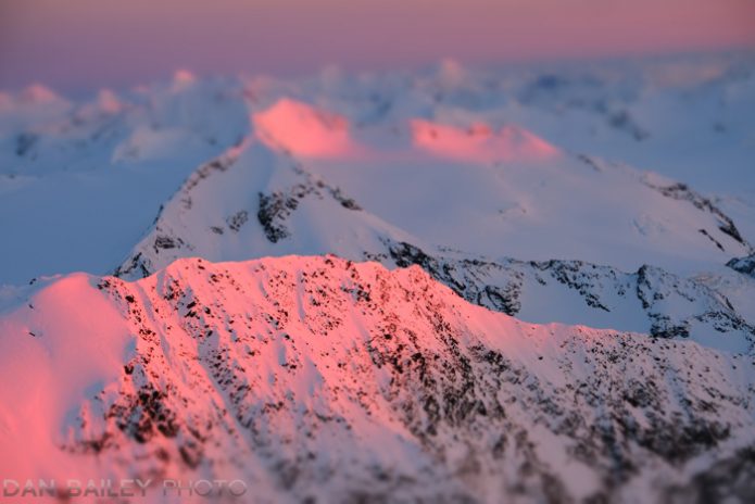
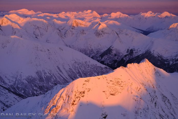
Many photographers know the term “Alpenglow” to be that magical reddish, pink light from the setting sun that’s visible on the high mountain peaks during those last few moments of the day. It’s the light we all live for. It’s the golden rainbow unicorn for people who like to shoot landscapes.

Originally derived from the German word Alpenglühen, to describe this special occurrence of light seen on the Alps, the term Alpenglow was brought into vogue by giants like Galen Rowell, who influenced an entire generation of outdoor photographers, myself included.

In Tyrolean legend, it’s said that King Laurin, ruler of the dwarves built a rose garden on the mountain entranceway to his underground fortress. During an event where he was scorned by not having been invited to the wedding of the beautiful princess Similde, Laurin cursed his Rose Garden, proclaiming that “Neither by day nor by night should anyone again glimpse this lovely sight.”

However, he forgot to specify that time day and night: Twilight, and so it is only during dawn and dusk when the wonderful pink glow of his rose garden can be seen on the sides of the mountains.

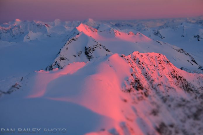
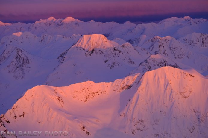
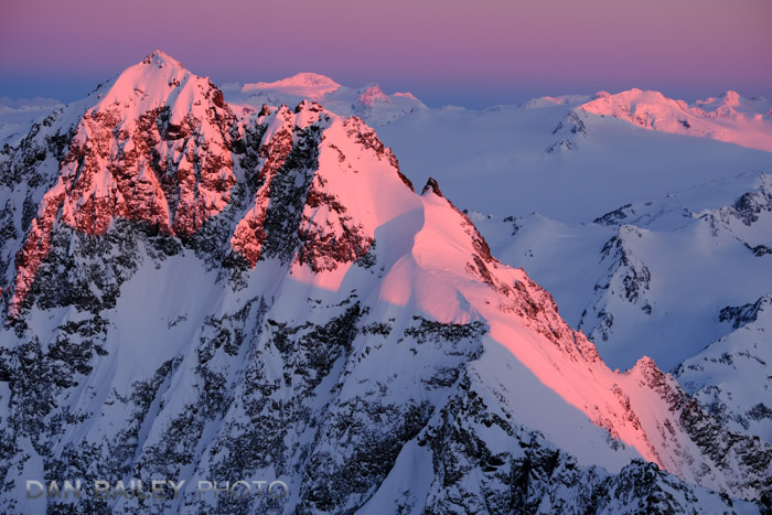
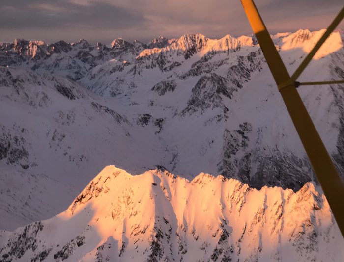
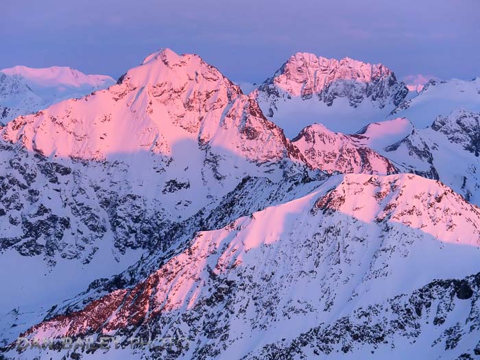
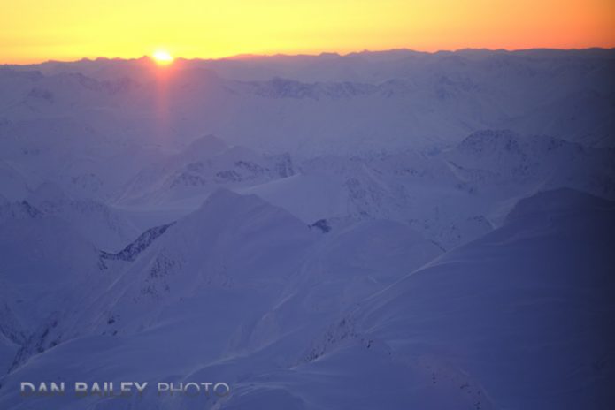
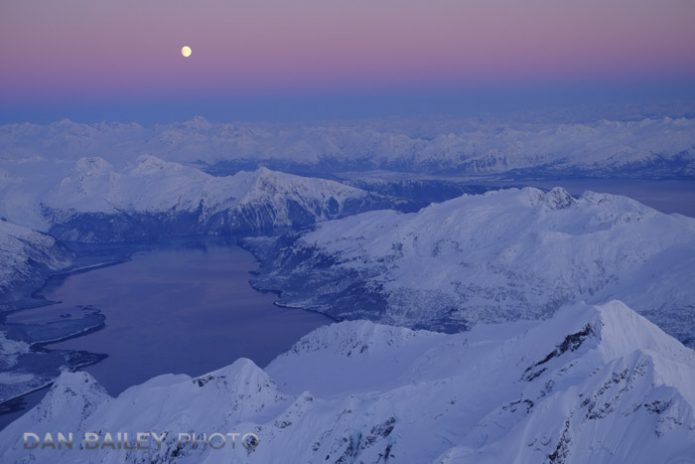
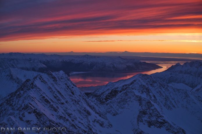
Aerial photo of the Chugach Mountains at sunset.

Dwarves and fairly tales aside, what exactly is Alpenglow? The current accepted definition of Alpenglow is that it’s an optical phenomenon that occurs as a reddish glow near the horizon, most visible on higher elevations and peaks opposite of the sun “when the sun is below the horizon.”

This theory says that after sunset, there is no more direct sunlight on the mountains, but the existing ambient, or indirect light is reflected and scattered off moisture, ice crystals and other airborne particles in the lower atmosphere, which causes that special pink and red glow on the mountains.

Thus, true Alpenglow is defined as a form of Indirect Light, and is different from the direct light we see just before sunset.

However, I’m not so sure that’s accurate

In fact, I will be so bold as to challenge the accepted definition and state that Alpenglow is actually caused by Direct Light. 

As you probably know, the warm, red, orange and yellow light of sunrise and sunset is caused by the longest wavelengths in the visible spectrum of electromagnetic energy. When the sun is low on the horizon, its light skims across the surface of the earth and passes through all the particles in our atmosphere.

The short blue waves of light are easy scattered by all those particles in the air, leaving only the longer red and orange light waves to make it all the way through to our eyes. This is the light we see at “Magic Hour,” and it’s the light we all crave as photographers. It’s the light that makes entire careers.

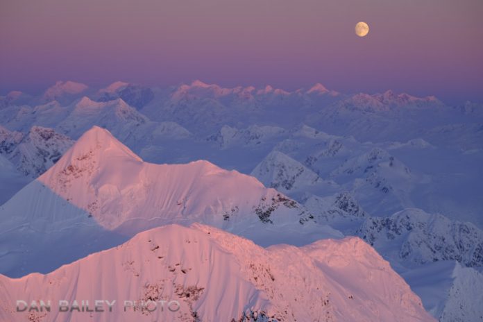
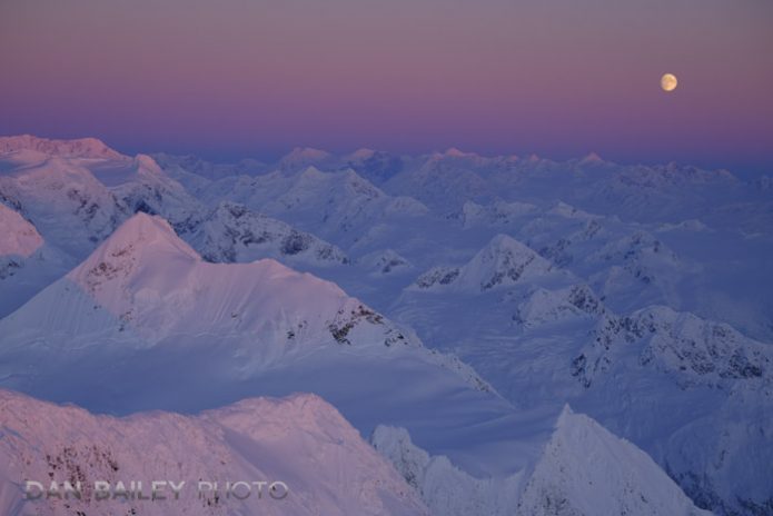
After sunset, the dim blue light of twilight, also know to photographers as “Blue Hour,” rises and pushes the band of pink higher into the sky. The defined blue line, which you can see in the two photos above, is actually the shadow of the earth, which rises as the sun dips below the horizon. That pink light above the line is actually the part of the sky still being hit by the direct sun, it’s just higher than anything on the planet.

Here’s Why I Think That Alpenglow is Caused By Direct Light

I have a secret weapon that I use to confirm my ideas on this matter: a 1947 Cessna 120, which I use to shoot aerials over the mountains at sunset. I often do my aerial photography in the winter and early spring, when the mountains are still covered in snow. This gives alpenglow and evening light the most pronounced look.

When I head up into the sky, I often fly around and photography mountains that can be seen from town. These are the same mountains I can see from my street.

Let’s say that on a given afternoon, my wife is standing on our front porch, looking at the mountains right after sunset, when the sun is no longer visible in the sky. She can see the brilliant pink light hitting the mountains of the Chugach Front Range. By definition, she is witnessing the stated phenomenon of Alpenglow.

If I’m in my little Cessna, flying around the mountains at the very same moment, I’m seeing that exact same pink light. It’s even more vivid and brilliant, because instead of being 10 miles away, I’m right up there next to the peaks.

But the thing is, I can still see the sun, because it still has not set for me. I’m seeing Direct Light on the peaks, which is creating that very same pink light my wife is witnessing on the ground.

How can this be?

It’s rather simple. The sun sets at different times at different altitudes. If I look at the sunset calculator, and plug in the Lat/long coordinates for Anchorage, Alaska, and enter the altitude for my street, about 39 meters, it shows a sunset time of 6:04pm.

If I then plug in for altitude of 2,133 meters, or 7,000 feet for the same location, which equates to my vantage point the plane when when I shot this picture below of Eagle Peak and Organ Mountain, it shows a sunset time of 6:11pm; a seven minute difference. 

Given the position of light on these mountains, it still be another 5 or so minutes until the sun has official set on the summits of these peaks.

Alpengow aerial photo of Eagle Peak, Chugach Mountains, Alaska

This means, my wife, who is watching from our porch, will see the Indirect Light of Alpenglow for about 10 minutes after the sun has set from her perspective, while at the very same time, I am witnessing the exact same illumination as Direct Light.

In addition, from my experience shooting sunset aerials, as soon as the sun disappears from my view, the pink light is gone. Even though the light is often the most brilliant during those last few moments of sunset, as soon as it dips below the horizon, that gorgeous light fades and

So, my hypothesis is that it’s a matter of perspective. Just because you can’t see the sun from your position on the ground, doesn’t mean it’s not still shining directly on the higher elevations.

In my mind, this debunks the traditionally accepted definition of Alpenglow as being a form of indirect light, because most people who see it are standing on the ground.

Here is a series of photos to support my hypothesis:

Shot at 3:41pm, at the peak of brilliant, direct sunlight.
Shot at 3:43pm, as the brilliant, direct light is beginning to fade.
Shot at 3:48pm, just as the sun is about to fall below the horizon.
Shot at 3:50pm, one and a half minutes after the sun has set. All color is gone from the peaks.


I’m not the only person who thinks this way. Gary Crabbe, who worked with Galen Rowell for seven years, also shares my hypothesis that Alpenglow is indeed a form of Direct LightAlso, on the Talk:Alpenglow page on Wikipedia, one person argues this fact:

“To say that Alpenglow occurs after the sun goes down is like stating that you can break up a ray of light using a prism, without shining the ray of light.”

On the same page, another user references this picture of Mote Viso, by Stefano De Rosa as proof that alpenglow occurs without direct light, stating that there are no shadows present, which indicates that this is indirect light.

However, if you look closely at the picture, you can indeed see defined shadows on the upper ridges from light that’s coming in from the left. They’re faint, but that’s because they’re being viewed through 40+ miles of air and haze.

Also, while the Basilica of Suerga in the photo sits at a mere 672 meters in elevation, the entire east wall of 12,602 foot high Monte Viso sits well above the 2,700 meter mark, which means that the entire east face of the peak could be hit by direct sunlight well before the light finally touches the basilica.

And, in nearly every example picture I see of “Alpenglow” around the web, you can see a defined line between light and shadow. If there’s shadow present, then you’re looking at direct light.

Last light on the summit of Organ Mountain, Chugach Mountains, Alaska

My aerial photography has prompted me to pondering this notion for awhile now, and while searching the web the other day, I came across this alpenglow post on Photo.net, where Gary insists that if you stood on a ladder high enough to be at the same level of the peaks, you would indeed see the sun.

This is further confirmed by the fact that long after sunset, we can still see vivid color in the clouds. Again, if you were on a ladder at the same height as the clouds, you would see the sun. Again, Direct Light.

Although no one actually has a ladder that tall, an airplane serves the same purpose. Gary, who has a keen interest in astronomy, also states that it would take a much greater mass than the earth to warp gravitational space enough to bend lightwaves.

If this is indeed true, (If only we had time to ask Stephen Hawking his opinion on the matter. R.I.P, Dr. Hawking), then what we consider to be the traditionally accepted cause of alpenglow would therefore be impossible.

Direct light on the underside of the clouds, visible after sunset.

Should You Be Concerned by Any of This?

Of course not. Whether Alpenglow is accurately defined as Direct or Indirect light has absolutely no bearing on the wonderfully magical experience of shooting at sunrise and sunset. It has no effect on your ability to create stunning images of the landscapes during those special moments when the sun hovers at the edge of the horizon.

It doesn’t challenge the accepted notion that these can be the very best times to make photographs, or even just to stand there outside in awe at the natural world, whether you have a camera in your hands or not. Either way, I’m pretty certain that getting up early or staying outside late enough to witness this beautiful light will have a positive effect on your photography, as well as your general well being and overall outlook on the world.

This hypothesis, and the ideas that Gary and I put forward, are the stuff of science, semantics and philosophy. They’re the musing of curious minds, and, of course, a blatant excuse for me to show off my pretty pink mountain pictures.

So, what do you think? I’d love to hear your opinion on this, since I’m effectively debunking a longstanding definition about a very closely held topic for outdoor photographers everywhere. I certainly welcome healthy debate on the subject.

However, as Peter West Carey says is in alpenglow post on Digital Photography School, getting too much in a tizzy about the correct labeling of direct and indirect sunlight means you should probably step away from the computer and go should some photos. I take that as very good advice!

Let me know your thoughts.

Aerial photo of the Chugach Mountains at sunset.

March 15, 2018
See this post
Challenging The Traditional Definition of Alpenglow

Attention “serious photographers,” you should probably look away. You’re not going to like this, as it’s little off the rails from what you’re used to doing, but I make no apologies, I’m posting it anyway.

The other day, I decided to dig in and try some of the different presets in Luminar 2018, just to see what I could come up with. You know, to be extra creative. Instead of just tweaking the highlights, vibrance and clarity like we always do with so many shots, I was in the mood to come up with something a little different.

That’s when I came across Nicole S. Young’s Parchment Preset pack, which was included in the initial launch of Luminar 2018. If you purchased and downloaded the program right around launch time, then you should have them too. (If not, or if you never got the download, you can grab Nicole’s Parchment Preset pack right from her webstore.)

I’ve used the Dramatic Presets, before, and they can be pretty fun, but I’d never used any texture presets in Luminar, or in any other software. That’s usually not my style. I tend to go for straight image making with little processing.

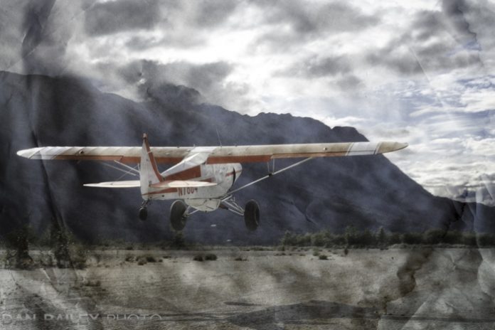
However, as artists, we should never be closed off to new ideas and creative experimentation, so I fired up Nicole’s Parchment Presets and started playing around with the different textures. Initially, I thought, “meh, not for me,” but as I dropped those unnecessary inhibitive barriers in my mind, I began to see the potential. I actually liked what I was getting.

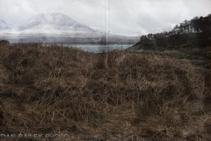
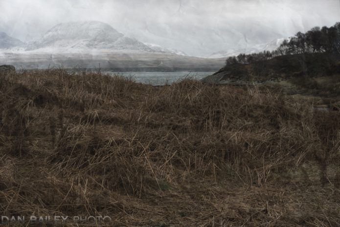
This image of the mountain landscape above was the first one I tried it with, and I quickly found a texture I liked. It’s an image I shot recently during my trip to Islay, looking across the bay towards the Isle of Jura. I felt that the muted color scheme and moody feel of the image worked quite well with the texture.

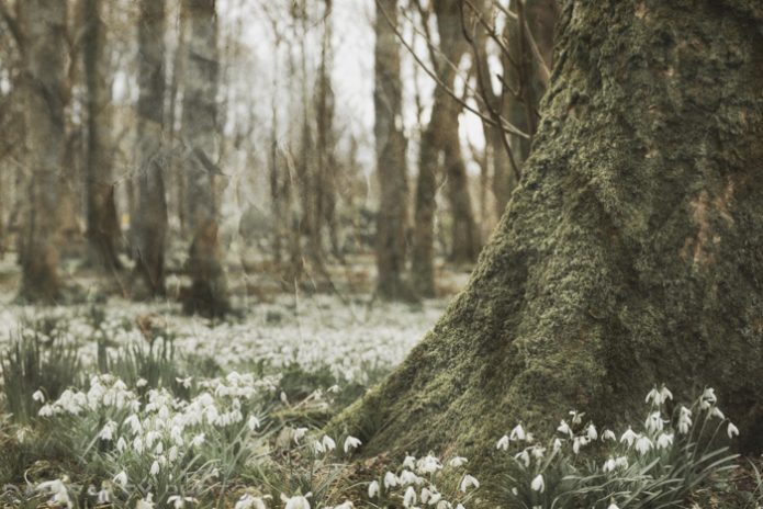
I decided to post the finished version on the Skylum Facebook Group page, just to get it out there. As I suspected it might, the picture garnered quite a collection of interesting comments and critiques. One person wasn’t so keen on the “folded page” line down the middle effect, so I went back in, chose a different preset and posted this one below.

What do you think? Is there one you like better?

Of course, the obvious question that begs to be asked is “why?” This style of processing is all new to me, and as I indicated above, most “serious photographers” would, in all likelihood, not be the slightest bit entertained by this.

That’s actually too bad, because it’s those people who need the most help. Those are the ones who could use a massive dose of fun-ness in their creative process.

My answer is the same as it always is. Because it’s fun. As I’ve said many times before, creativity should be fun, and it should be open to an unlimited variety of ideas that can propel your artistic process in new directions.

Photography is about personal artistic expression, it’s not a contest that revolves around extreme sharpness, vivid colors and the lowest noise possible in our imagery. It’s about what YOU like and what evokes a mood within you or your viewers.

Tools like this, and any of the other presets found in Luminar and other photo software are designed to provide inspiration. They’re like playing new chords or mixing different color paints, or picking up a new instrument or brush that you’ve never tried before, and seeing what comes out.

I love how easy Luminar is to use, it’s been my processing software of choice for over a year now. It’s packed with a huge selection of tools that vary from straightforward image correction/enhancement tools to stylistic creative tools that can help you take your images down totally different roads.

These parchment textures are just one example, and as with any of the other Luminar presets, you can dial them up and down to your liking and combine them with any of the other tools and filters included in the program. Will I use them all the time? Hardly, but they’re there if I need them, when inspiration strikes.

If you haven’t seen my full review of Luminar 2018, you can read it here. And again, if you don’t have Nicole’s Parchment presets included in your version, you can grab them from her website. 

If you haven’t checked out Luminar, learn more about it here. Also, you can use this special coupon code DANBAILEY to save $10 on the program.

March 14, 2018
See this post
Using the Parchment Texture Presets in Luminar