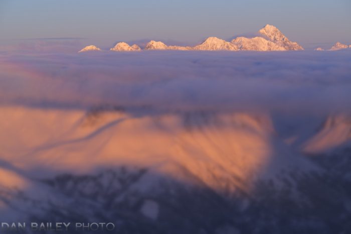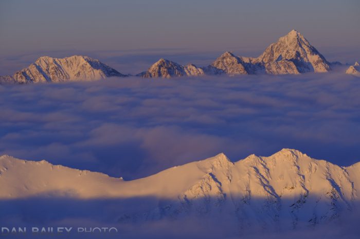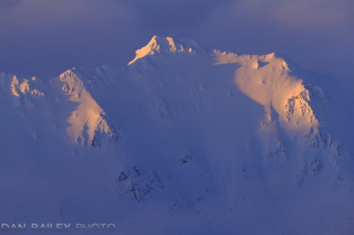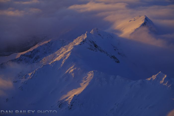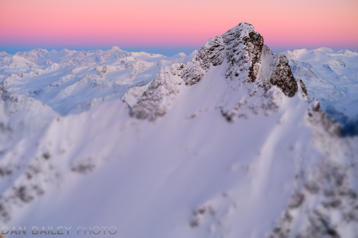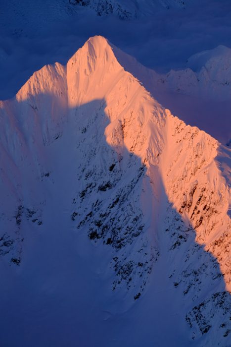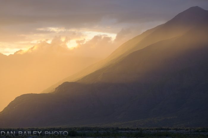
If you’re a regular reader, you know that winter is my favorite time for shooting mountain aerials here in Alaska. On clear afternoons, the low sun casts warm pink and orange light on the snow covered peaks, yielding magnificent views, allowing me to capture what I feel are some of my best landscape images.

After a few straight weeks of overcast skies and ice fog, and two failed attempts to go flying, I finally shoveled out the Cessna and got back in the sky.

As I often do, I headed towards the Chugach Mountains, which are my favorite aerial subjects around Anchorage. With so many valleys to explore, it’s simply a matter of picking a direction and chasing what seems to be the best light.

I started by heading north and climbing along the west side of Pioneer Peak, which sits near the head of the Knik River Valley. Looking north, I saw a thin layer of clouds hanging over the valley at about 6,000 feet, partially obscuring the lower regions of the mountains that lay to the east.

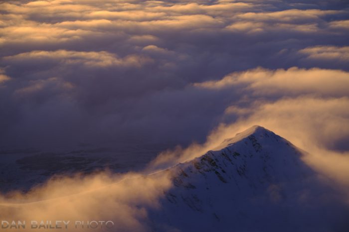
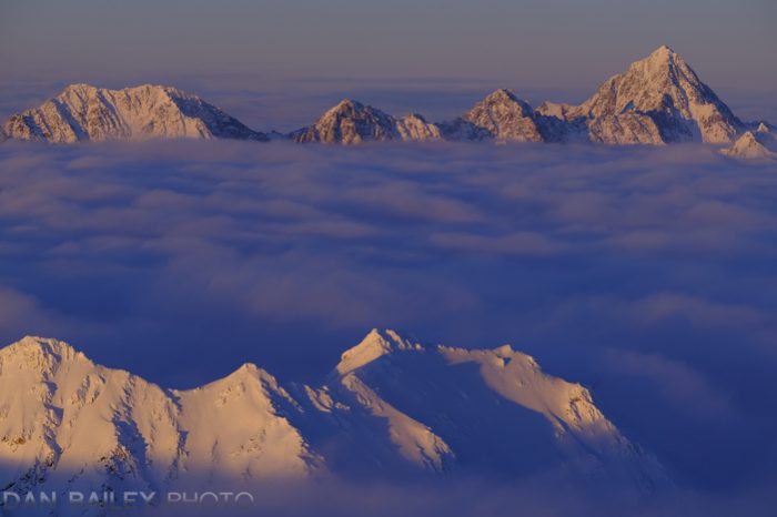
The tops of the taller peaks poked up through the clouds, like islands hovering above a sea of fog. As I crossed the flanks of Pioneer’s southeast ridge, I caught the full view of this cloud layer which now hung over the entire Knik valley. Scores of high peaks stood isolated in this mystical alpine ocean, their tops being lit by the increasingly warm light of the dropping sun.

I’ve flow over this area countless times in all seasons, during every month of the year, but I’d never seen it like this before. It was like some magical, otherworldly place where I’d never been. I felt as if I was flying in a whole new place.

Looking down, I could barely see the Knik river or glacier; aside from a few small holes, I was completely isolated on top of the cloud layer.

Keeping my eyes open for a good vantage point to capture this impressive scene, I was drawn to Peak 8675 and its rugged massif of neighboring summits. A few miles to the southwest, I saw a second set of isolated peaks sticking up through the clouds as well.

Although not nearly as high, I felt they would contrast nicely against the taller, more forbidding mountains in the background. Starting with the XF90mm f/2 lens, I flew alongside the closer ridge, opened the window and shot a series of frames lining up the two sets of peaks.

The -10 degree air quickly pulled all the warmth out of my hands and fingers, even through my thick gloves. Although I’m well practiced with this kind of shooting, it’s still a shock on these very cold days. It becomes a constant battle of getting good shots and fighting the pain of freezing digits.

Reaching into my pocket, I opened a pair of hand warmer packs and stuck them into my gloves. That would help, but at these temps, it isn’t a magic solution. Like I said, it helps. Huge mittens would be warmer, but that would make it really difficult to handle the camera.

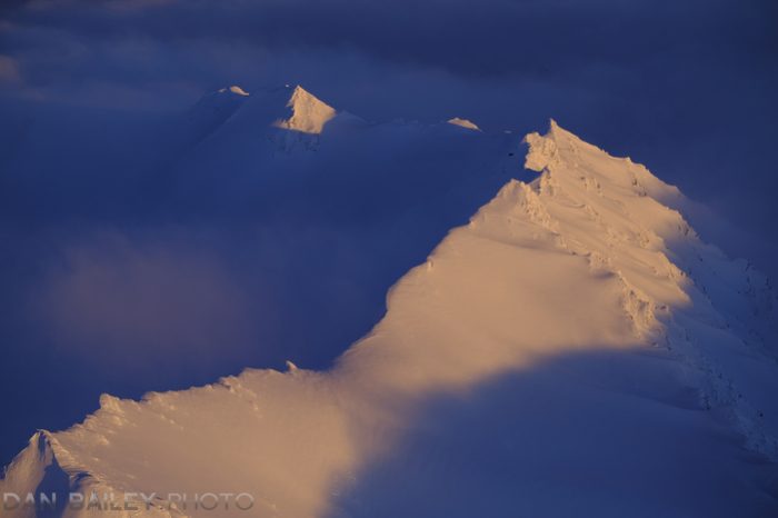
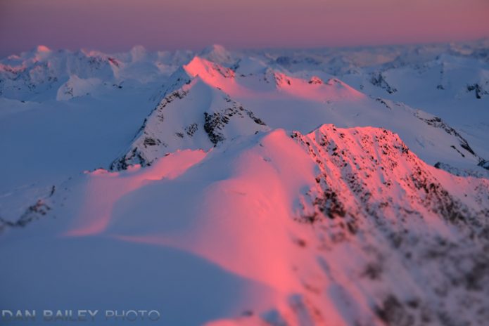
I really liked the juxtaposition of the two sets of peaks. My favorite is the lead-off shot at the top of the post. However, there was something intriguing about this smaller island, so I flew a full circle around it, shooting 22 frames from different vantage points.

I loved the way the warming light on the snow contrasts with the deep blue of the shadows. The Velvia color palette portrays this so well; it’s a look I’m endlessly fascinated with. As my vantage point shifted to straight west, the clouds became a heavy blanket of gold against that last summit in the line.

After my pass, I pulled the window closed, rubbed my hands together and turned the plane south. The good light was only just beginning and I continued to shoot more aerials for the next 45 minutes as the colors turned to bright pink.

I’ll save those images for a future post though. Stay tuned…


January 16, 2019
See this post
Islands In The Sky – Aerial Photography Above the Clouds

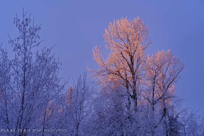
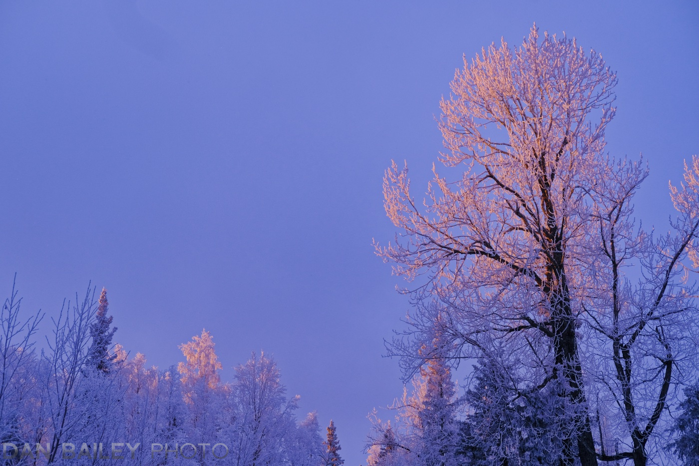
It’s almost like clockwork. Right at the beginning of January here in Anchorage, we often get days of ice fog and very cold nights, which leaves a thick layer of hoar frost on all the trees. It’s a beautiful sight; so surreal. My friend refers to this time as Anchorage being in “full bloom.”

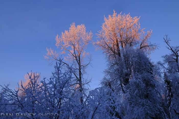
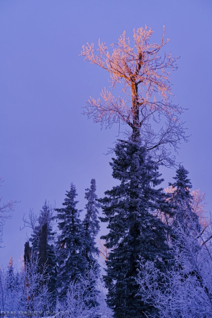
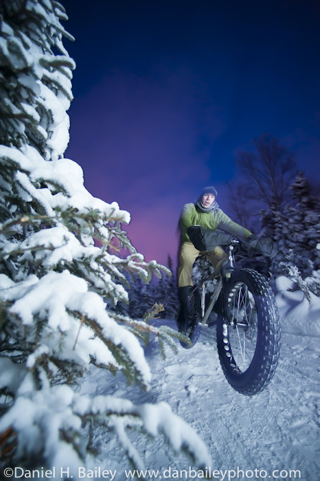
One one particular day two years ago, January 4th to be exact, I was exploring the local trails on my snow bike. The air was a brisk zero-ish degrees, and on this clear afternoon, the light was low and bright as it cast its warm glow upon the thick winter landscape.

As my good fortune would have it, I popped out into a clearing just past 4:30pm, just as the light was about to hit its peak. Hopping off my bike, I pulled my X-T2 out of my camera pack and shot a few photos of the pink, orange light that was kissing the treetops.

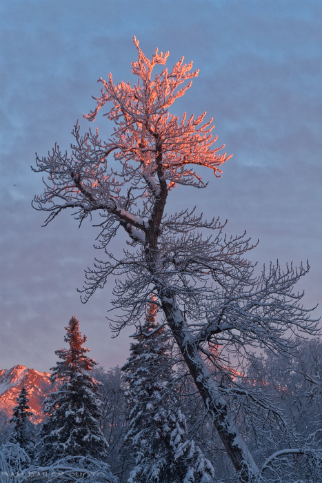
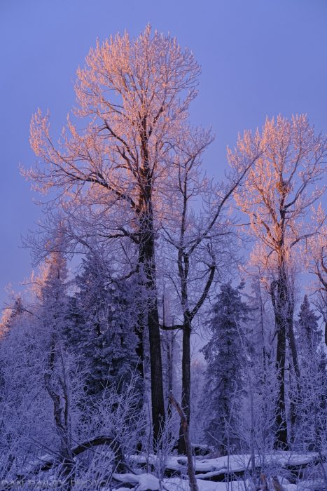
The image above was shot that day, as was this image below, which I love so much, that I included it as one of the featured examples in my brand new eBook, Behind The Landscape. 

Later that week, I wrote a blog post called You Never Know What Kind of Magical Light Will Befall You, which celebrated this kind of incredible and often fleeting rendezvous we occasionally have with amazing light when we’re out in the world.

Fast forward to this past Saturday

January 5, to be exact. I was out exploring the trails on my snow bike under a fresh blanket of hoar frost that had built up the night before. The ice fog hung heavy over Anchorage, so I hadn’t stopped to take any photos during my ride.

However, as luck, serendipity, good fortune, happenstance, or by some happy coincidence would have it, I found myself approaching the very same clearing in the woods just after 4:30pm.

As it often happens, the fog had begun to lift just before sunset, and I suddenly caught sight of a flurry of pink treetops through the forest above me.

I smiled to myself as I crossed that very same bridge across the creek and found myself in the very same place, during the very same time, just one day away from the very same date when I captured those photos two years ago.

Hopping off my bike, I grabbed my camera, the X-T3 this time and spent a few minutes tromping through the snow capturing photos of the magical light before it faded. I only had a single lens with me, my XF35mm f/2, so I wasn’t able to shoot the exact same vantage points and compositions, but I did recognize the scenery, including that notable tree that earned a place in my eBook.

What are the chances? Have you ever experienced this kind of event when magical light repeats itself?

January 7, 2019
See this post
When Magical Light Repeats Itself

Happy new year! Now that 2018 is officially a wrap, it’s been fun to look back and remember all the adventures, projects and fun times that the past year brought.

With my 50th birthday trip to Islay, 2,674 miles of bike riding including 206,900 feet of climbing, numerous events at camera stores around the country and the chance to meet so many of you guys in person, the X-T3, some fantastic flying opportunities, the paperback edition of X SERIES UNLIMITED, my new landscape eBook, lots of memorable images and a super fun Fuji Summit in the Great Smokies, 2018 will be a tough act to follow. I hope this is the same with you.

I always enjoy looking back and seeing what I wrote during the past year. In chronological order, and to recap and highlight articles you might have missed, here are my 10 favorite blog posts that I published during the 12 months of 2018.

1. The 5 Lenses I Used Most in 2017

I included this one because it’s a concise look back at what I shot the previous year and the lenses I used to create some of my favorite images from that period. It’s always fun to review older images and see how your vision and technique evolved over a particular stretch of time.

2. Don’t Fall Into This Trap With Your Photography 

This was my “public service announcement” from last February, and it resonated strongly with readers. In this insightful and inspiring post, I encouraged photographers to avoid falling into the “technical trap” with photography, and focus on what really matters in our craft.

It was a reminder to embrace the joy, the wonder, the light, the moments and the people that excite us in and compel us to lift our cameras. Those things matter so much more than pixels, noise, ISO Invariance, sensor size or what camera you use. Hopefully this post can help you align your photographic priorities for the coming year. 

3. 28 Years Later…

February 2, 2018 marked my 28-year anniversary of when I bought my first real camera and began my amazing journey with photography.

In this post, I share a few of my old images and spoke of a time when things like email and Instagram didn’t even exist yet, when I still used this thing called film, which came in little metal cans, stamping and captioning slides by hand, and falling in love with Veliva for the very first time.

I ponder what it might have been like as an outside to watch young, 22-year old Dan Bailey become enamored with photography and follow it with such enthusiasm for nearly 3 decades. What an exciting journey it’s been.

4. Challenging The Traditional Definition of Alpenglow

In March, I wrote a long post explaining exactly what Alpenglow is and where the term originated. I also challenged what many people accept as the common definition of Alpenglow and used my experiences photographing mountain sunsets from the air to back up my hypothesis.

This post provoked a great deal of discussion and polite arguments in the comment section and on social media. Is my hypothesis right? I can see it both ways. What do you think?

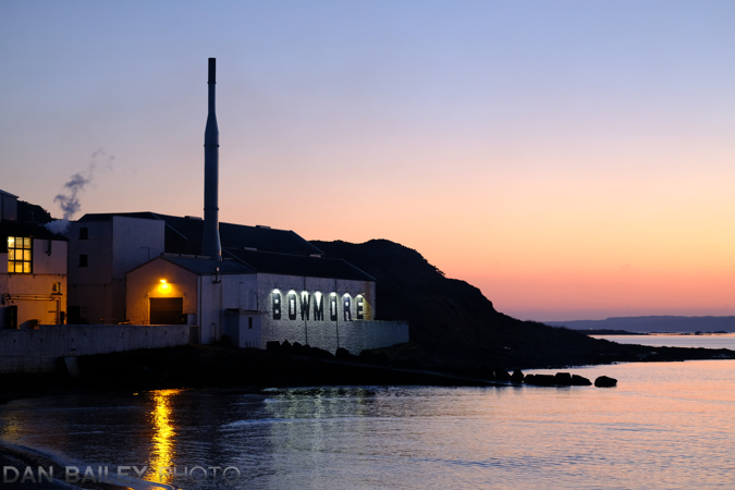
5. Sunset over the Shores of Bowmore on the Isle of Islay

I celebrated my 50th birthday this past year with a weeklong trip to the Isle of Islay off the west coast of Scotland. Islay is where the really peaty, smoky scotch whisky comes from, and being a newfound whisky connoisseur, I enjoyed visiting and touring all 8 distilleries on the island.

This post was more of a travelogue that touched on whisky production, memories of a similar pilgrimage to Spain 15 years prior, and capturing photos of the area. When I was younger, I wanted to be a travel writer. I even took some travel wiring courses after college. Fortunately, my blog allows me the perfect outlet to practice those skills and produce my own self-directed traveling writing stories and photo essays.

6. Using Bold vs. Subdued Colors in Your Photography

I’m endlessly fascinated by the notion that photography is a representational art form. In a handful of “tips” articles I wrote last year to discuss this concept, I shared my ideas about how photographers can express their creativity by using different techniques to add variety to their images.

In this post, I talked about the effects of using bold and subtle color palettes to tell specific stories about your subject matter. Whether you do this in camera or during the processing stage, you can use these ideas to impart a unique look to your photographs.

7. The Coolest Action Photo I’ve Ever Shot

On September 22, 2018, I captured the coolest action photo I’ve ever shot in my 22 years as a pro adventure and outdoor photographer. Made with the new Fujifilm X-T3, I was so excited by this image, I wrote a long blog post talking about how every single technique, creative idea and camera skill I’ve ever learned has led up to this point.

From that standpoint, it would only surmise that right now, I am the best photographer I have ever been, and are thus capable of capturing the best photo I’ve ever made.

I really enjoyed writing this article and exploring the ideas of practice, experience, learning, constant improvement and striving to be the best photographer you can possibly be. I hope you enjoy it. 

8. 10 Essential Autofocus Tips for Sports & Action Photography

I read many comments from people who struggle with autofocus. The truth is that nailing sharp shots of fast moving subject matter is very hard to do and it requires a great deal of skill, experience and knowing exactly how to use your camera.

More often than not, we’re the weak link in the process, not the camera. With this in mind, I wrote a post outlining 10 essential tips that will help you increase your percentage of sharp images when shooing things that move.

Whether you shoot sports, wildlife, or children, this post will help you increase your proficiency with autofocus. This was one of three action photography related tips posts I wrote during the second half of 2018. You can find the other two posts here and here.

9. Looking Back on our 2001 Himalayan Mountain Bike Trip

In July of 2001, I did a six-week mountain bike touring expedition to Ladakh, India with my longtime friend Eric Parsons, who just celebrated the 10-year mark for his company that makes bicycle frame bags. I was prompted to write this post after waking up and seeing a familiar photo staring back at me on the Revelate Designs Instagram feed one particular morning in back in October.

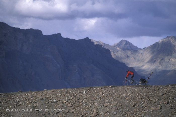
Immediately flooded with memories, I sat down and wrote a fun account of our trip, how it came about, my history of adventuring with Eric and what it was like to ride my bike over the highest passes in the world. I also shared a number of images from our time over there.

I still look back on this adventure as one of the coolest, most amazing trips I’ve ever done, so it was fun to relive it here on my blog.

10. Experimenting with Monochromatic Color Photography

As with my post about using bold and subdued colors in your photography, this post explored another creative technique you can use to vary the style of your imagery, shooting monochrome in color.

What I mean by this is capturing images that revolve around a single dominant color palette and composing so that you either reduce or in some cases, eliminate any other hue that’s not directly related to your main color.

I love using this technique, and it’s one that can really inspire you as you survey your scenes and try to think of unique ways to portray your subjects. At any rate, it can be a fun visual exercise.


So, those are my favorite posts from the past year. I hope you take the time to read or revisit at least some them, especially if there were one or two that you missed.

As always, thanks for your support during 2018 and I wish you the best for a great year ahead. I look forward to the next few months and seeing where my own ideas take me and my photography.

January 4, 2019
See this post
My 10 Favorite Blog Posts I Wrote in 2018

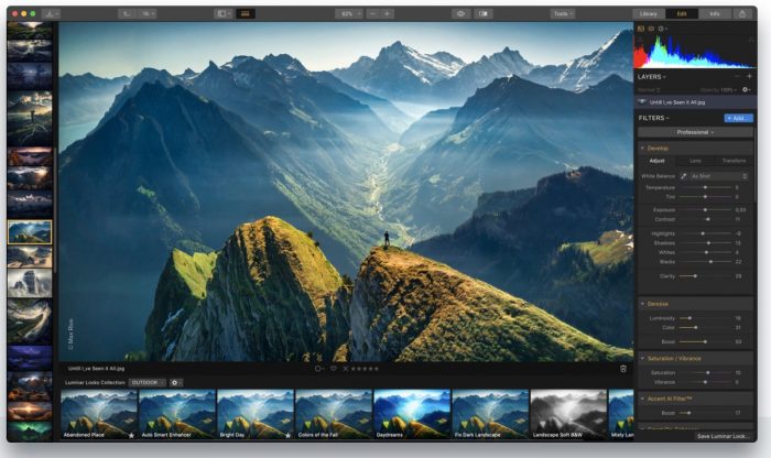
Skylum Software has just released Luminar 3. This much-anticipated update to what has become a very popular photo editing app will contain the new Library module, which will now allow you to use Luminar to import, store and organize your images. Essentially, Luminar can now function as your primary, full-solution photography program.

Skylum first announced that they were working on a catalog system for Luminar in the fall of 2017. This got everyone’s attention, because if they did it right, it would allow many photographers to leave the frustrations of Lightroom’s subscription model and increasing complicity behind. For the many photographers who are drawn to the simplicity and flexibility of Luminar’s photo editing interface, we’ve been excited to see what they come up with.

Development of the catalog system took the better part of 2018, but it’s finally here! After meeting with the Luminar developers at PhotoPlus back in October, I got to test the Luminar 3 beta versions, and I was highly impressed with what I saw.

Having listened to a wide range of photographers, they took the necessary time to make sure the program met their own expectations. Now they’ve finally unveiled it to the world, and it looks awesome.

In this blog post, I’m going to give you a quick rundown of Luminar 3 and let you know what I think.
The Interface

Luminar’s tag line is “Your photos. More beautiful. In Minutes.” Their approach is to make the computer aspect of photography fun, easy and efficient. They want to create an enjoyable user experience that inspires creativity and allows you to quickly adjust your images and give them maximum visual impact in a minimal amount of time.

With customizable Workspaces, a wide variety of Tools and Presets, a handful of very innovative A.I. “smart tools,” a powerful RAW Develop engine, simple shortcuts and non-destructive editing, Luminar 3 offers a straightforward user interface that seamlessly lets you easily jump between viewing, organizing and editing your images.

I’ve been using Luminar for over two years and I find the program very easy to use. It allows me to quickly select the tools I want to use, preview what each one does and quickly come up with a final look I want for the final image.

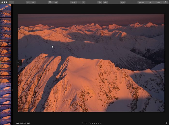
Luminar now builds on that with the ability to catalog and manage your images.

The Library Panel

Organization, Speed and Performance

Upon launching for the first time, Luminar 3 asks you where your photos are stored and where you would like to store your catalog. You can create as many catalogs as you like and store them wherever you want on your computer.

Importing images is a fast, easy process. You can import from folders, memory cards, external hard drives, and even cloud storage folder locations like Dropbox and Google Drive.

When selecting a folder, Luminar import all the images inside, and it will keep the entire hierarchy and folder structure. This makes it easy to import your existing catalog. Currently, there’s no dedicated menu item to “Import Catalog From Another Program…” but as long as you know where your images are stored, you should be able to move your entire catalog over with ease.
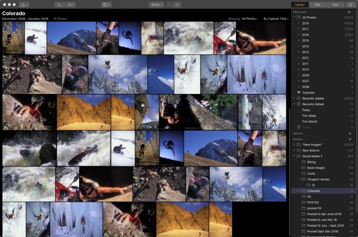
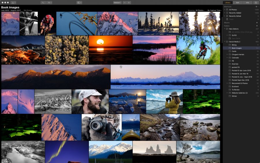
It takes a few minutes if you have a very large folder, but in my tests, I’ve been able to import up to 50K images in less than five minutes. Image previews are built pretty quickly, but if you have thousands of images, it will still take time to get them all loaded. On my Mid 2010 Mac Pro, it takes about 20 seconds to render 100 image previews.

However, once all the previews are built, navigating and scrolling through your catalog is an blazingly fast process. Last year, the lead developer told me that they were using Photo Mechanic as a benchmark, and they seem to have achieved their goal.

Keep in mind, that Photo Mechanic isn’t a catalog per-se; it doesn’t store any previews or editing information, it’s just browsing folders. That’s who it’s so fast. The fact that Luminar 3 attains this kind of browsing speed is quite remarkable. Hats off to Ivan and his team.
Managing, Exporting Images and Syncing Folders

Moving images around is easy inside Luminar 3, you just drag images or entire folders to a new location within the program. You can rename folders, create subfolders and add any folder to your Shortcuts, which lives at the top of the Library. You can even move and rename images and folders on your desktop outside the program and Luminar will instantly sync the changes.

Navigating the catalog is simple and it uses keystrokes that are similar to Lightroom: G = Grid, F = Full Screen, D = Develop (Edit), P = Favorite (Pick), X = Reject. There are probably more that I don’t know about yet. Double clicking an image brings it up a large preview inside the Edit window, which I’ll talk about below.

Luminar allows you to add star ratings, colors and tag images as Favorites or Rejects. You can create Albums and add images by dragging them into an Album, or by selecting one or more images and creating a New Album.

If you have a shared folder in your library from a service like Dropbox or Google Drive, Luminar will stay synced with the contents of that folder. If you, or anyone else adds, modifies or removes any images from that folder, Luminar will automatically sync the changes. I really like this feature, as it allows for synced sharing and collaboration between multiple users if they include the same shared folder in their own Luminar catalog.

Even if a folder is “offline,” or an external drive is not connected, you can still browse the image previews inside Luminar, and you can still move and organize images, add to albums and add ratings. You just can’t edit them.

The Edit Panel
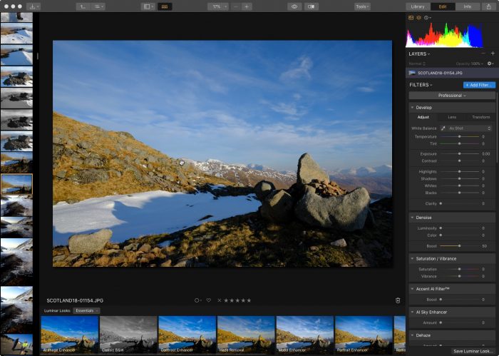
The Edit, or Develop panel is where you process your images. Selecting the Edit tab at the top, double clicking an image in the Library, or hitting D on the keyboard brings up Luminar’s Develop screen. If you’ve used Luminar before, then the editing interface will look familiar. It’s the same layout as before, except you have a new thumbnail Filmstrip along the left side of the window.

You have the option to show the standard view above, or you can hide the Filmstrip and/or the side Tool panel. You can also scroll through images and choose a new one to work on without leaving the Edit Window.

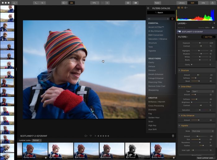
Once you’re in the Edit window, you can process your images using a wide range of tools and presets, inducing their awesome AI tools. You can make use of the different Workspaces include in Luminar, or you can create your own custom Workspaces. A Workspace is simply a set collection of tools, and you can always add or subtract tools from any Workspace.

Editing in Luminar 3 is a non-destructive process. Your edits are stored as small steps that can always be undone or altered without affecting the original image. There are also shortcuts inside the Edit Window, including J = Show/Hide Gamut Warning, C = Crop.

Luminar 3 allows you to Copy Adjustments and apply them to other images, and you can do Batch Processing and apply the same preset to multiple images.

As with previous versions, Luminar 3 allows you to create your own presets, modify and rename them. These are called Custom Looks and once you make one, you find it in the regular Preset Menu. You can also download other Preset packs from the Luminar website, many of which are free.
Quick Edit and Using Luminar as a Plugin

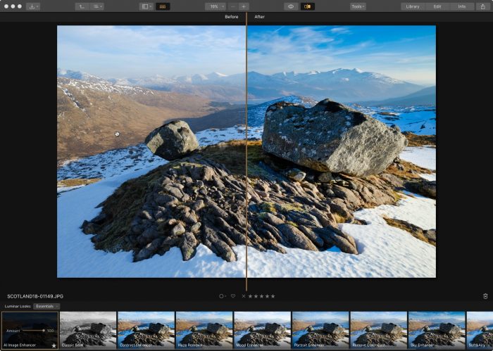
If you don’t want to upload images to a Luminar catalog before editing them, say if you already have a catalog system and don’t want to change, you can use the Quick Edit option. This allows you to choose any image on your computer and bring it up in a separate Edit Window so you can use Luminar’s processing tools to work on the photo. The program will save your Quick Edits so you can easily find them again

You can then export or save the image as desired. You can also use Luminar 3 as a Plugin for Lightroom, Photoshop, Photoshop Elements, Apple Photos or Aperture. This gives total flexibility for using the program however you want. Some people might love the library feature, other people prefer to use the editing tools inside another environment or as a standalone editor.

What It Doesn’t Have…Yet

Skylum is very clear: The Luminar catalog system is a work in progress. Although they nailed it right out of the box, keep in mind, this is their first release, so it’s missing a few essential features that are surely to come in future updates. If they tried put include everything on the first release, it would take forever to get the first build out. Releasing a foundation that performs well will allow them to build up with the most stability.

As it was put to me by the Skylum people, there are a whole lot of things that fall under the category “Not at this time.” Although they haven’t told anyone for certain what will be added, there are definitely a few things we’d like to see.

Here’s a short list of “Not at this time” features I personally requested when I met with the developers.

  • Captions and keywords: There is no search function yet, nor is there anyway to add captions or keywords. This is a big one and I’m sure they’ll add this feature in a future edition.
  • Read metadata from files: Right now, Luminar 3 doesn’t read color tags, star ratings or picks from other programs. Colors and stars are universal across most programs, so I’d be very surprised if they didn’t add this sometime soon.
  • Adjust Capture Times
  • Watermark: This is a very big item. You can create watermarks using Layers in Luminar, but they should give you a very easy and fast way to add watermarks on your images during export.
  • Geotagging
  • Smart Folders/Collections
  • Publish Recipes: Lightroom and Capture One both have this kind of feature.
  • Dual Monitor: It would be nice to have the Library on one monitor and the Edit Window on another.
Final Thoughts

For all that it doesn’t have yet, Luminar 3 is still an exceptional program. It’s got a very straightforward interface and it does what it’s supposed to do: You can easily upload your images, sync and store them in a very easy-to-use library and edit them with a variety of fun, creative tools.

As I said, if you’ve used Luminar before, you’ll feel right at home with this new version. If you’ve been waiting for the catalog, or if you’re thinking of leaving Lightroom, I think you’ll be impressed. It runs well, it plays well with any camera system, it’s easy to navigate and it keeps things synced between shared folders.

Although the first release may not include full support for the Fujifilm X-T3, it’s guaranteed to come soon in a future update. That said, Luminar 3 will recognize the files and you can include them in your catalog with what appears to be full comparability. I’m able to edit my own X-T3 RAW files in Luminar 3, and although it may lack full functionality with some tools, I can perform many develop adjustments and apply presets.

Have no fear, though. Luminar’s developer is a Fuji user, and I know that they’re dedicated to fully support all Fuji cameras. Unfortunately, as some people have found, Adobe only gave X-T3 support to Lightroom CC, and have even stated that the standalone Lightroom 6 version will not get X-T3 support. All the more reason to try out Luminar.

It’s recommended but not necessary that you store your catalogs on a solid state drive, and it can be an internal or external drive. If you don’t have an SSD installed inside your computer, you can pick one up for a decent price. My own personal favorite is the SanDisk Extreme SSD External drive. It’s a very good value and offers extremely fast data transfer rates and good storage size for a variety of uses.

Overall, I’m really liking what I see in Luminar 3, even on my 8 year old Mac Pro. It’s awesome that you can include and sync shared folders in your library. There are a lot of potential uses for this kind of feature. I’ve using Luminar as my main image editing program because I love the fast creative workflow it inspires. With the new Library feature, the whole thing just got a lot more handy.

Right now, I use Photo Mechanic for almost all of my image browsing/moving/saving/copying/export tasks, Lightroom for my catalog and Luminar for my processing. Although I’ll probably never stop using Photo Mechanic for some things, I can see shifting towards Luminar for much of my daily imaging workflow and starting my transition away from Lightroom.

I know that some photographers will find the first version of Luminar’s Library module a bit limiting. However, I think that Luminar offers a perfectly viable solution for the vast majority of people who are looking for a comprehensive, and frustration-free photography management and editing program. Again, hats off to the development team for creating a gorgeous program that offers the creative inspiration, performance and highly intuitive interface we all deserve.

Luminar 3 is now out. You can purchase the program and save $10. If you use discount code DANBAILEY, you’ll save another $10 and get the program for only $49.

If you’ve already purchased the program and currently use Luminar 2018, then you’ll get the update for free as soon as it’s released.

You can check out the user manual for Luminar 3 and read about all the new features here.
December 12, 2018
See this post
A Preview Look at Luminar 3 with Libraries

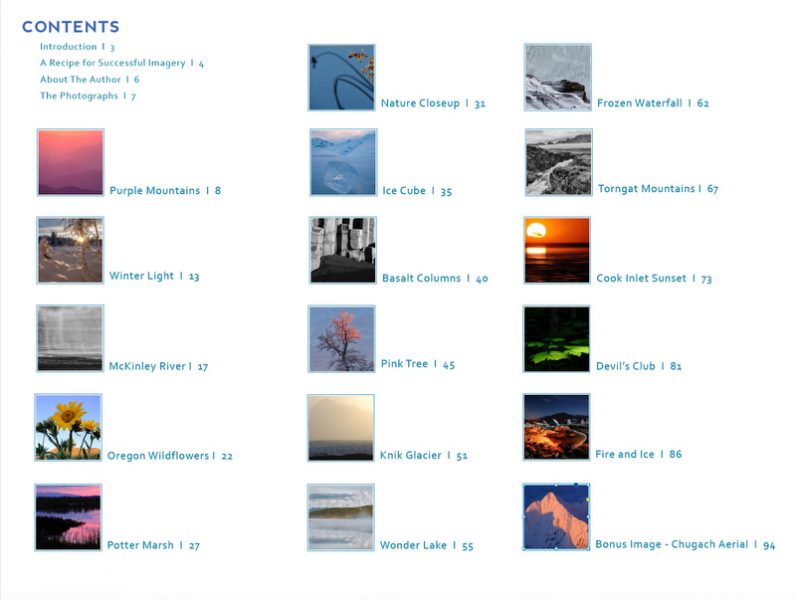
I’m excited to announce the release of my brand new ebook, BEHIND THE LANDSCAPE: A Manual for Seeing, Composing and Processing Captivating Imagery.

In this comprehensive eBook, I take you behind-the-scenes during the creation of sixteen of my favorite landscape images I’ve made in the past five years.

For each example, I walk you through the entire process. I let you look over my shoulder as I outline the exact gear I had with me, the specific concept I had in mind, my creative approach, potential problems I faced, and how I solved them

I describe my compositional techniques, my lens choice, how I used the light, specific exposure information and any other details that went into the process of bringing the image to life. I also highlight the types of challenges that you might face when shooting a similar style of imagery, and I show how to overcome them so that you can walk away with a great photograph.

I Even Show You The Outtakes!

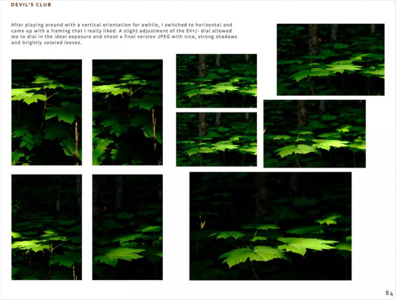
I even show you the outtakes that led up to the one final select of the series to illustrate that creating a great image is rarely a one-off activity. I feel this is one of the most valuable aspects of the entire book. Even if you didn’t read a single word, you could just look at the pictures and get a feel for how each shot developed in the scene.

With a horizontal format and 105 full-page spreads, BEHIND THE LANDSCAPE is packed full of practical photography tips and creative insight from a 20+ year professional photographer and instructor. And of course, it’s filled with stunning imagery!

A Step-By-Step Recipe Book for Successful Landscapes

In this book, I’m not just trying to show off my imagery, my goal is to teach you how to create stunning photos on your own. With this in mind, I’ve formatted this book around what I feel are the essential steps required for any successful photo shoot:

  • SCENE
  • GEAR
  • LIGHT
  • APPROACH
  • EXECUTION
  • ANALYSIS
  • FINAL THOUGHTS
  • TAKEAWAYS


For every single image, I walk you through my own creative and technical process as I work through each of these steps. I evaluate each scene, describe the camera gear I had with me, analyze the color, quality and direction of the light, and tell you my specific approach for how I plan to capture each scene. Then I describe in detail my exact method of execution for turning my creative ideas into a successful image.

At the end of each example, I give you my final analysis for the image and describe the specific elements that I feel give the shot exceptional visual power. In addition, I share my final thoughts, reflecting on the personal, creative or introspective journey that led to the image.

Finally, I leave you with three takeaways. These are specific tips, techniques, compositional methods and ideas that directly contributed to the success of the image. The idea is that you can identify the methods that worked worked, so that you can apply to your own photography.

AND PROCESSING TOO.

Although most of the final images in the book are straight JPEGs, a few of them have been processed to give them maximum impact. For those photos, I describe the look I was going form and walk you through the steps I took in the processing stage. I also discuss the specific aspects about the scene or the image that inspired me to edit the photo in a specific way.

You even get a special bonus image!

As a special treat, I’ve included a special bonus image. Rather than being another how-to chapter, it’s more of an adventure tale where I take you along with me on one of my aerial photography missions. You get to imagine what it’s like to be sitting next to me in the right seat of my little Cessna as we chase magical light around the sky and capture one of my favorite aerials!

Years of Professional Insight at Your Disposal

Not only does BEHIND THE LANDSCAPE teach you the essential steps towards creating stronger images, it provides real-world inspiration that will motivate you to get out and try these techniques on your own.

Most of the photos in the book were shot in locations that are accessible to anyone with a basic level of fitness, and none of them required any special camera gear aside from what would be considered a normal outdoor photography kit. This means you can use these tips with your own subjects.

I’m confident that you’ll get a lot out of BEHIND THE LANDSCAPE. It’s full of useful information and and inspiration and written so that you can start applying these techniques right away in your own photography.

Order your copy of BEHIND THE LANDSCAPE with a 100% money back guarantee. I’m pretty sure you’re going to like this book, but if for some reason you don’t, I’ll gladly refund your money. Let me show you how to take more captivating photographs.

November 29, 2018
See this post
My Brand New eBook is Here – BEHIND THE LANDSCAPE

I often get questions from readers and workshop students about how I exposure for my scenes.

Which exposure mode do I use, how often do I bracket, and in what increments? Which metering pattern do I prefer, center weighted, spot or multi segment? How do I handle challenging light? What should the histogram look like? Do I exposure for the right or the left?

Since proper exposure is such a vital part of photography, I thought I’d give you a quick primer on the exact exposure methods I use with my Fujifilm mirrorless cameras. Note, these techniques work with pretty much any kind of mirrorless camera.

I’ll start by saying that my technique looks a lot different than it used to, simply because mirrorless camera technology makes exposure a whole lot easier.

Compared to digital, color slide film had very narrow latitude, only about five stops, so you either nailed it, or else you threw the picture away. Anyone could get it right in easy light, but when the light got really tricky…

…Let’s just say that this is what separated the men from the boys. Your exposure chops were the most important skills you had as a photographer and serious shooters were forever chasing the dragon of being able to perfectly expose for every type of scene, no matter how challenging the light.

Oh, and I say “men” & “boys” because it’s us male people who tend to obsess about the technical aspects of photography, like how big our lenses are and how good we are at exposure. Women are perfectly capable of making a perfect exposure in tricky light, they usually don’t flap their wings so much when they nail it.

With DSLRs, things are kind of the same. Even though modern sensors have a much wider latitude than film, unless you shoot in Live View Mode, you still have no idea what the picture will look like until you actually shoot it and press the playback button. However Live View on most DSLRs doesn’t give full functionality and performance, especially with regards to autofocus.

Also, if you’re shooting fast breaking scenes, waiting to see if you nailed it might mean the difference between nailing the scene or missing it.

The Magic of Mirrorless

It’s a whole different world with mirrorless cameras. Real-time Live View with full performance and WYSIWYG viewfinders shows you what the picture will look like before you take it, simply because what you’re looking at on the screen is an exact view that’s being fed directly from the sensor.

It’s like magic. There is no surprise. No more “oops.”  No more blowing the shot because you underexposed when you should have overexposed, or because you used the wrong type of meter.

Even in the most challenging lighting situations imaginable, you can still see EXACTLY what your final image will look like. And that changes everything. 

With this in mind, here’s my basic exposure workflow:

  1. Turn on camera and set to Aperture Priority Mode.

  2. Point it at the scene.

  3. Look at the LCD or peer through the EVF.

  4. If I like what I see, I press the shutter button. 

  5. If it looks too dark, I turn the EV+/- Dial a few click up until I like what I see. Then I press the button.

  6. If it looks to bright, I turn the EV+/- Dial a few click the other way, until I like what I see. Then I press the button.

I’ll say it again: IF I LIKE WHAT I SEE, I PRESS THE BUTTON. 

It’s as simple as that. Most of the time, the camera gets it right, but if I want something different than what the camera is showing me, I simply turn the EV Dial until l get the look I want. Even if I’m using a different exposure mode, like Shutter Priority or Program.

In other words: The EV+/- Dial is your friend. 

Here’s an example:

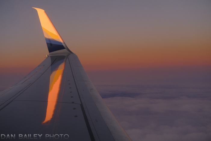
The other day, I was riding in an airplane. I looked out the window and saw beautiful sunset light hitting the “winglet.” I grabbed my camera and pointed it out the window.

Hmmm… what should I do to ensure “proper exposure?” Set a spot meter and point it at the winglet? Or maybe at the brightest part of the sky. (That’s what we used to do.) Nah, that’s too much work.

I simply looked at the screen and decided that the current exposure at 0EV was a little to bright. The color on the winglet was a little bit washed out, so I turned the EV+/- Dial to -3 and pressed the button.

That’s all. I turned the EV dial until I liked what I saw. Then I pressed the button and immediately Tweeted it to Alaska Airlines as soon as we landed.

Here’s another example.

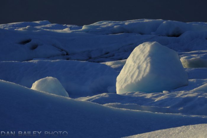
In the scene below, the camera told me that “The right exposure” was one thing, but I wanted a slightly darker background and more contrast, so I turned the EV+/- Dial to -7 and took the second photo.

What About Shutter Speed and Aperture?

Ok, now we’re getting a little more complicated. But not really.

For some picture situations, you’ll want a high or low shutter speed in order to freeze or blur the motion. Other times, you might want a wide or narrow aperture in order to get a shallow or wide depth of field.

In Aperture Priority mode, you can control both of those parameters by simply turning the Aperture control until you see either the shutter speed you want or the f/stop you want. The camera will compensate by changing the shutter speed, which you can see right in the display.

So, for most scenes, I simply point the camera and think about how I want my scene to look. Sharp? Blurry? Lots of stuff in focus? Only one thing in focus? Once I figure that out, I turn the Aperture ring until I see either the shutter speed or f/stop that will create that effect.

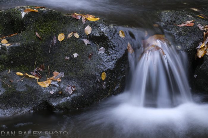
For the first picture below, I wanted a fast shutter speed. I set my aperture to f/2.8, which got me a speed of 1/640 sec. For the second picture, I wanted blurry water, so I set my aperture to f/16, which gave me a shutter speed of 3 seconds.

What about ISO?

If my current ISO setting won’t give me either the f/stop or shutter speed I want, I simply adjust the ISO. (You could use Auto ISO, but I prefer to change it manually.)

Here I was photographing crows early in the morning when the light was dim. I was using the new Fuji XF200mm f/2, which meant I needed a high shutter speed in order to get a sharp photo of a flying bird. I cranked the ISO up to 1600, which gave me a high enough shutter speed.

It’s a simple as that. Need the speed? Crank up the ISO dial.

What about Manual Exposure Mode?

Manual exposure mode works pretty much the same way, only you have to control everything. You adjust the shutter speed, aperture control and ISO, and watch what happens in the viewfinder. As you adjust those controls, you’ll be able to see the picture get brighter or darker.

When you get your desired shutter speed or f/stop, and you like what you see on the screen, press the button.

Simple as that.

If your picture is too light or dark, adjust SS, f/ or ISO until you get the look you want. Then press the button.

What about The Histogram?

The Histogram is a graph of all the tones in your image. Without going into too much detail, (you can read a great post on histograms here), the basic rule is that you don’t want to have a giant spike on either side, because that means that either your highlights or your shadows will be “blown-out.”

Sometimes it’s ok to blow out your shadows, because shadows are your best friend in photography. Blown highlights don’t usually look as good in photos.

You also don’t want to have a huge gap on the right side of the histogram. Due to the way that digital sensors capture light, there’s more tonal information in the brightest tones than in the darker tones. This means you have more latitude for processing your photos if they’re generally brighter than if they’re darker.

If you try to brighten the really dark tones in your photo processing software, you’ll end up with more noise than if you adjust the brighter tones.

You can display a histogram right in your LCD/EVF. (Depending on the model, you can show a simple histogram or a 3-color RBG histogram. Either is fine.) This can help you with your exposures. Why?

Because you can’t always trust your LCD. Sometimes it can can fool you. Not all cameras have the same quality viewfinder, and not all screens are calibrated the same with 100% accuracy. Also, the LCD can look different in excessively bright or dark light.

I usually trust the LCD on my Fujis, but I’ve seen some cameras where the LCD is not very accurate. You’ll generally find this to be true with cheaper cameras.

It’s very simple to incorporate this tool into your shooting method. When you’re doing the “Exposure Workflow” I outlined above, just keep an eye on your histogram and make sure there aren’t any huge spikes or gaps at either end. If there are, simply adjust the EV+/- Dial or our camera controls until it looks ok.

Ideally, you want a nice, even bell curve that extends all the way across, but doesn’t jump over either side. When in doubt, you should aim for a brighter image than a darker image. However the exact shape will very depending on what you’re shooting.

If you’re photographing predominantly light or dark subject matter, or subject with very high or very low levels of contrast, your histogram won’t look like a nice bell and it may even have some gaps the edges. You may even have some spikes.

Sometimes spikes and gaps are unavoidable, especially if you’re shooting high contrast subjects. Again, you just don’t want too much stuff blowing over the edges.

Imagine how different the histograms would look like for these three photos below.

Being a great photographer still requires a high level of proficiency and experience with your camera. It takes knowing which settings to change, being able to adjust them quickly in real-time, anticipating your scenes and knowing how to translate your creative vision into a final photograph.

Years of practice.

However, the basics of getting a good exposure are relatively simple when using mirrorless cameras. Don’t make it harder than it needs to be. Look at the screen/viewfinder and if it doesn’t look right, make an EV adjustments as needed. When you like what you see on the screen, press the button. It’s that easy.

November 26, 2018
See this post
Exposure Basics for Shooting With Mirrorless Cameras

Last fall, Skylum announced that the were developing a catalog module for Luminar which would make it not just an image processing program, but an asset management tool as well. Originally, this update was slated for early 2018.

I was very excited to hear this news, and not just because I’m an enthusiastic Luminar user. I think it’s important for us to have more viable choices besides Lightroom and Capture One when it comes to storing, processing and cataloging our images.

However, as we got further into 2018, we all started to wonder when Luminar would actually release the new catalog system. People started to get impatient, and rightfully so, since all we heard was “it’s coming…”

Then, a few weeks ago, Alex Tsepko, the CEO of Skylum admitted that they had indeed overpromised on their time frame. They were still in development mode, an still hoping to get an initial release out asap.

To make things right, Skylum promised that the Library module would appear before the end of 2018. In addition, all updates to the program for free throughout the entire year of 2019. From a PR standpoint, I think this was a very good move on their part, and I applaud Skykum for being forthcoming working to satisfy their customers.

The good new is that Luminar 3, which will include Libraries function, will be coming on December 18, and anyone who has already purchased Luminar 2018 will get the update for free, along with any and all updates they release next year.

​​​​​​​If you don’t already have Luminar 2018, you can get it right now for a $20 off. Normally $69, Luminar is priced at $59 right now, and if you use discount code DANBAILEY, you’ll save an additional $10 and get the program for only $49.

And this will ensure that you get the upcoming library update for free, as well as all 2019 updates. (They’ve got some cool new tools coming!) 

Image

Having used numerous imaging processing programs over the years, including Photoshop, Lightroom, Capture One and Iridient Developer, I like Luminar because it gives me very good results quickly, it fosters a style of creativity that I find fits well with my “fun” approach to photography, it’s powerful, but very easy to use, and it plays well with the Fuji X-Trans RAW files. 

Luminar’s Lead Developer is an X-T2 user, as are a number of their other employees. They’re passionate about Fuji, so they’re working very hard to get it right with regards to quality, color accuracy and sharpness.

While at PhotoPlus trade show last month, I sat down with three of Luminar’s project developers and software engineers and they showed me some examples of what’s coming. Without giving away too many  details, I can attest that the future looks bright with Luminar. 

In addition, they spent quite a bit of time asking me question about what I would like to see in the upcoming catalog system. They’re eager to get input, because they’re serious about putting out a truly great photography program that will match the needs of most photographers from start to finish.

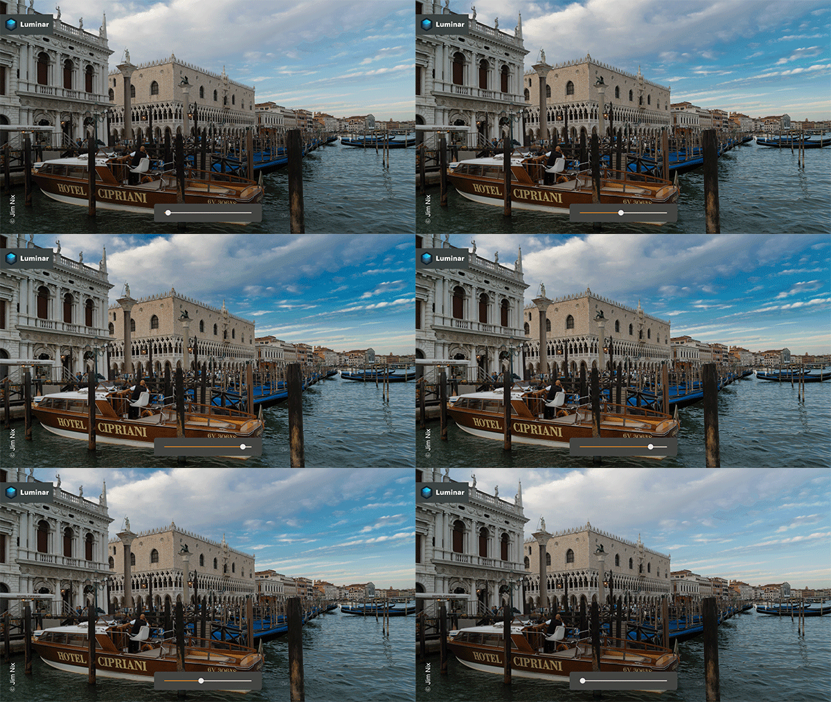
On thing I can mention is the new Sky Enhancer Filter. This new AI can automatically detect and adjust your skies, even when they’re partially obscured by other objects in the frame. With some scenes, this it could require complicated masking to isolate the sky for adjustment, but with the new filter, it’s easily done in seconds with a single slider.

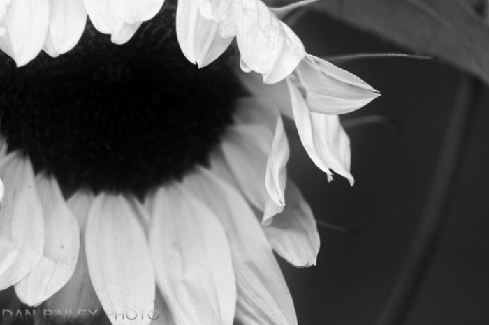
I’m excited for the new release, and if you’re a current Luminar user, you will be too. You may even want to download the new free Tonality Mega B&W Pack, which has over 170 awesome monochrome and looks and vintage styles. I’ve been having a lot of fun with this one! (See below.)

If you’re not currently a Luminar user, I highly recommend trying it out. There is so much I like about the program, and with the upcoming catalog module, it’s about to get better in a huge way.

And remember to use discount code DANBAILEY to save $20. 

​​​​​​​If you have any questions about Luminar, you can check the website here.

Enjoy the rest of your week!

November 14, 2018
See this post
Luminar 3 With Libraries is Coming December 18

I just got back from the Great Smoky Mountains, where we just finished our third Fujifilm X-Photoraphers Nature and Travel Summit.

These 4-day intensive workshops are specifically designed for Fuji shooters. We teach photographers how to get the most from their X Series gear and also give them a chance to try out different X/GFX cameras and lenses in the field.

This was my third time photographing in the Great Smokies, which is by every measure, a fantastic location for landscape photography. It’s also the most popular National Park in the entire U.S., with 10 million annual visitors, most of who come to peep autumn leaves during the fall.

After all, this region is known for its amazingly beautiful fall colors, with brilliant hues of red, orange and yellow that paint all of the hillsides and thick forests.

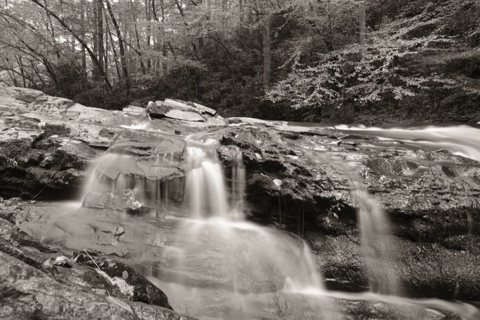
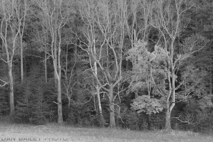
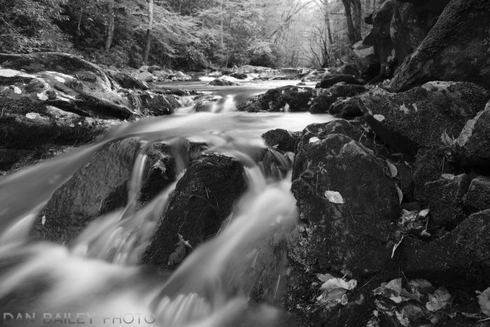
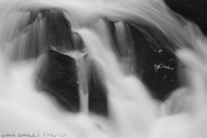
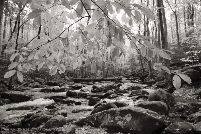
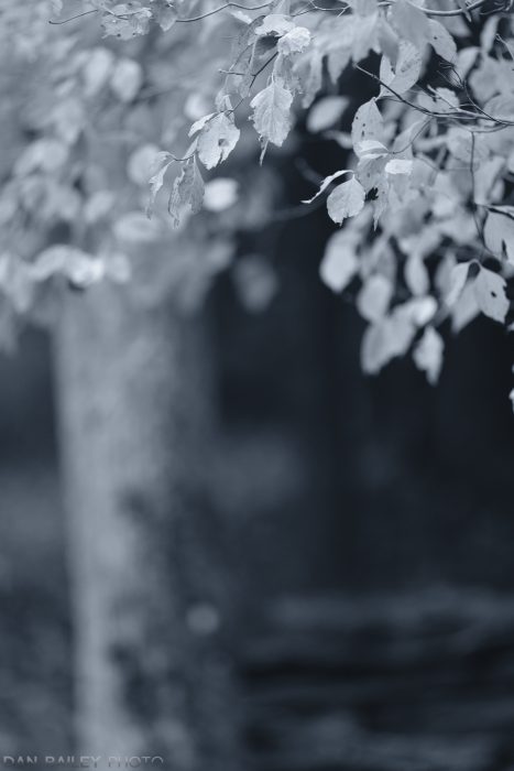
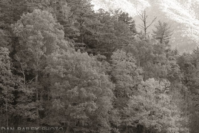
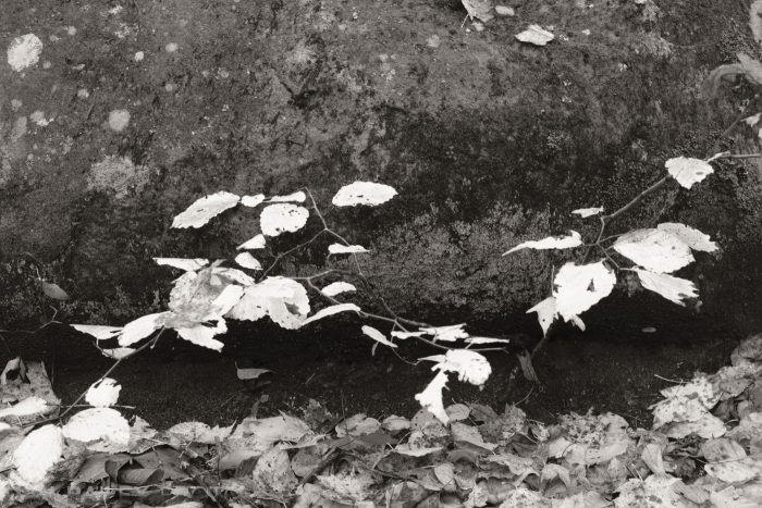
So, what did I do with all of this vibrant, saturated scenery? I ran around shooting in black and white.

Wait… huh?

That’s right, I captured about a third to a half of my scenes in monochrome.

I’m always trying to stretch my own creative boundaries, and I enjoy playing around with different techniques as I try to create unique images that excite and inspire me.

As much as I love color photography, I love shooting in black and white on my Fujifilm cameras, mostly with the ACROS film simulation. I’m also endlessly fascinated by the notion that photography is a representational medium where you’re trying to tell a story or evoke ideas and emotions with a single still image.

One of the most most powerful creative techniques in photography is to abbreviate your scenes. This engages your viewer’s imagination to fill in the rest of the story inside their own mind. When your narrow down to very simple compositions with just a few key elements, you incite an immediate connection between your photo and your viewer that triggers a much different emotional response.

By rendering the scene in black and white, you’re accentuating that notion of photographic abbreviation. Since most people don’t see in black and white, they can’t help but perceive the scene in a different light. Without the distraction of all that pesky color, they’re allowed to focus more on the elements of shape, shadow, tone and the placement of your subject matter, and hopefully extract the message you’re trying to present.

I’ve also been having fun lately with the new B/W ADJ. setting on the Fujifilm X-T3. Found inside the IMAGE QUALITY menu, this new feature lets you apply a warm or cool tone to your black and white images right inside the camera.

I love this feature, and aside from the faster autofocus, it’s pretty much my favorite thing about the X-T3. It’s like adding a whole new brush to your creative kit. The results remind me of classic warm, sepia-toned platinum prints, and gold toned prints, which impart a very slight blue cast.

When you select this setting on the X-T3, you can dial it up or down + or – 9 steps in either direction. It’s fun to experiment and see how the feel of the image changes, depending on the level of adjustment you make.

Then, after going warm and cool for a few frames, it’s always fun to go back to a straight neutral black and white tone and see what you get.

What do you think? Does the message of “fall” come across in these B/W images?

One thing to note, if you’re bracketing film simulations on the X-T3, the B/W ADJ. setting is not available to you, even if one or more of your chosen film sims are set to ACROS or Monochrome. Also, if you shoot RAW, it’s almost guaranteed that your RAW conversion software will trash the nice warm or cool color look you’ve applied as soon as you upload the image.

However, if you’re shooting RAW and doing in-camera conversions on the X-T3, you can apply the B/W ADJ. setting in the conversion menu, but only if you’re already using a black and white film sim. If your original RAW was shot with a color film sim, this option is grayed out.

As I mentioned above, I did capture a wide range of color images during the past week. When I look through my library, though, it’s the monochromes that seem to jump out at me. Those are the ones that make me go “oooh” and “ahhhh.” Probably for the exact reason I discussed in paragraph #3.

I encourage you to try shooting or processing in black and white, at least some of the time. It’s fun to see and show the world in a new way, and digital photography makes it really easy, since most modern cameras have some kind of monochrome mode tucked somewhere in the menus.

November 5, 2018
See this post
Shooting the Great Smokies in Black and White

Shooting action is a blast. Except when it’s not. There’s nothing more exciting than trying to freeze an exhilarating moment when your subject is whizzing by; trying to capture the feeling of speed and physical exertion in a single frame, except when the light is really bad.

Then this supremely awesome style of photography can turn into an immensely frustrating challenge. Photography is all about light, and if you don’t have very much of it, then you’re hard pressed to get the kinds of images you were hoping for. You’re left standing in the dark with a card full of blurry, grainy frames and very few keepers.

It happens to the best of us, but rest assured, I’m here to help. In this post, I’ll give you five simple tips that will ensure better images when you’re trying to photograph moving subjects in terrible light.

Remember, it takes a lot of practice to be a good action shooter, so don’t get discouraged if you’re not always getting killer shots. Look at each outing as a new opportunity to learn and build valuable experience. These techniques work with any kind of moving subject, no mater if you’re shooting adventure, wildlife, indoor sports or kids running around the yard.

1. Crank The ISO Dial Up…WAY Up.

First and foremost, don’t be afraid of shooting at high ISO. The noise war is over and we won. Modern cameras do an amazing job in low light, so you shouldn’t be afraid of those big numbers on the far end of the dial.

You’ll find that any camera made within the past four years will do a decent job. With my X-T2 and now the X-T3, I have absolutely no problem using ISO 1600 as a baseline and spinning the dial up to 3200 or 6400, or even 12,800 when things get really dim. (The lead off shot above is ISO 1600.)

Sure, you’ll get noise, but today’s image processors are able to render it as “grain” instead of the offensive, blotchy, digital noise that we used to get. And even if you do get a lot of grain, so what?

I know some of you old school guys get a little uncomfortable with this kind of cavalier, care-free attitude, but as I like to say, a little grain never hurt anyone. Your alternative might be a card full of blurry images, so deal with it. If you get a truly great shot, no one will care. They’ll be so blinded by the jaw-dropping bad-assery of your killer action image, they won’t even see the grain. They’ll just see awesome.

This being said, ISO noise does tend to block up in those mid-range tones, so it’s often most noticeable on human skin. i.e., bare arms and faces. If things get a little too splotchy for you, try using different compositions that don’t accentuate your subject’s faces, focus on other elements in the frame or back off and shoot wide.

ISO 1600
ISO 3200
ISO 12,800


2. Shoot in Monochrome

Here’s a technique I like to use with my Fujifilm cameras. Often times when I’m shooting at very high ISO settings, I’ll use the monochrome film simulations.

For some reason, the image processor is better able to reduce ISO noise and make it look even more like film grain when you’re shooting in black and white.

You’ll find this to be especially true with ACROS. It’s designed with a very complex grain structure that holds together extremely well and actually looks great at the higher ISO. I love shooting ACROS at ISO 3200 and 12,800.

In addition, black and white photos just look cool. They carry a strong, timeless representational feel that gives them extra power. Even if you don’t have bad light, and even if you’re not a Fuji shooter, I highly recommend shooting in B/W, or at least processing some of your color image to B/W when you get home. I think you’ll be impressed with your results.

I especially love using the new BW Warm/Cool adjustments, which is a brand new setting found on the X-T3, they let you add an additional element of style to your images.

The first two images below were made with varying degrees of adjustment using the “warm” setting. The third one is straight ACROS.

3. Use Your Widest Lens

Usually when shooting action, you want fast shutter speeds so you can get sharp subjects. By the nature of their design, wide angle lenses let you get sharper images at lower shutter speeds than you would normally be able to get with telephoto lenses.

As you move further away from your subjects and decrease their relative size in the frame, your chances of getting them sharp increase even more.

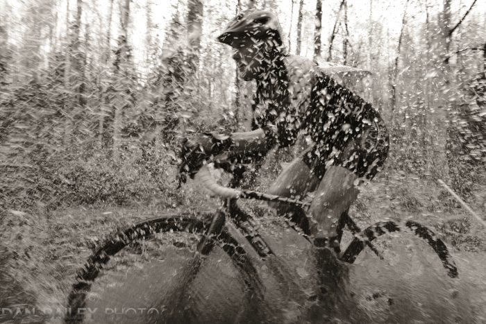
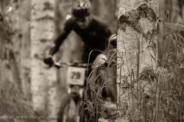
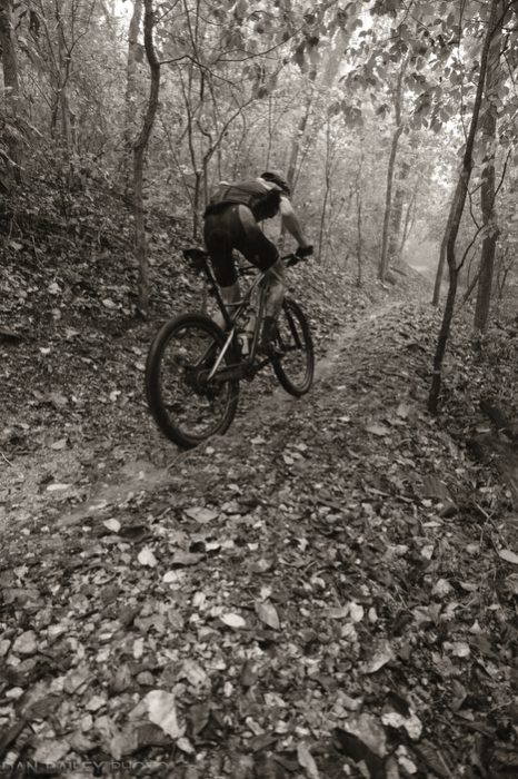
Earlier this month, I was shooting a mountain bike race inside a dark forest during a heavy rain storm, so my ambient light was very dim. My only hope was using my ultra-wide XF14mm f/2.8 lens and opening my aperture all the way up. With a telephoto, things would have been way too dark to get really crisp frames.

4. Use Slow Shutter Panning Techniques

Panning is an essential technique that should be in every action photographers bag of tricks. In situations like this, it can make all the difference between nailing exciting shots and getting an entire card full of throwaways.

To get the best results, you simply lock onto your subject and follow it with steady camera motion while clicking away with a relatively slow shutter speed. The trick is to move your camera at the same speed as your subject as they pass by. Your background will be blurred, as will part of your subject.

However, any part of your subject that’s moving at the same speed as your camera will be rendered with varying degrees of sharpness in your frame. If you’re able to match the motion perfectly, then that part of your subject will end up being wonderfully crisp, although a nice combination of crispness and blur usually makes for the most dynamic shot.

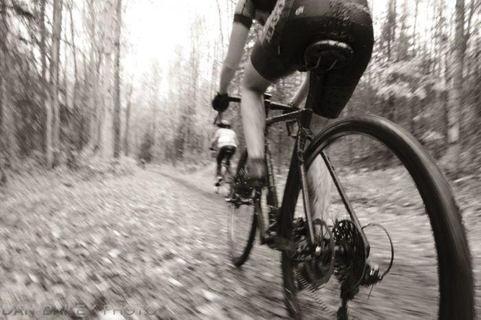
What speed works best? That depends on your lens and how fast the subject is moving. These photos below were shot with my XF14mm wide angle lens between 1/30 and 1/50 second.

It will take some experimentation to figure out what speeds give you results that match the look you’re going for. In adding to side-to-side panning, I often use front-to-back panning, which gives a different feel.

5. Use a Flash

Bringing a flash into the mix can add a whole new dimension to your action photos. When I’m shooting sports with flash or battery powered strobes, I usually combine it with my regular slow-shutter panning techniques. Although off-camera flash is my preferred method, using the pop-up flash on your camera can work just as well.

A quick blast of light at the end of your shutter cycle will illuminate your subject and create a “ghost-like” motion blur where you have a prominent, sharp subject against a blurred background. In order for this technique to work, you’ll want to make sure your flash is set to “Rear Curtain Sync.”

In addition, by slightly underexposing your camera exposure, you can create effects where your subject is lit even more prominently against a darker background. You can see more examples of my flash/panning technique in action here.

One thing I didn’t cover in this tutorial is autofocus. That’s a whole different beast. To brush up on your AF skills, read my post 10 Essential Autofocus Tips for Sports and Action Photography.
October 29, 2018
See this post
5 Tips For Photographing Sports and Fast Action in Low Light